About Animated Accordion
Why it works:
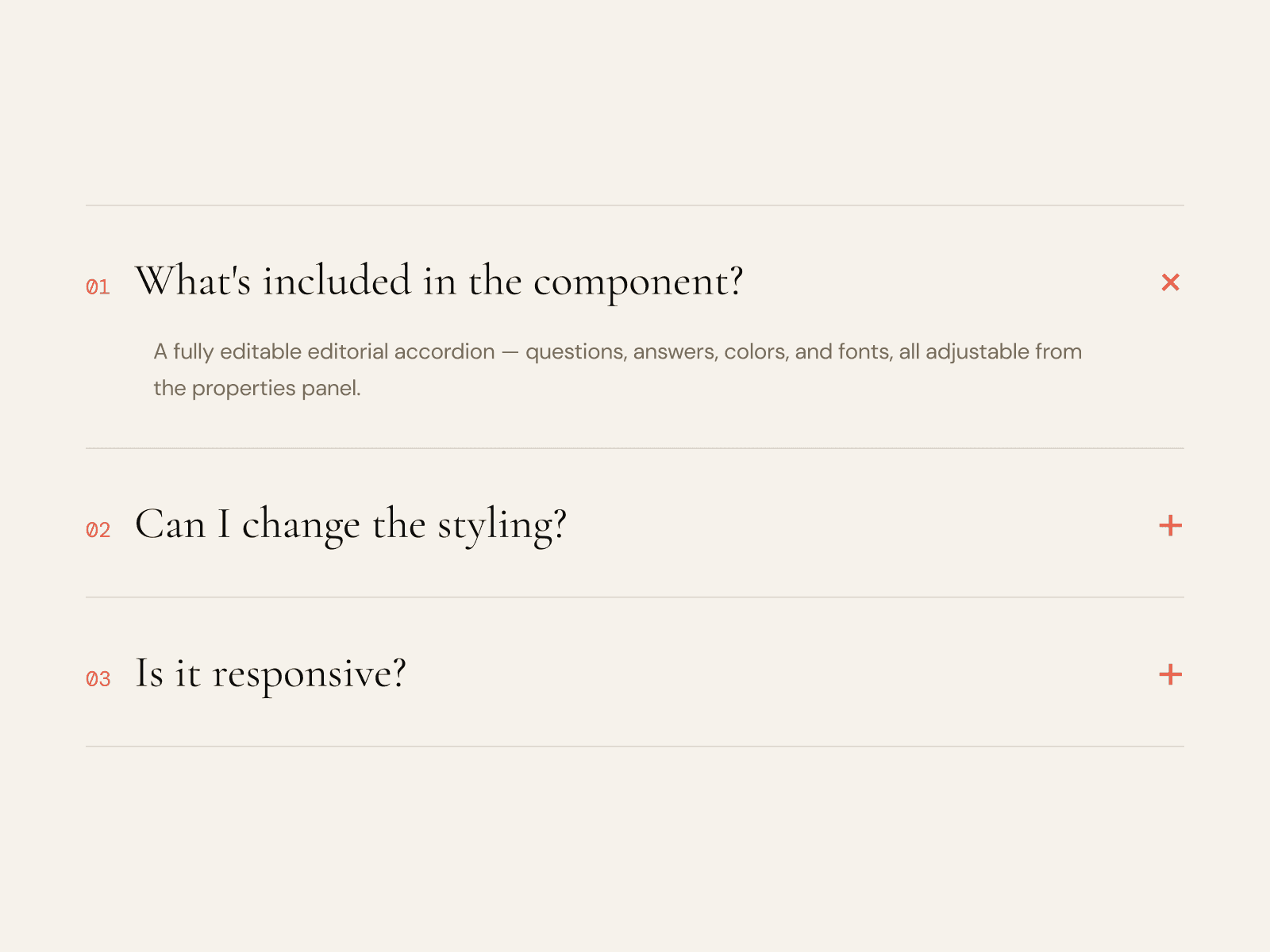
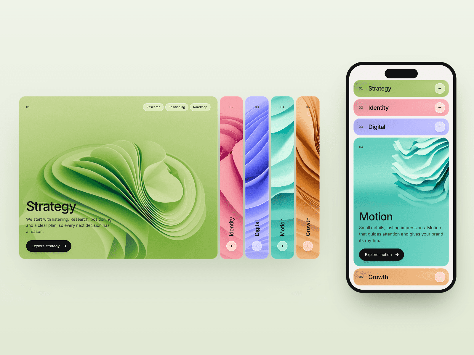
Default accordions feel like form widgets. This one has enough hand-tuned motion (the rail, the icon, the height transition) that it reads as part of the design instead of a stock component, without the bundle cost of a motion library.
Under the hood:
- Heights animate from a measured pixel value back to zero, so the transition stays smooth at any content length.
- The plus icon is two SVG strokes that rotate independently, turning from a `+` into a horizontal bar.
- When two or more items are open, a vertical line draws between them along the accent rail.
Best for:
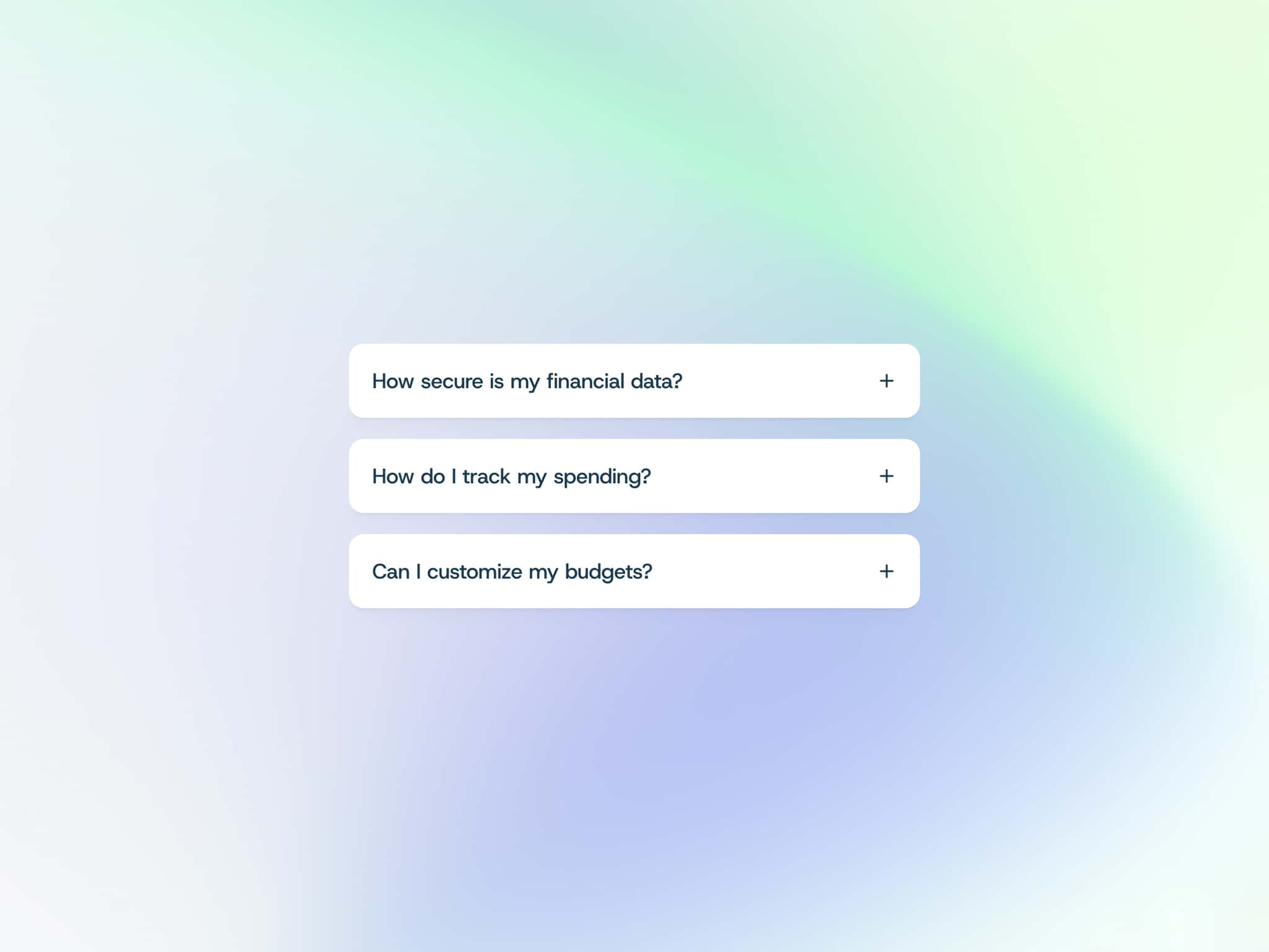
- FAQ sections and pricing pages
- Documentation, help centers, and onboarding
- Agency portfolios and studio sites
- Premium SaaS and marketing pages
- Product feature lists
Controls:
- Items: array of `{ title, body }` pairs
- Accent: glow and active-state color
- Mode: single or multiple open at once
- Default Open: index of the item that starts open (-1 for none)
- Title Size, Body Size: typography
- Title Color, Body Color, Muted: text palette
- Border: divider line color
- Row Gap: spacing between items
Built for production:
Pure CSS transitions, no animation libraries. Keyboard accessible with `aria-expanded` and `aria-controls` wired up. Respects `prefers-reduced-motion` (clicks still work, transitions soften). Responsive at any width.