About Dot Matrix Card
About Dot Reveal Card
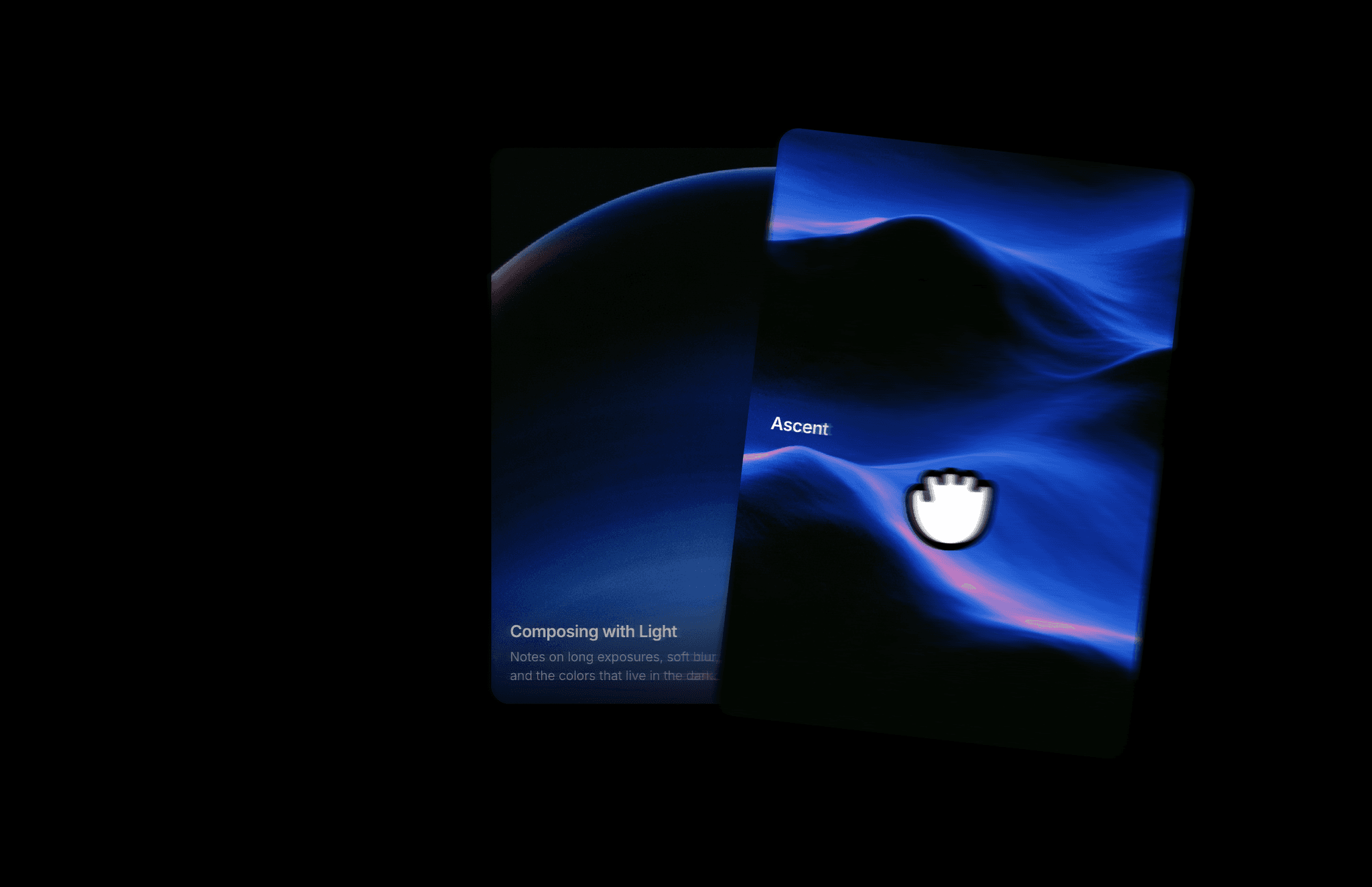
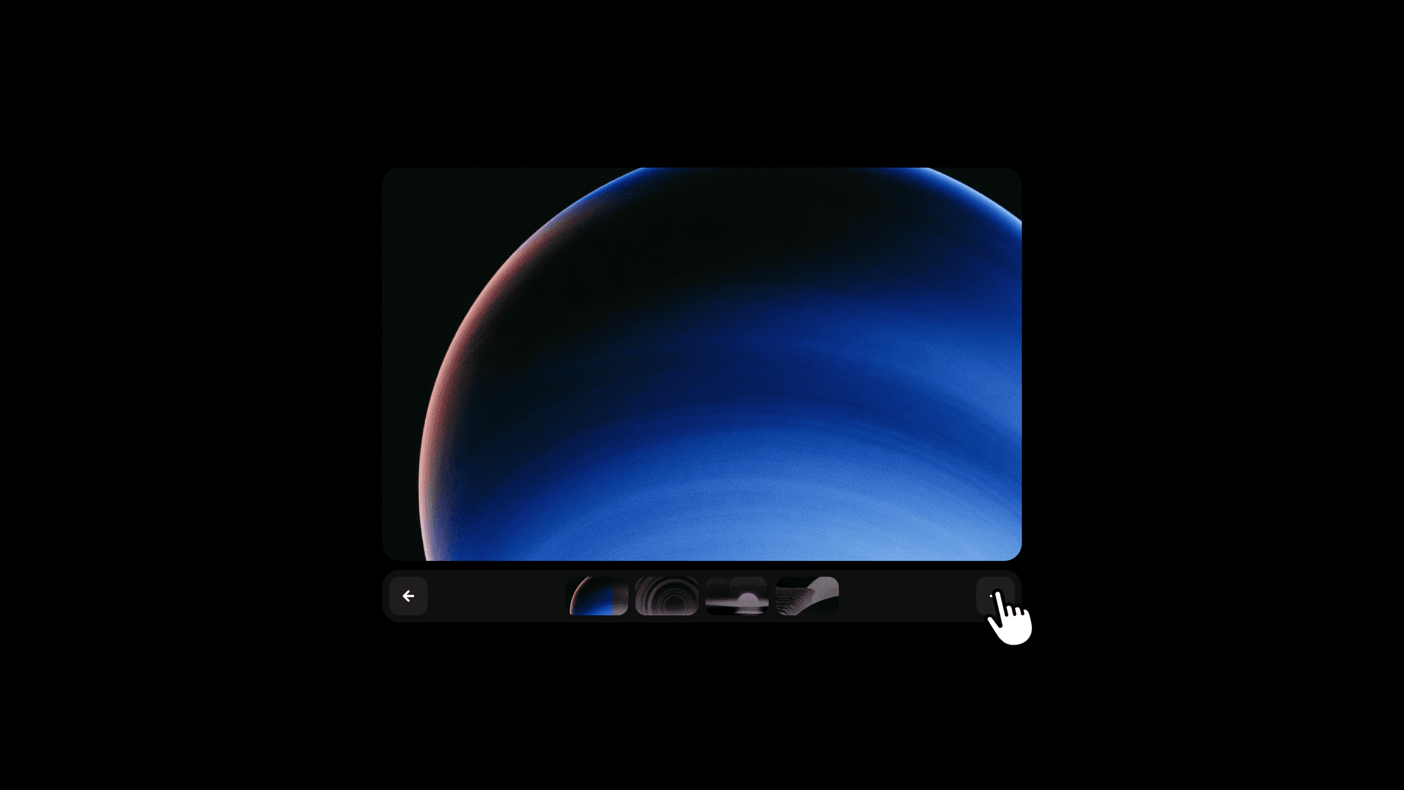
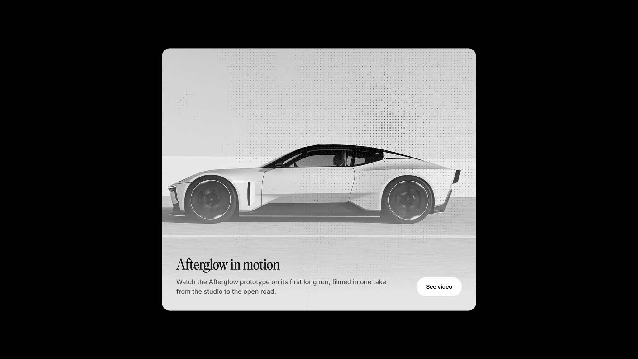
Dot Reveal Card pairs an image with a label, title, and description, adding an animated dot matrix effect on hover. An optional button and link give the card a clear next action. Use it to introduce a project, feature a story, or highlight a piece of content.
What you can customize
Choose the image, edit the text, and add a link with the option to open it in a new tab. Show or hide the button, edit its label, and choose an arrow, plus, or no icon. Customize its colors, hover colors, blur, height, padding, radius, and hover expansion.
Set the card's surface, border, hover border, shadow, radius, padding, and text width, plus image dimming and zoom on hover. Choose the width at which the card switches to its compact layout and whether the button fills the width on mobile. Set separate fonts and colors for the title, description, and label.
Use image colors or a solid color for the dots. Adjust the wave accent, dot size and spacing, deployment duration, organic motion, twinkle, minimum brightness, cursor lens, and idle intensity. White Lift is available when using image colors.
How to use
Copy the component from the Marketplace and paste it onto the canvas
Choose an Image and edit Label, Title, and Description
Add a Link and set New Tab if needed
Open Button to set its visibility, label, icon, and styling
Adjust Card and Text, including Compact Below for the compact layout
Open Dots to customize the effect
Use Preview to inspect Rest and Hover on the canvas
Preview the page to test the hover effect and link
Great for
Portfolio project cards
Featured articles and stories
Product and feature highlights
Video and case study previews