About Swipe Cards
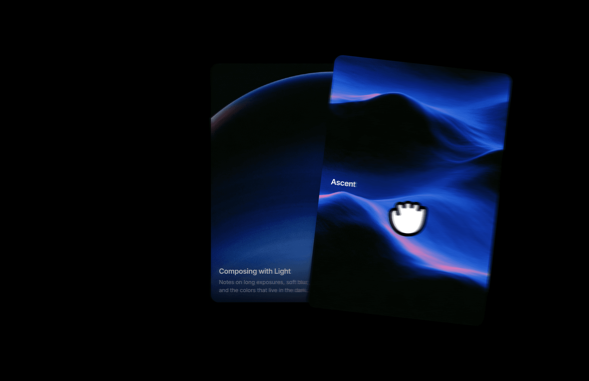
Swipe Cards lets visitors browse a layered stack by dragging or swiping the front card. Visual cards pair an image with a title and tag, while Content cards add a longer description.
What you can customize
Add or remove cards and choose Visual or Content for each. Edit images, titles, tags, and text, with separate typography and styling controls for both card types.
Set the visible card count, offset, scale step, and corner radius. Adjust swipe distance and tilt, enable scroll navigation or arrows, and choose Instant, Ease, or Spring animation. Customize text and border colors, caption placement, tag fill, and content gradients.
How to use
Copy the component from the Marketplace and paste it onto the canvas
Open Cards to add items, choose a Type, and edit their content
In Stack, set Visible, Offset, Scale Step, and Radius
In Swipe, adjust Distance and Tilt, then toggle Scroll and Arrows
Set Animation and customize Colors, Visual Cards, and Content Cards
Preview the page to test swiping and any enabled navigation controls
Great for
Browsing selected portfolio projects
Mixing photography with short editorial stories
Presenting product images and feature details
Sharing artwork and design studies