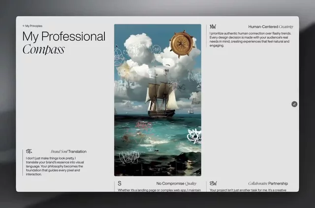
Denis HussleExpert1wA compass that spins as you scroll on my Framer portfolio, because values should be experienced, not just listed.1111
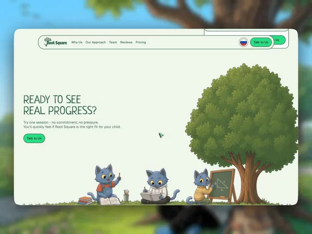
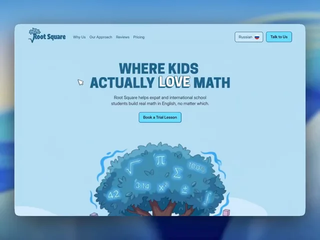
Denis HussleExpert1wThis Framer landing for an international math school ends the same way it starts.55
Denis HussleExpert1wTabs with icon animations, expanding credentials, and scroll-morphing illustrations. One page, zero boring sections.A French tutor site built in Framer.222222
Denis HussleExpert1wBlockbuster has such an iconic visual world, and I never understood why no one made a real brand system for it.GPT-Image-2 continues to show interesting brand kits.What do you think?77
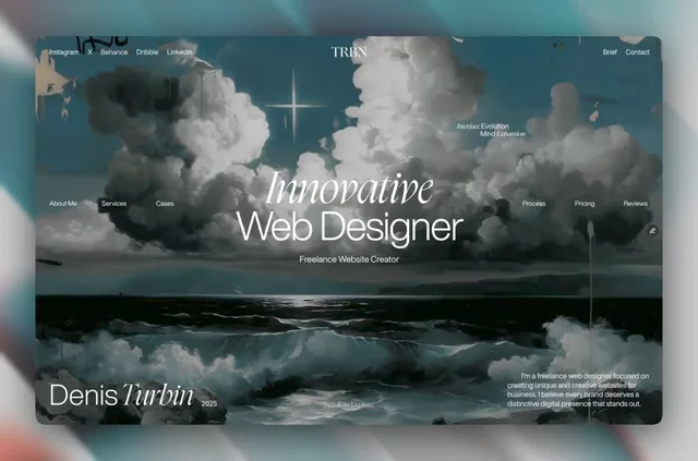
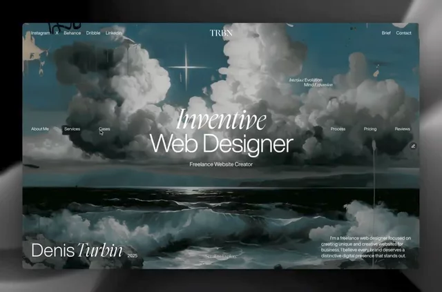
Denis HussleExpert1wMy 2025 portfolio site: dark aesthetics, cinematic scrolling, and high-end interactions.Built in Framer with Unicorn Studio.66
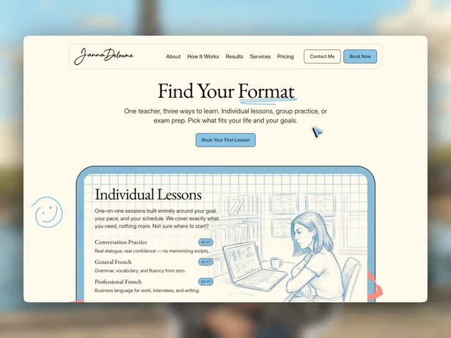
Denis HussleExpert1wA sketchbook-style services block with flipping pages, playful doodles, and animated pricing icons—built in Framer for a French tutor.222233
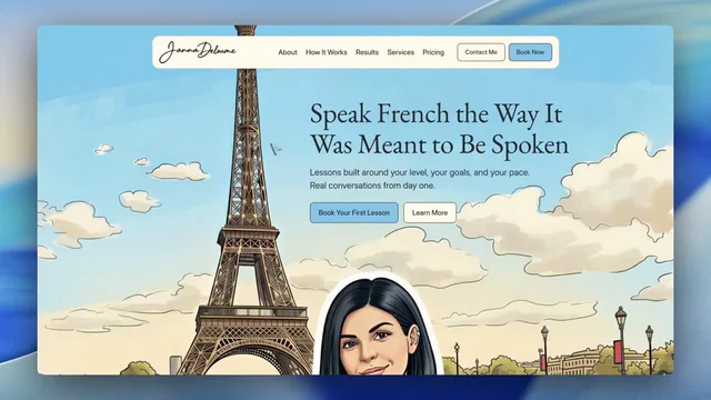
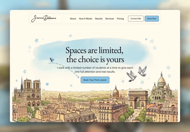
Denis HussleExpert1wA comic-book hero section I designed for a French tutor landing page in Framer.The visual direction combines hand-drawn illustration with small micro-animations to keep the page playful without losing clarity.9911
Denis HussleExpert1wA set of GPT-Image-2 brand-kit experiments inspired by my favorite childhood cartoons.Four different visual worlds, translated into something closer to complete identity systems.8822
Denis HussleExpert2wI’ve always loved the Walkman aesthetic but never actually seen a proper brand kit for it.So I used GPT-Image-2 to explore what one could look like. The result combines product nostalgia with a more structured visual system.1212
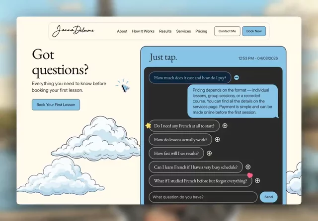
Denis HussleExpert2wAn FAQ interaction I built for a French tutor site in Framer.It works like iMessage: tap a question, receive the answer, or send your own directly to the teacher.121211
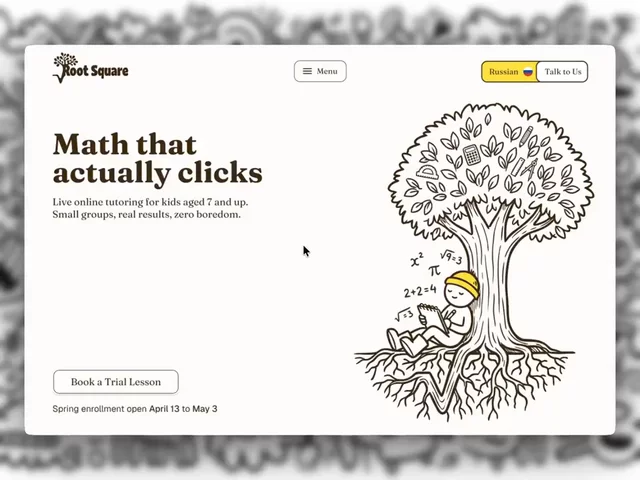
Denis HussleExpert2wA hand-drawn direction I created for a math learning platform.The formulas grow into tree roots, turning a familiar academic symbol into the core of the visual system.131322
Denis HussleExpert2wOne of the visual directions I explored for an online math school.Playful illustrations, smooth motion, and a more storybook-like approach to learning.5511
Denis HussleExpert2wA CTA and footer I designed for a French tutor site in Framer.The Paris skyline carries the transition into the final section, while magnetic hover states make the social icons feel less static.66
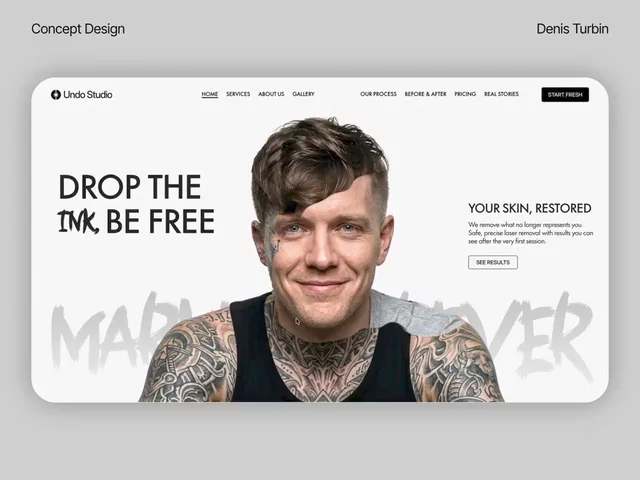
Denis HussleExpert2wOne of the bolder directions I created for a tattoo removal studio.A high-impact Framer hero built around oversized type, sharp contrast, and a deliberately aggressive visual rhythm.55
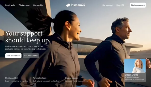
Denis HussleExpert2wStatic mockups only tell part of the story.So I built a fourth direction for HumanOS around video, motion, and interaction.The energy became part of the interface, not just the art direction.1313
Denis HussleExpert2wThird visual direction for HumanOS.Softer. Brighter. More optimistic.A split hero, more color, and a clearer treatment system.The challenge was balancing warmth with the confidence people expect from a health platform.7711
Denis HussleExpert2wSecond visual direction for HumanOS.This one puts people first.Large photography, direct typography, and a simple card system make the brand feel more accessible without losing the premium health-tech side.4411
Denis HussleExpert2wFirst visual direction for HumanOS.I wanted health data to feel organic, not clinical.Dark imagery, biological textures, and a guided path from scattered signals to a clearer plan.22
Denis HussleExpert3wThree visual directions I created for Basepoint.1. Signal and motion2. Clinical precision3. A warmer editorial sideThe final identity will probably live somewhere between all three—which one would you choose?Read more111122