Mahin Rahman
Helping Founders Launch Faster With High-Converting Framer Templates. Open to Collab. DM mahinrahman17@gmail.com
Helping Founders Launch Faster With High-Converting Framer Templates. Open to Collab. DM mahinrahman17@gmail.com
If a travel site looked like this, would it get you to plan a trip, or scroll past?
If a travel site looked like this, would it actually get you to plan a trip — or would you scroll past like every other one? 👀
This is TERRA, a travel agency landing page I designed in Figma. The whole goal was to make the destination do the selling — hence the polaroid-style hero with that little handwritten caption, and a trending strip down the bottom to spark some "ooh, where's that" curiosity.
Tried to keep it warm and editorial instead of the usual cold booking-site look, with quick-pick categories (beaches, mountains, city, off the grid) so you're not staring at a blank search bar wondering where to start.
Framer build is next, so I'd love to know — does this make you want to click "Plan Your Trip," or does something feel off?
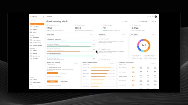
Light mode this time. This is the dashboard side of FlowAI, the AI automation template I shared earlier. Designed in Figma and built out fully in Framer, so the progress bars, charts, and hover states you see in the video are all actually working 👀
It's made for AI tools and automation platforms that need to show real activity — tasks automated, time saved, cost savings, success rates, all that. There's an active work feed with live progress, an AI insights panel, a time-saved breakdown, plus sections for tasks needing attention and automation performance. Tried to keep it dense with data but still clean and easy to read, which is always the tricky part with dashboards.
Comes with light and dark modes, fully responsive, and set up with styles so it's easy to rebrand. Pretty happy with how the light version came out.
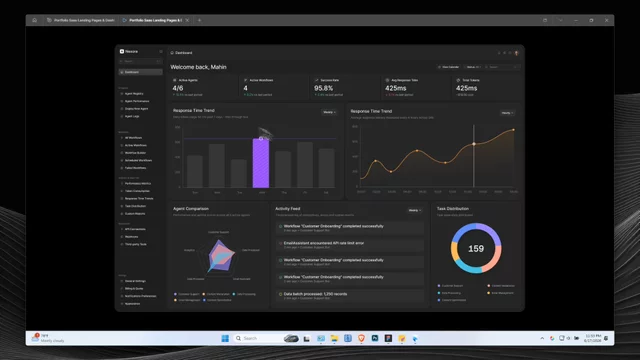
Back with another one. This time I went dark and built out a full AI agent management dashboard, Nexora. Started it in Figma and brought the whole thing into Framer, so the charts, the hover states, all the little details you see in the video are actually working, not just static screens 👀
It's built for AI platforms and automation tools that need to actually show what's happening under the hood ; active agents, workflow status, response times, token usage, the lot. There's a clean overview up top, response time trends, an agent comparison radar, a live activity feed, and task distribution all laid out so the data feels readable instead of overwhelming. Dark mode done properly, fully responsive, and easy to rebrand with the styles set up.
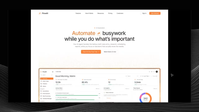
Spent the last little while on this one and finally got to put a video together for it. FlowAI started as a Figma design and I built the whole thing out in Framer — the scroll, the little interactions, all of it. You can catch most of that in the clip 👀
It's made for AI tools, automation startups, and the kind of modern SaaS products that need a clean, conversion-focused site without building everything from zero. There's a hero with a proper product dashboard mockup, a "how it works" flow, feature sections, social proof, and a chat-style bit to show off the automation side. Fully responsive, easy to rebrand with the color and text styles, and the Figma file comes with it.
Honestly pretty happy with how it turned out. Would love to hear what you think