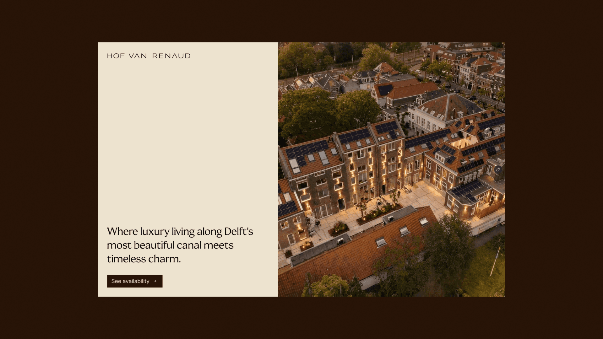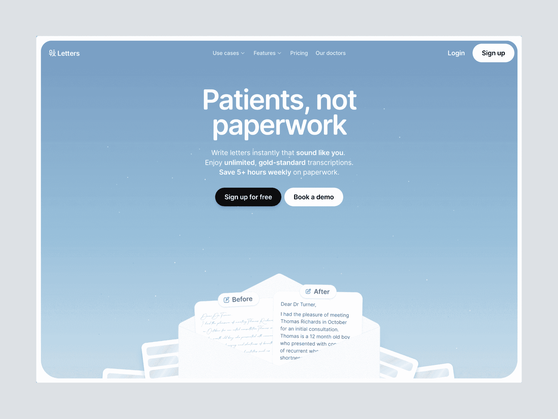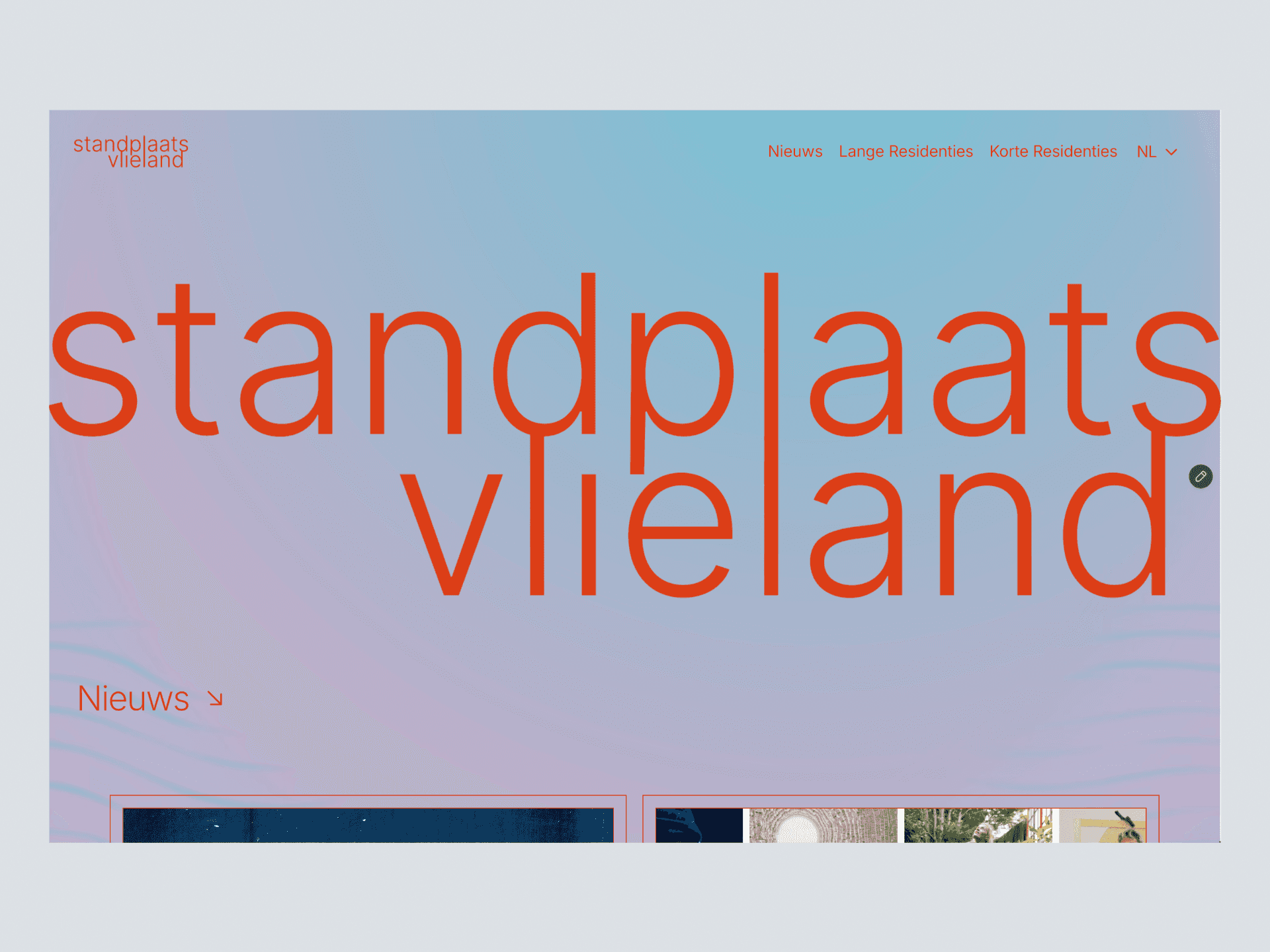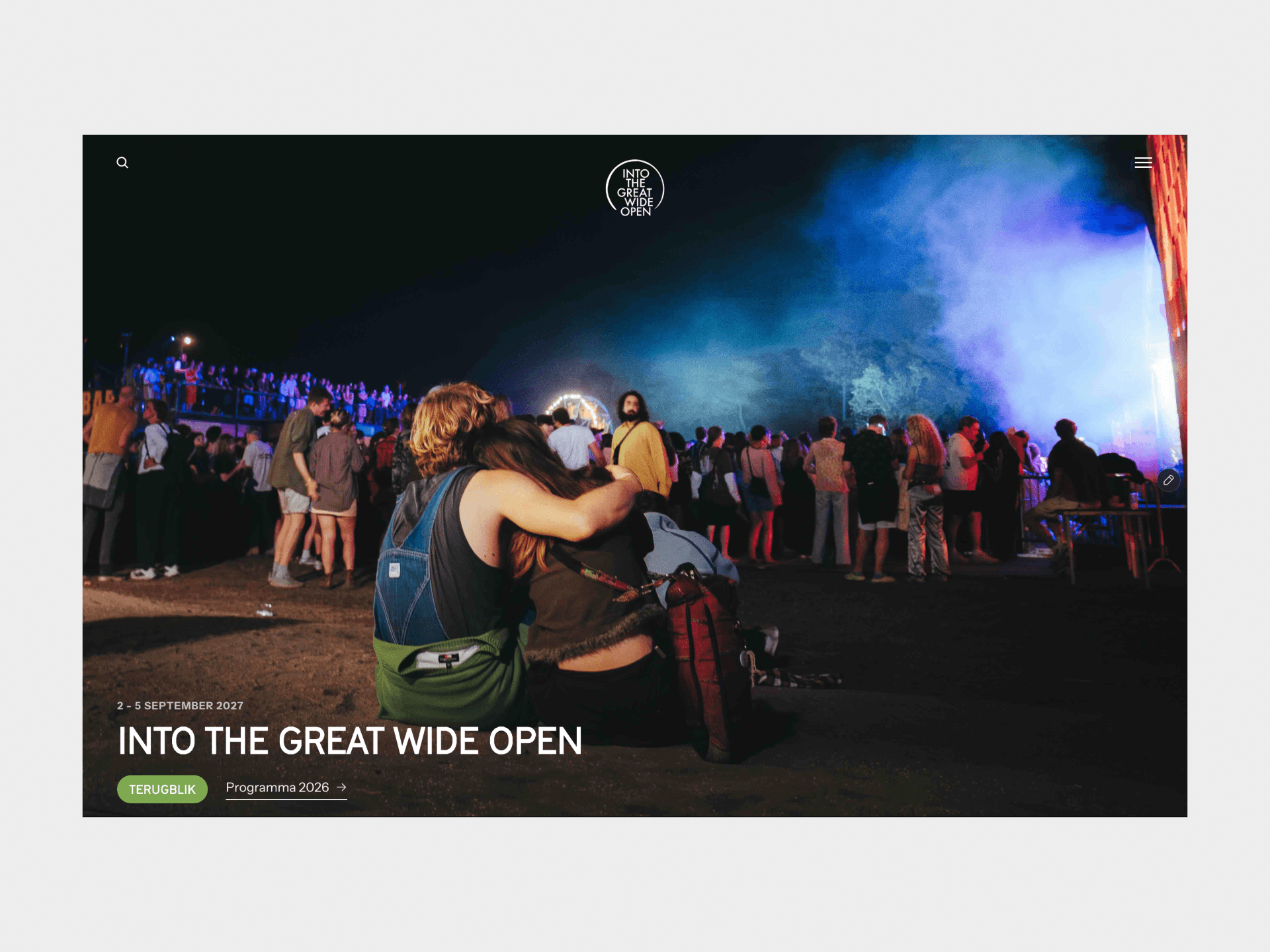
About Schneider Portfolio
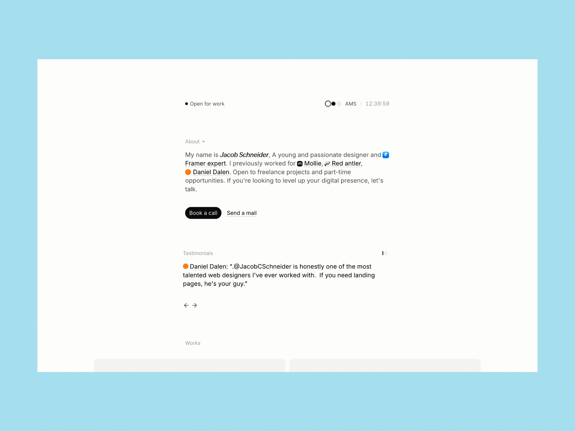
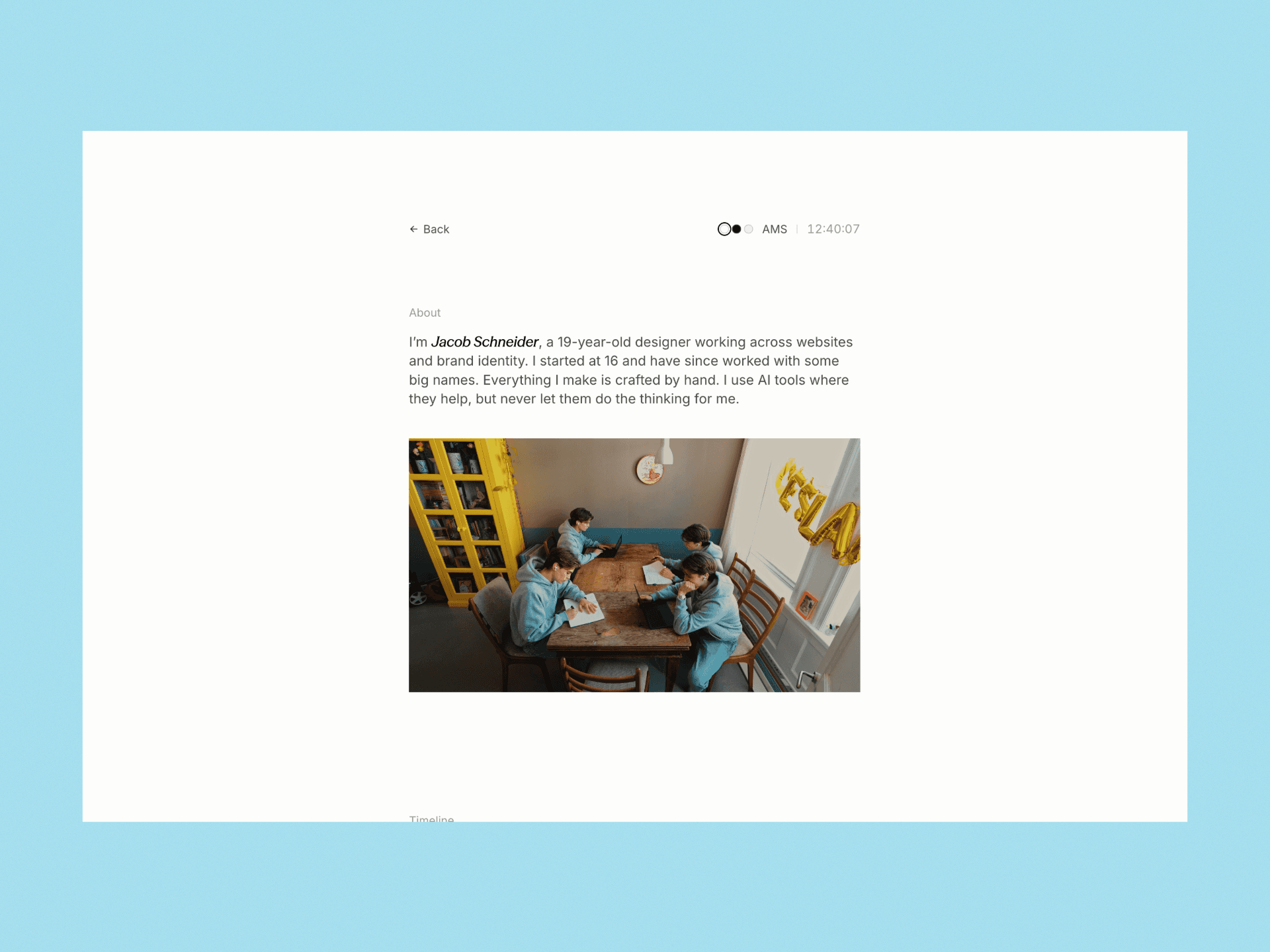
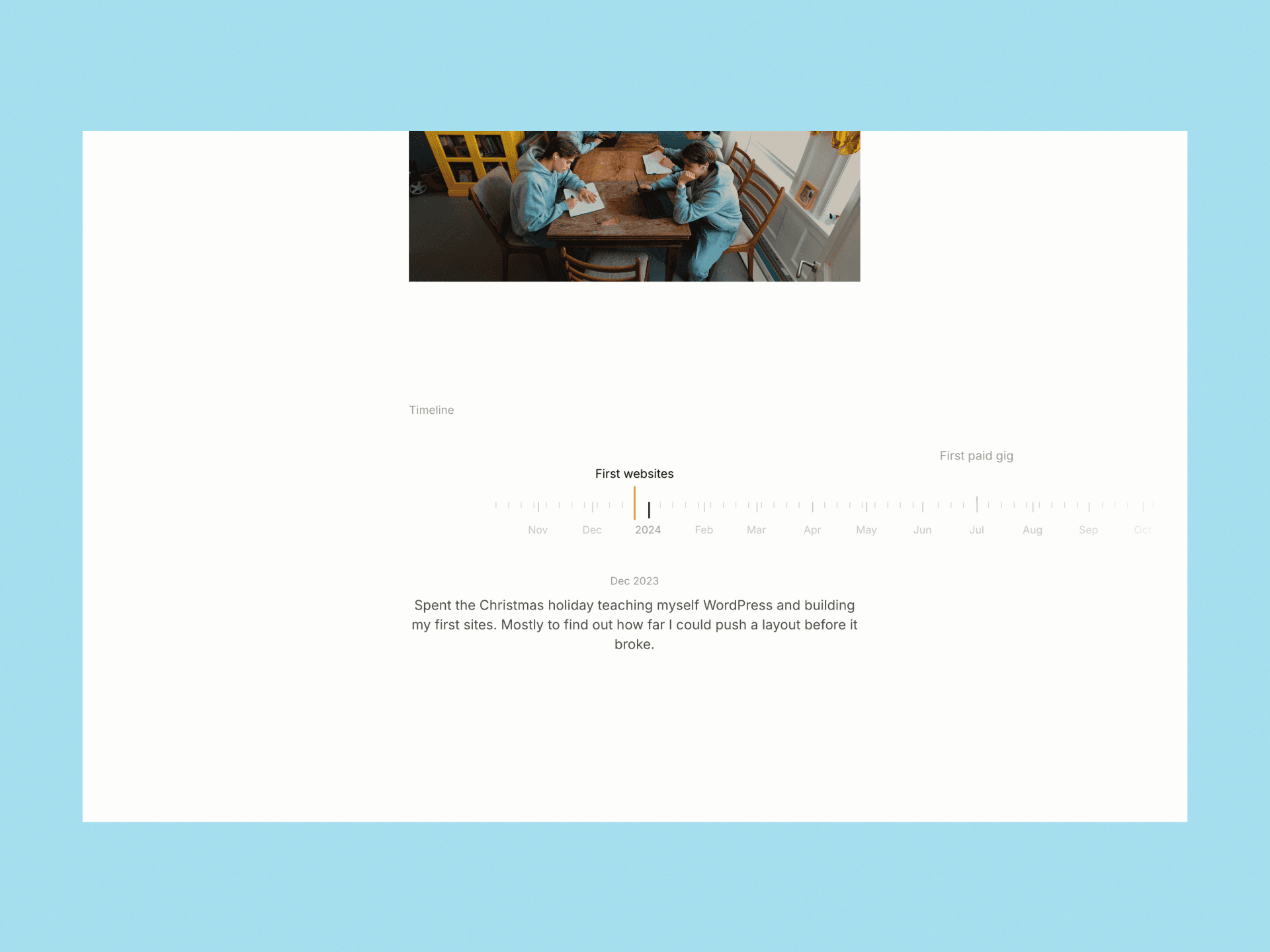
Designed and developed as my own portfolio. I wanted the site to feel like a well-set page rather than a website: one narrow column of text, plenty of white space, and nothing on the page that doesn’t need to be there.
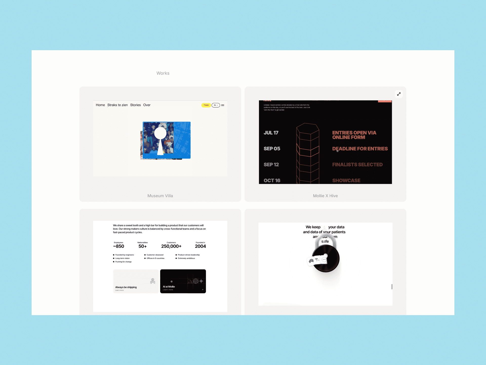
The typography does most of the work. Everything is set in Inter, with my name in Season Mix italic as a signature. The colour is almost all greys, with a single orange accent saved for the few things that need it. The logos of the companies I’ve worked with sit inside the sentence itself, so my experience reads as part of the story instead of a logo wall. The work section is the one place the layout breaks out of the column, so the projects get the room. A small status bar at the top shows whether I’m open for work and the live time in Amsterdam.