A polished, customizable checkbox component for Framer, built for forms, settings, filters, consent flows, and everyday UI.
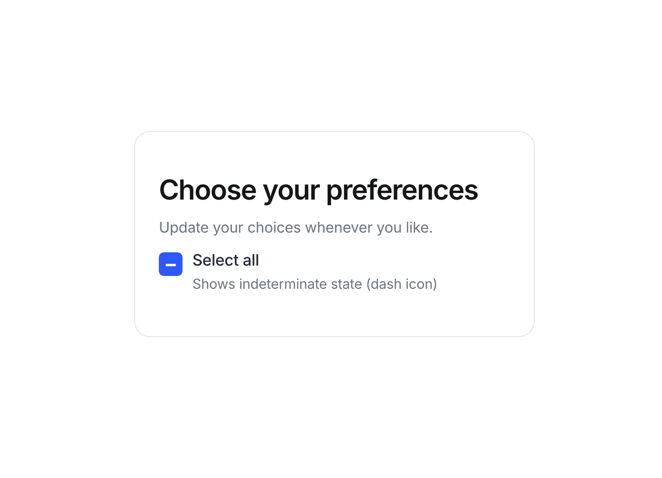
Custom Checkbox comes with checked and indeterminate states out of the box, plus flexible controls for typography, colors, sizing, spacing, borders, radius, shadows, and more.
What you can customize:
Heading, subheading, label, and description
Checked and indeterminate states
Checkbox size and icon
Active, inactive, and icon colors
Typography and text styling
Padding and spacing
Background, border, radius, and shadow
Everything is available directly in the property panel, so you can drop it into your project and make it match your design without touching the code.
Simple to use, easy to customize, and ready to fit into your next Framer project.

A polished, customizable checkbox component for Framer, built for forms, settings, filters, consent flows, and everyday UI.
Custom Checkbox comes with checked and indeterminate states out of the box, plus flexible controls for typography, colors, sizing, spacing, borders, radius, shadows, and more.
What you can customize:
Heading, subheading, label, and description
Checked and indeterminate states
Checkbox size and icon
Active, inactive, and icon colors
Typography and text styling
Padding and spacing
Background, border, radius, and shadow
Everything is available directly in the property panel, so you can drop it into your project and make it match your design without touching the code.
Simple to use, easy to customize, and ready to fit into your next Framer project.