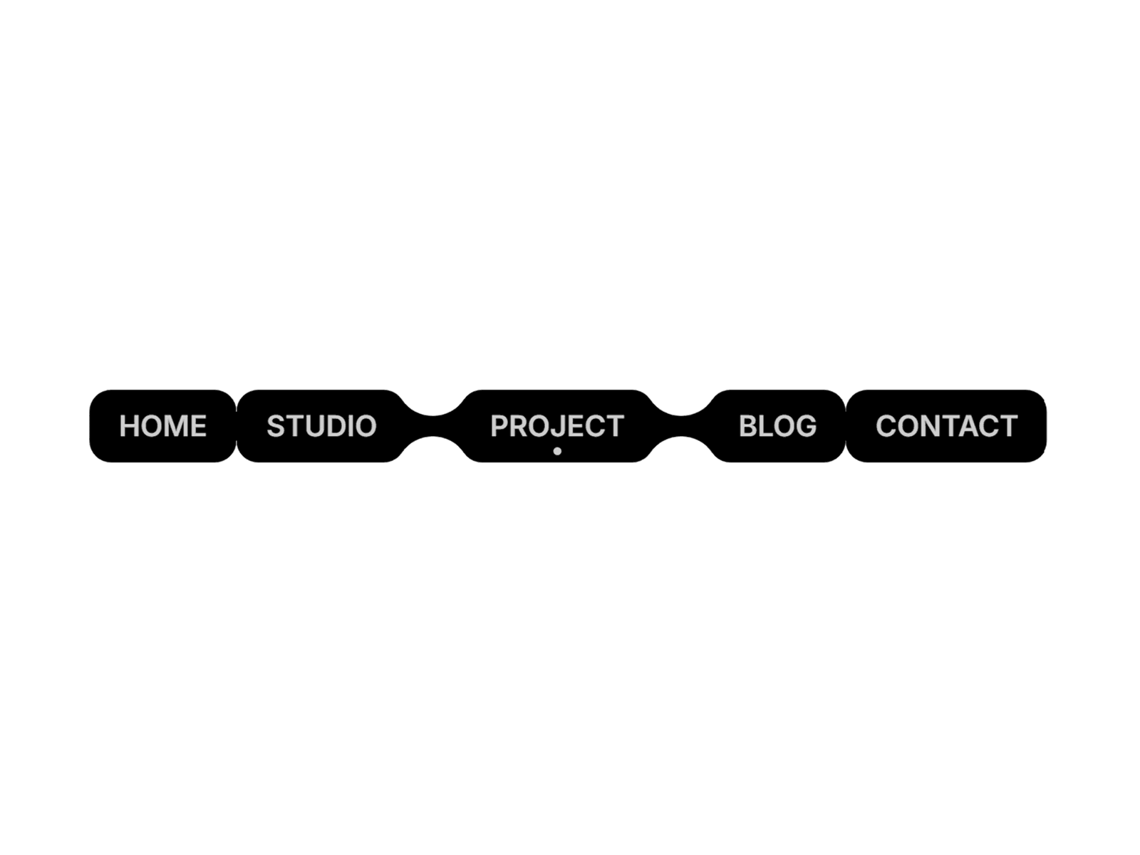
Gooey Navbar is a code component for a pill-style navigation that stays visually connected at all times, with each join rendered as a true geometric fillet — not a CSS blur trick. That means crisp edges at any zoom, a corner radius you can actually control, and a waist thickness that never breaks down as your gap or push settings change.
Highlights:
Real geometry, not filters. Every pill and every joint is one continuous SVG path, built from circle-tangent fillets. No feGaussianBlur, no soft edges, no performance cost.
Hover halo. A soft light follows the cursor across the row, fading in and out — not a hard fill swap.
Three ways to mark "active." Point it at your site's pages, at sections on a single scrolling page, or let it behave like a segmented control driven by clicks.
Built-in smooth scroll. Section links ease the page into view with a configurable duration and offset — no separate scroll library needed.
Anchor-aware growth. Choose whether the row expands from its left edge, right edge, or stays visually balanced in the centre — so it holds its position whether you pin it left, right, or centred.
Fully styleable. Colors, fonts, padding, corner radius, gap, and the join's thickness are all exposed as properties — from a tight capsule pill to a boxy segmented control.
Drop it into any page, a landing page's table of contents, or use it as a lightweight segmented control — one component, three jobs.

Gooey Navbar is a code component for a pill-style navigation that stays visually connected at all times, with each join rendered as a true geometric fillet — not a CSS blur trick. That means crisp edges at any zoom, a corner radius you can actually control, and a waist thickness that never breaks down as your gap or push settings change.
Highlights:
Real geometry, not filters. Every pill and every joint is one continuous SVG path, built from circle-tangent fillets. No feGaussianBlur, no soft edges, no performance cost.
Hover halo. A soft light follows the cursor across the row, fading in and out — not a hard fill swap.
Three ways to mark "active." Point it at your site's pages, at sections on a single scrolling page, or let it behave like a segmented control driven by clicks.
Built-in smooth scroll. Section links ease the page into view with a configurable duration and offset — no separate scroll library needed.
Anchor-aware growth. Choose whether the row expands from its left edge, right edge, or stays visually balanced in the centre — so it holds its position whether you pin it left, right, or centred.
Fully styleable. Colors, fonts, padding, corner radius, gap, and the join's thickness are all exposed as properties — from a tight capsule pill to a boxy segmented control.
Drop it into any page, a landing page's table of contents, or use it as a lightweight segmented control — one component, three jobs.