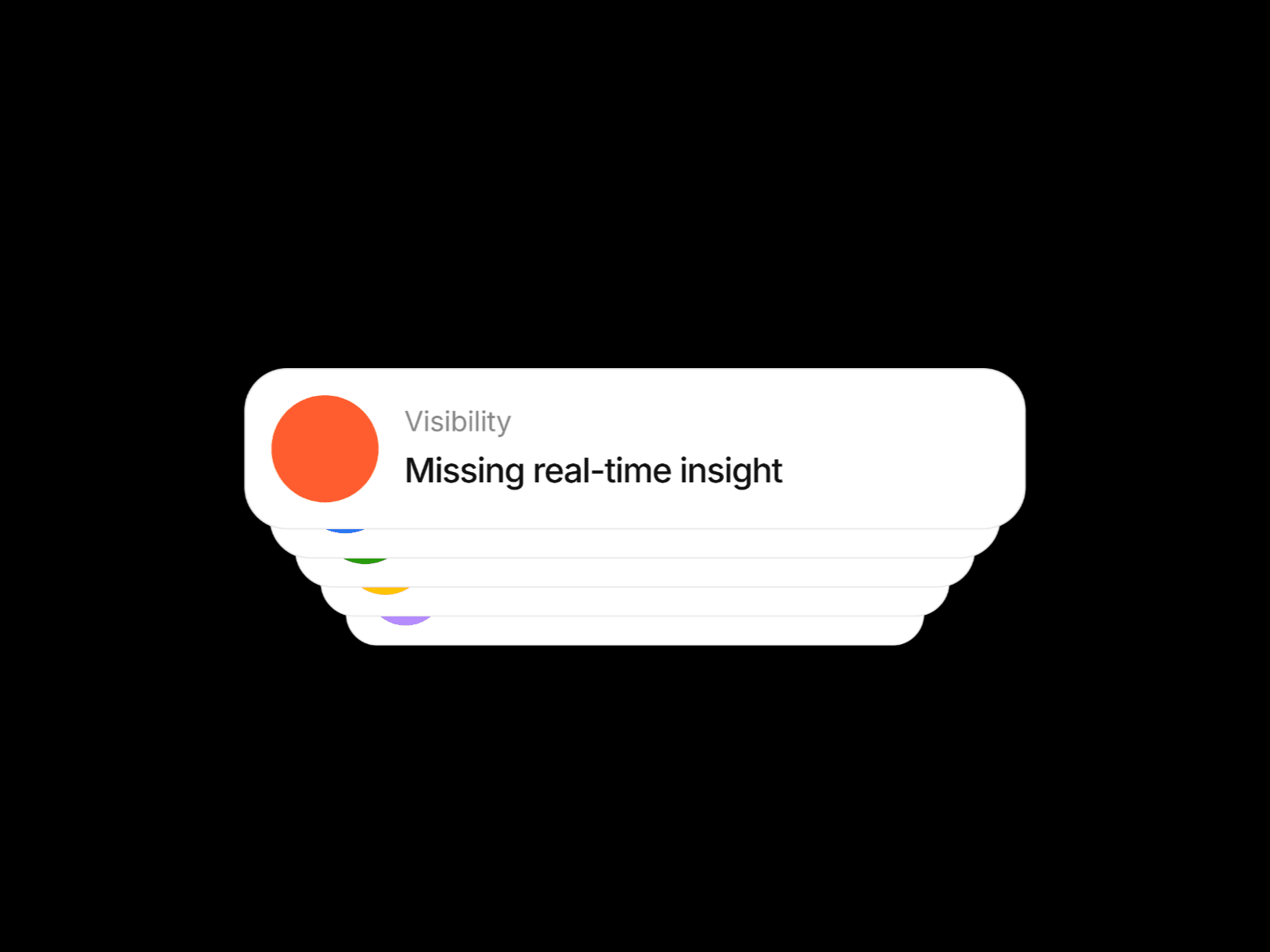
Stacked Rollover Cards brings an engaging, interactive card stack to your Framer projects.
This component creates a visually striking 3D card stack that cycles through content on hover, powered by smooth spring animations and fully customizable styling.
Why This Component
Perfect for designers and developers who want to add high-end, interactive card experiences to their Framer projects—without writing code, while retaining full creative control.
Each card includes a label, title, icon box, and background color—making it ideal for:
Service showcases
Feature highlights
Testimonials
Portfolio displays
Key Features
Automatic Card Cycling Cards rotate through the stack on hover with configurable timing (250ms – 5000ms)
3D Perspective Effects Built-in tilt animation adds depth and visual interest
Fully Customizable Cards Customize label, title, background color, and icon box color for each card
Flexible Stack Configuration Adjust vertical offset, scale reduction, and rotation between cards
Spring-Based Animations Smooth motion powered by Framer Motion (stiffness: 260, damping: 34)
Responsive Design Adapts to any container size (minimum: 280px × 200px)
Performance Optimized Animations pause when out of viewport to save resources
Accessibility Ready Includes ARIA labels, keyboard navigation (Enter / Space), and semantic markup
Supports Up to 10 Cards With intelligent fallback content handling
Use Cases
Service or product feature showcases
Team profiles or testimonials
Portfolio highlights
Pricing comparisons
Step-by-step processes
Category navigation
Awards or achievements

Stacked Rollover Cards brings an engaging, interactive card stack to your Framer projects.
This component creates a visually striking 3D card stack that cycles through content on hover, powered by smooth spring animations and fully customizable styling.
Why This Component
Perfect for designers and developers who want to add high-end, interactive card experiences to their Framer projects—without writing code, while retaining full creative control.
Each card includes a label, title, icon box, and background color—making it ideal for:
Service showcases
Feature highlights
Testimonials
Portfolio displays
Key Features
Automatic Card Cycling Cards rotate through the stack on hover with configurable timing (250ms – 5000ms)
3D Perspective Effects Built-in tilt animation adds depth and visual interest
Fully Customizable Cards Customize label, title, background color, and icon box color for each card
Flexible Stack Configuration Adjust vertical offset, scale reduction, and rotation between cards
Spring-Based Animations Smooth motion powered by Framer Motion (stiffness: 260, damping: 34)
Responsive Design Adapts to any container size (minimum: 280px × 200px)
Performance Optimized Animations pause when out of viewport to save resources
Accessibility Ready Includes ARIA labels, keyboard navigation (Enter / Space), and semantic markup
Supports Up to 10 Cards With intelligent fallback content handling
Use Cases
Service or product feature showcases
Team profiles or testimonials
Portfolio highlights
Pricing comparisons
Step-by-step processes
Category navigation
Awards or achievements
 Hani Y S

