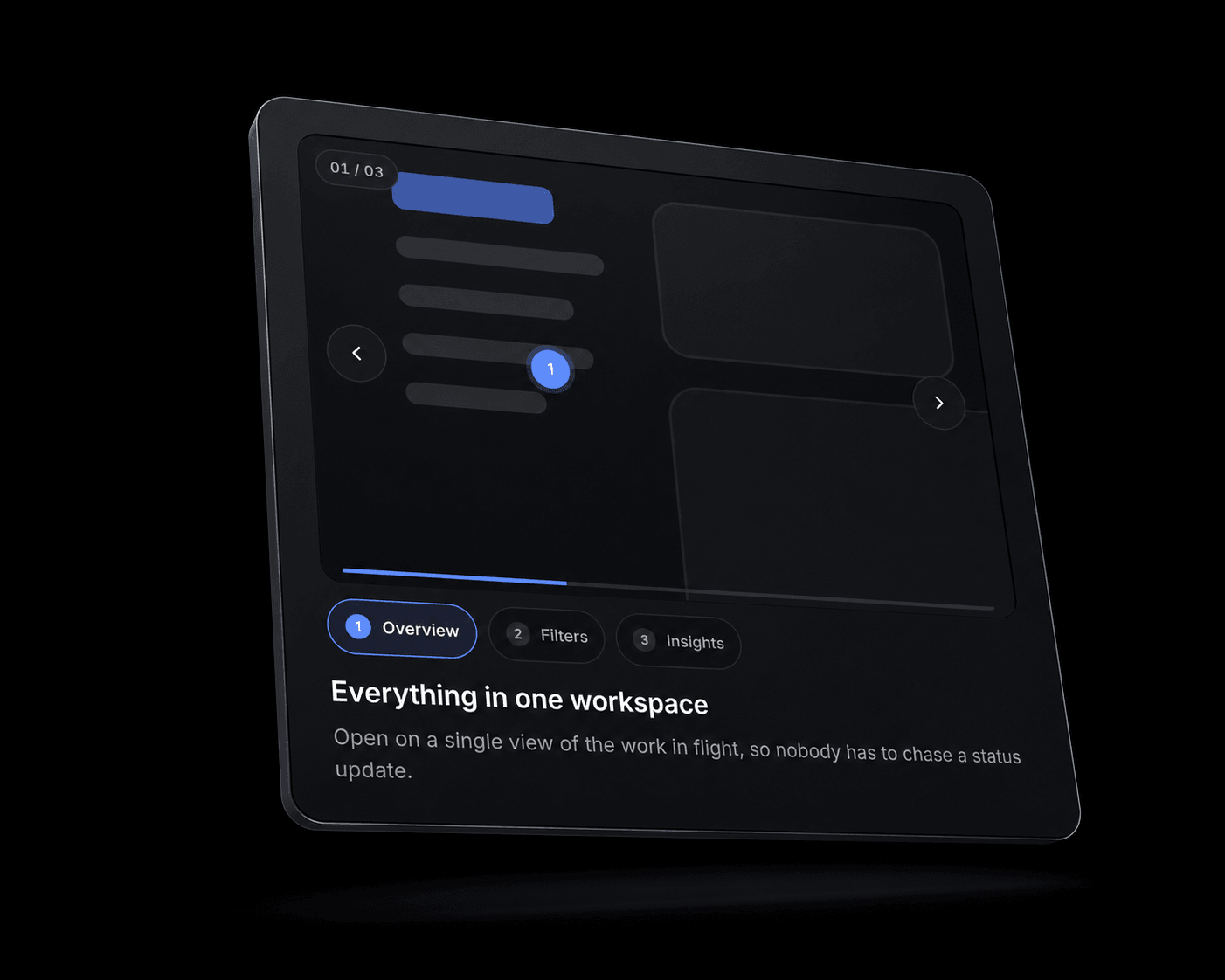
Spotlight Tour turns one product screenshot into a step-by-step walkthrough. You place numbered pins on the image, write a caption for each, and the component pans and zooms to that region when a visitor selects it.
It solves a specific problem: product screenshots on landing pages are too dense to read once they are scaled down to fit a section. Spotlight Tour keeps the full context on screen and moves the visitor's attention to one detail at a time, so you do not have to crop your UI into disconnected close-ups or commission a demo video.
Each step carries its own focus point, zoom level, label, title, body copy, and optional link. You can also give a step its own image, which turns the component into a screenshot sequencer with a crossfade between states. Beyond content, you control three caption layouts (below, beside, overlay), three step-navigation styles (chips, list, dots), three pin styles (numbered, dot, ring), aspect ratio, all colours and type sizes, dim level, radius, borders, shadow, and the full motion model — spring stiffness and damping, or a tween with a duration and easing curve. Autoplay is available with an interval, looping, and pause-on-hover.
Responsive. The component measures its own container rather than the browser window, so it collapses to a single column when placed in a narrow stack, not only on a narrow screen. The media area uses an aspect ratio, so it scales without any per-breakpoint setup. Nothing depends on hover, so every step is reachable by tap.
Accessible. Steps are real buttons with tablist semantics. Arrow keys, Home, and End move between them. The caption announces changes to screen readers. Focus rings appear for keyboard users only. When a visitor has reduced motion enabled, camera moves become instant and the pin pulse stops.

Spotlight Tour turns one product screenshot into a step-by-step walkthrough. You place numbered pins on the image, write a caption for each, and the component pans and zooms to that region when a visitor selects it.
It solves a specific problem: product screenshots on landing pages are too dense to read once they are scaled down to fit a section. Spotlight Tour keeps the full context on screen and moves the visitor's attention to one detail at a time, so you do not have to crop your UI into disconnected close-ups or commission a demo video.
Each step carries its own focus point, zoom level, label, title, body copy, and optional link. You can also give a step its own image, which turns the component into a screenshot sequencer with a crossfade between states. Beyond content, you control three caption layouts (below, beside, overlay), three step-navigation styles (chips, list, dots), three pin styles (numbered, dot, ring), aspect ratio, all colours and type sizes, dim level, radius, borders, shadow, and the full motion model — spring stiffness and damping, or a tween with a duration and easing curve. Autoplay is available with an interval, looping, and pause-on-hover.
Responsive. The component measures its own container rather than the browser window, so it collapses to a single column when placed in a narrow stack, not only on a narrow screen. The media area uses an aspect ratio, so it scales without any per-breakpoint setup. Nothing depends on hover, so every step is reachable by tap.
Accessible. Steps are real buttons with tablist semantics. Arrow keys, Home, and End move between them. The caption announces changes to screen readers. Focus rings appear for keyboard users only. When a visitor has reduced motion enabled, camera moves become instant and the pin pulse stops.
 Artem Kireev

