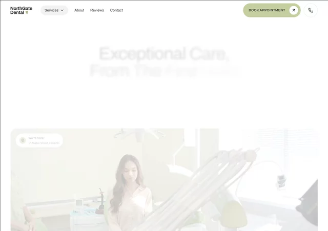
Lumident gives a dental practice the kind of website patients already trust before they call: quiet, precise, and unmistakably professional.
The design leans editorial rather than clinical. A deep royal indigo carries every headline, generous whitespace does the rest, and a single typeface — Schibsted Grotesk, with italics for emphasis — keeps the whole page in one voice. Nothing shouts; everything reads.
Motion is used the same way. Headlines rise line by line, images settle out of a gentle zoom, grids stagger into place as you scroll, a partner marquee drifts sideways, and the award badge turns slowly in the background. Every animation is built with Framer's native effects, so it stays smooth on mobile and needs no code.
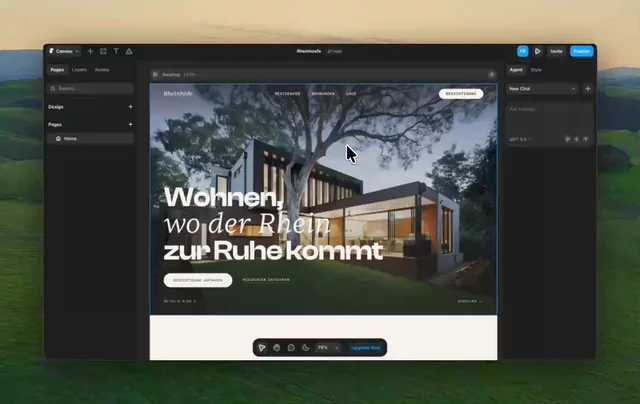
Under the surface it is a proper system, not a flat canvas. Eight color styles, twelve text styles with responsive sizing, two link styles, a layout template holding the navigation and footer, and six interactive components — including an accordion used by both the services list and the FAQ, and a testimonial slider with animated slide transitions. Change a token, and the change lands everywhere.
Everything is laid out on a strict 8-pixel spacing scale across three breakpoints, so the rhythm holds from a 1200px desktop down to a 390px phone. Swap the photos, rewrite the copy, adjust the palette to your brand — the structure carries you.

Lumident gives a dental practice the kind of website patients already trust before they call: quiet, precise, and unmistakably professional.
The design leans editorial rather than clinical. A deep royal indigo carries every headline, generous whitespace does the rest, and a single typeface — Schibsted Grotesk, with italics for emphasis — keeps the whole page in one voice. Nothing shouts; everything reads.
Motion is used the same way. Headlines rise line by line, images settle out of a gentle zoom, grids stagger into place as you scroll, a partner marquee drifts sideways, and the award badge turns slowly in the background. Every animation is built with Framer's native effects, so it stays smooth on mobile and needs no code.
Under the surface it is a proper system, not a flat canvas. Eight color styles, twelve text styles with responsive sizing, two link styles, a layout template holding the navigation and footer, and six interactive components — including an accordion used by both the services list and the FAQ, and a testimonial slider with animated slide transitions. Change a token, and the change lands everywhere.
Everything is laid out on a strict 8-pixel spacing scale across three breakpoints, so the rhythm holds from a 1200px desktop down to a 390px phone. Swap the photos, rewrite the copy, adjust the palette to your brand — the structure carries you.