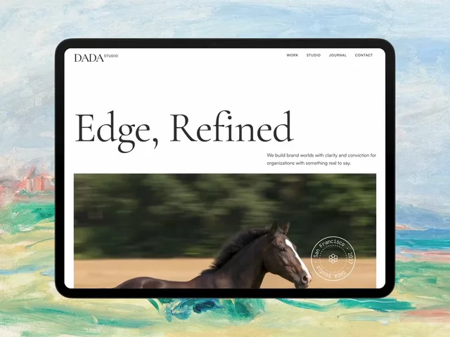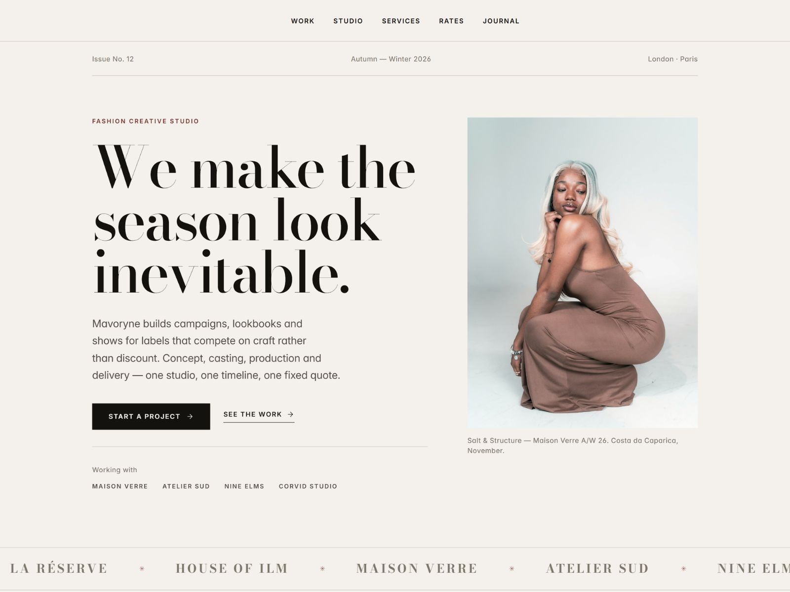
Mavoryne is a fashion template that behaves like a printed issue. High-contrast Didone headlines sit against wide-tracked uppercase micro-type, hairline rules replace boxes and shadows, and a bone-paper ground carries a single oxblood accent reserved for the things you want clicked.
Built for studios, labels, photographers and creative directors whose work should speak first and still has to sell.
Thirteen designed pages: Home, Work, Lookbook detail, Studio, Services, Rates, Journal, Article detail, Contact, Privacy, Terms, Imprint and a custom 404. Every page carries its own SEO title and description, with template variables on the CMS pages.
Seven CMS collections arrive filled with 33 entries: Lookbooks, Journal, Services, Plans, Team, Testimonials and Categories, cross-referenced the way you would actually build them. Articles link to authors and categories. Sorting, limits and offsets are already configured, so featured items and archives behave correctly the moment you swap in your own work.
Underneath sits a real design system. 11 colour styles, 19 text styles each with its own tablet and phone size step, 4 link styles with hover and current-page states, and five components: a five-variant button with hover gestures, a navigation with a proper mobile drawer that closes on tap, an FAQ accordion, and two form submit buttons wired to pending, success, error and incomplete states. A shared layout template carries the sticky nav and footer across every page.
Three breakpoints at 1200, 810 and 390, built desktop-first so global changes cascade. Grids collapse to stacks, sidebars unstack, image crops adjust. No horizontal scroll, no fixed widths.
Motion stays restrained: word-level headline entrance, staggered scroll reveals, crop-zoom on hover, subtle parallax and a draggable client marquee. Nothing bounces.
Typeset in Bodoni Moda and Inter, both open-source and available directly in Framer.

Mavoryne is a fashion template that behaves like a printed issue. High-contrast Didone headlines sit against wide-tracked uppercase micro-type, hairline rules replace boxes and shadows, and a bone-paper ground carries a single oxblood accent reserved for the things you want clicked.
Built for studios, labels, photographers and creative directors whose work should speak first and still has to sell.
Thirteen designed pages: Home, Work, Lookbook detail, Studio, Services, Rates, Journal, Article detail, Contact, Privacy, Terms, Imprint and a custom 404. Every page carries its own SEO title and description, with template variables on the CMS pages.
Seven CMS collections arrive filled with 33 entries: Lookbooks, Journal, Services, Plans, Team, Testimonials and Categories, cross-referenced the way you would actually build them. Articles link to authors and categories. Sorting, limits and offsets are already configured, so featured items and archives behave correctly the moment you swap in your own work.
Underneath sits a real design system. 11 colour styles, 19 text styles each with its own tablet and phone size step, 4 link styles with hover and current-page states, and five components: a five-variant button with hover gestures, a navigation with a proper mobile drawer that closes on tap, an FAQ accordion, and two form submit buttons wired to pending, success, error and incomplete states. A shared layout template carries the sticky nav and footer across every page.
Three breakpoints at 1200, 810 and 390, built desktop-first so global changes cascade. Grids collapse to stacks, sidebars unstack, image crops adjust. No horizontal scroll, no fixed widths.
Motion stays restrained: word-level headline entrance, staggered scroll reveals, crop-zoom on hover, subtle parallax and a draggable client marquee. Nothing bounces.
Typeset in Bodoni Moda and Inter, both open-source and available directly in Framer.
 Noel Dario Andres