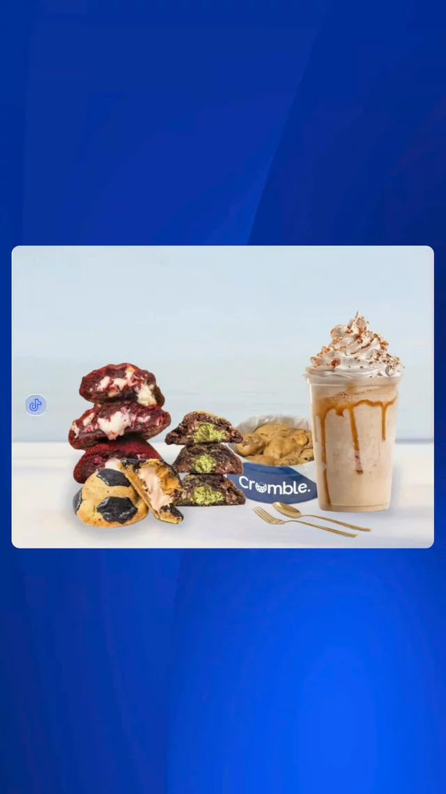
Crumble Pakistan Website Redesign Concept 🍪
Hey everyone! I wanted to share a desktop redesign concept I recently designed in Figma for Crumble Pakistan. The goal was to move away from rigid, static grids and instead focus on an emotional, high-energy layout driven by fluid motion and clean typography.
Key UI details in this Figma design:
Interactive Product Slider: Structured a clean, sliding layout concept to let users seamlessly toggle between shakes, cakes, and exclusive flavors.
Bold Brand Identity: Paired heavy typography with high-contrast blues and creams to make the product imagery pop.
Streamlined User Flow: Designed a clear, 3-step delivery section to keep the path from craving to checkout completely friction-free.
Would love to get some feedback from fellow designers on the visual hierarchy and presentation layout! 👇