About Neon Glass Cards
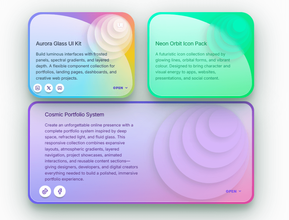
Neon Glass Cards turns a source-inspired glass interaction into one configurable Framer component. Every theme combines a bright gradient shell, an asymmetrical translucent plane, five top-right depth layers, editable content and a separated action row.
Features
Six visual themes in one component.
Asymmetrical borderless glass surface with directional highlights.
Five concentric translucent depth layers with an editable mark and a direct hide switch.
Responsive logo upload that automatically replaces the text mark and preserves transparent artwork.
True non-flattened CSS perspective with staggered disc and button separation.
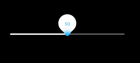
Editable title and description with a directly accessible 20–100% width slider.
Body Font alignment supports Left, Center, Right and Justify within the chosen description width.
Top/Bottom text-position control moves the complete content block without affecting the action row.
Gradient, solid-color and responsive-image backgrounds with fit and position controls.
Borderless glass dropdown with up to eight editable linked items and a hide switch.
Proper brand icons for Instagram, X, Discord, GitHub, LinkedIn, YouTube, Facebook and TikTok.
Static Canvas/export behavior, reduced-motion support and no external runtime package.
Setup
Paste the Component URL into a Framer project.
Choose a Theme, edit the Title and Description, then show or hide Layered Discs.
Add a Logo Image or leave it empty to use Logo Mark.
Use Description Width and Text Position directly below Description to control wrapping and vertical placement.
Choose a gradient, solid color or responsive image background.
Configure the menu and social links, then open Preview to test the dropdown and 3D motion.