About Perspective Rail
Description
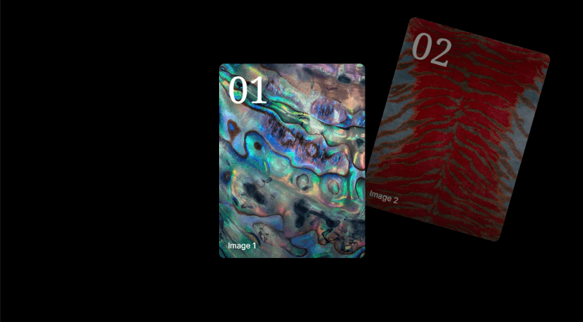
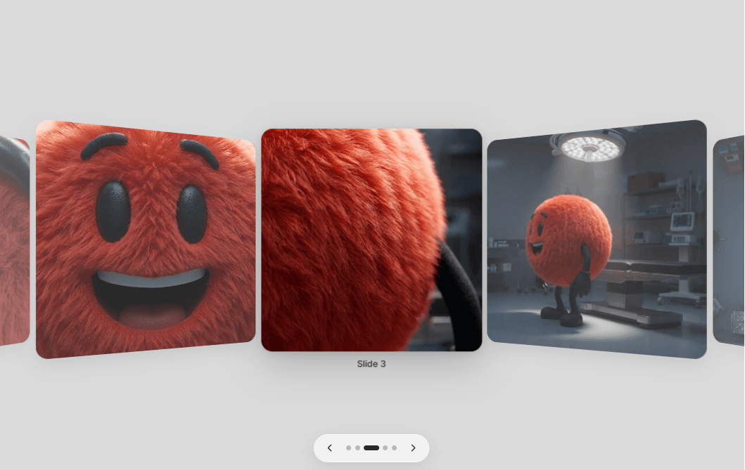
Perspective Rail gives image sequences a directional, editorial rhythm. The selected card faces forward while neighboring cards fold into perspective, creating a compact gallery that communicates position and focus immediately.
It is built specifically for Framer with responsive image controls, configurable card geometry, accessible navigation and a static editor-friendly render.
Features
Up to 20 responsive images with titles, alt text and optional links.
Adjustable card dimensions, responsive width, gap, perspective, tilt, scale, opacity and radius.
Arrow, dot, click, keyboard and swipe navigation.
Optional looping and autoplay with pause on hover.
Framer-native Font, Color and Transition controls.
Reduced-motion behavior and static Canvas/export rendering.
No third-party runtime dependencies beyond Framer's built-in React/Motion environment.
Setup
1. Paste the Component URL into a Framer project.
2. Add images under Slides and set titles/alt text.
3. Resize the component frame and tune Layout, Navigation and Behavior.
4. Preview to test interaction; the Canvas intentionally remains static.
Compatibility and limitations
Requires current Framer Code Component runtime compatible with React 18.
v0.1.0 is an image carousel; arbitrary component slots, CMS access, modal viewing and momentum drag are not included.
A high slide count with very large source images can still affect page weight.