Advance CMS and non-CMS carousel with smooth snap scrolling, auto-disabled arrows, effect support, and advanced, fully customizable arrow and indicator controls. A powerful component that can handle different section designs, saving you time and money with easy carousel updates and no more hacks for complex changes.
Key feature
Supports CMS and non-CMS
Responsive
Customizable columns
Card overrides (Padding, Direction, Gap, Align, Radius, Order)
4 customizable indicator styles (Text, Dash, Dot, Progress)
Dot & Dash supports progress indicator animations when autoplay is enabled
2 customizable directional symbol styles (Arrow & Chevron)
Supports directional symbol effects
Advanced indicator placement
Advanced directional symbol placement
Auto show & hide of related property controls for easier navigation
Any effects applied to cards inside the CMS are supported only for home page
Autoplay and non-autoplay
Fading options (left, right, or both)
Dot and Dash indicators support vertical layouts when the placement set to inside
Directional symbol support both horizontal and vertical layouts
Natural drag/swipe interaction
Smooth snap scrolling with auto-disabled arrows (customizable)
Perfect for
Hero sections
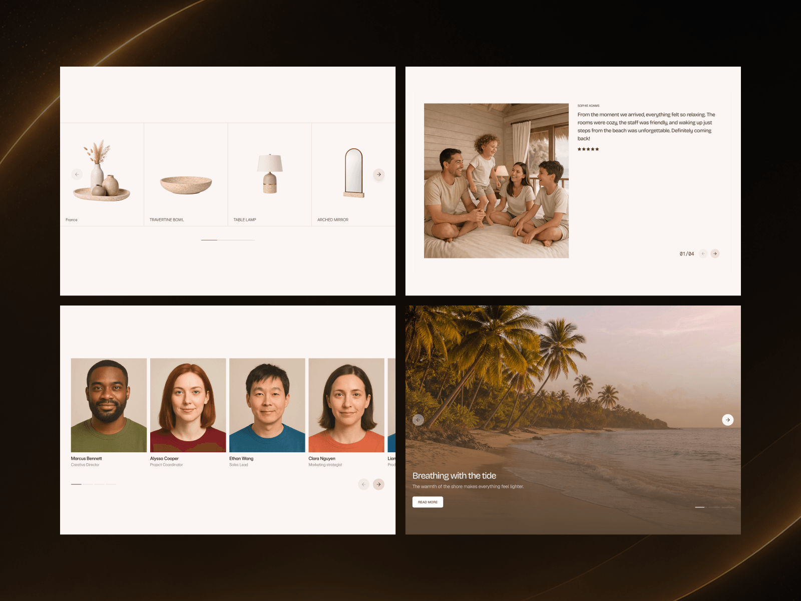
Product showcase sections
Video sections
Testimonial sections
Team list sections
Blog sections
Portfolio sections
Any horizontal section
Why CMS Carousel Pro?
CMS Carousel Pro is a carousel component designed to support both CMS and non-CMS content, with advanced control over arrows and indicators. Many designers attempt design hacks just to make CMS carousels work in Framer, and it often becomes a constant headache-sometimes feeling impossible.

Advance CMS and non-CMS carousel with smooth snap scrolling, auto-disabled arrows, effect support, and advanced, fully customizable arrow and indicator controls. A powerful component that can handle different section designs, saving you time and money with easy carousel updates and no more hacks for complex changes.
Key feature
Supports CMS and non-CMS
Responsive
Customizable columns
Card overrides (Padding, Direction, Gap, Align, Radius, Order)
4 customizable indicator styles (Text, Dash, Dot, Progress)
Dot & Dash supports progress indicator animations when autoplay is enabled
2 customizable directional symbol styles (Arrow & Chevron)
Supports directional symbol effects
Advanced indicator placement
Advanced directional symbol placement
Auto show & hide of related property controls for easier navigation
Any effects applied to cards inside the CMS are supported only for home page
Autoplay and non-autoplay
Fading options (left, right, or both)
Dot and Dash indicators support vertical layouts when the placement set to inside
Directional symbol support both horizontal and vertical layouts
Natural drag/swipe interaction
Smooth snap scrolling with auto-disabled arrows (customizable)
Perfect for
Hero sections
Product showcase sections
Video sections
Testimonial sections
Team list sections
Blog sections
Portfolio sections
Any horizontal section
Why CMS Carousel Pro?
CMS Carousel Pro is a carousel component designed to support both CMS and non-CMS content, with advanced control over arrows and indicators. Many designers attempt design hacks just to make CMS carousels work in Framer, and it often becomes a constant headache-sometimes feeling impossible.