Live Preview: https://featureshowcase03.framer.website/
About Feature Showcase 03
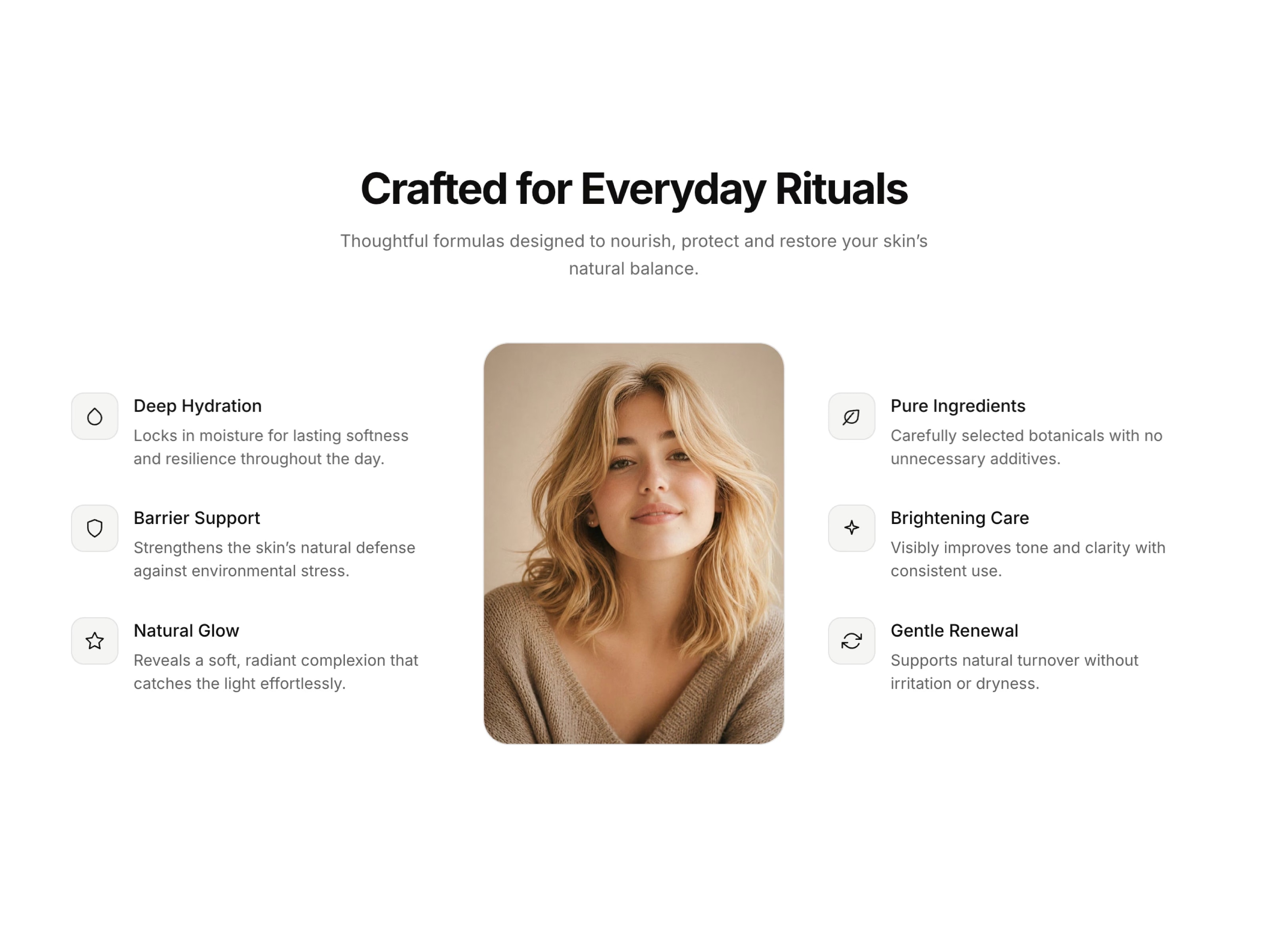
Feature Showcase 03 is an editorial split-layout component for Framer. A center portrait image sits between two columns of icon-led feature highlights, built with minimal stroke icons instead of emoji for a clean, premium look. Includes light and dark themes, scroll-triggered stagger reveal animation, and grouped property controls for fast customization. Fully responsive, accessible, and SEO-ready with semantic markup and structured data out of the box. Perfect for beauty, wellness, and product-led brands, everywhere.
Split layout with center portrait image and two feature columns Minimal stroke-based icon set — no emoji, fully theme-aware Scroll-triggered stagger reveal animation on view Light and dark theme with instant one-click toggle Demo Mode — live preview image width and corner radius Grouped property controls: Settings, Layout, Colors, Typography Semantic list markup and proper heading hierarchy WCAG AA compliant color contrast out of the box Built-in JSON-LD structured data for stronger SEO Fully responsive — collapses to single column under 900px Works out of the box — no setup needed
Use Cases
Skincare and beauty brand landing pages Wellness and self-care product pages Fashion and lifestyle editorial sites Personal care and cosmetics e-commerce SaaS feature highlight sections Portfolio and personal branding websites Agency service showcase pages Product feature and benefits sections Editorial and magazine-style layouts Marketing pages for physical products
Keywords
feature list component, icon feature section, portrait image showcase, split layout framer, skincare feature section, product feature list, icon list framer, light dark theme card, feature showcase component, accessible feature list, minimal icon list, editorial feature section, responsive feature grid

Live Preview: https://featureshowcase03.framer.website/
About Feature Showcase 03
Feature Showcase 03 is an editorial split-layout component for Framer. A center portrait image sits between two columns of icon-led feature highlights, built with minimal stroke icons instead of emoji for a clean, premium look. Includes light and dark themes, scroll-triggered stagger reveal animation, and grouped property controls for fast customization. Fully responsive, accessible, and SEO-ready with semantic markup and structured data out of the box. Perfect for beauty, wellness, and product-led brands, everywhere.
Split layout with center portrait image and two feature columns Minimal stroke-based icon set — no emoji, fully theme-aware Scroll-triggered stagger reveal animation on view Light and dark theme with instant one-click toggle Demo Mode — live preview image width and corner radius Grouped property controls: Settings, Layout, Colors, Typography Semantic list markup and proper heading hierarchy WCAG AA compliant color contrast out of the box Built-in JSON-LD structured data for stronger SEO Fully responsive — collapses to single column under 900px Works out of the box — no setup needed
Use Cases
Skincare and beauty brand landing pages Wellness and self-care product pages Fashion and lifestyle editorial sites Personal care and cosmetics e-commerce SaaS feature highlight sections Portfolio and personal branding websites Agency service showcase pages Product feature and benefits sections Editorial and magazine-style layouts Marketing pages for physical products
Keywords
feature list component, icon feature section, portrait image showcase, split layout framer, skincare feature section, product feature list, icon list framer, light dark theme card, feature showcase component, accessible feature list, minimal icon list, editorial feature section, responsive feature grid
 Ahmet Loca