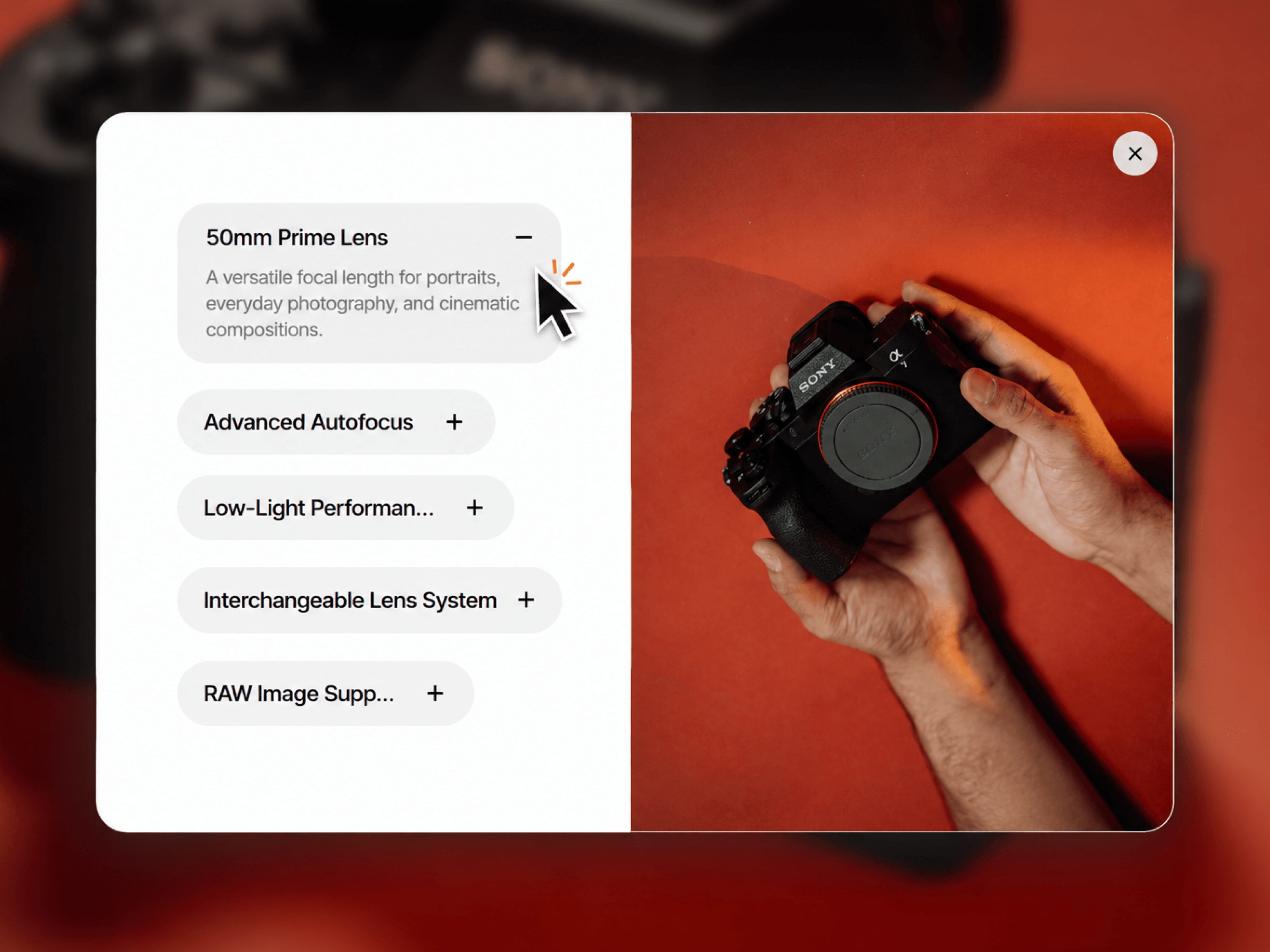
FeatureAccordionShowcase is an interactive two-panel product feature display, inspired by expanding feature-pill patterns. It’s built for showcasing a product (currently set up with camera lens features as example content) alongside supporting imagery.
Splits into a features column and an image panel, arranged side-by-side (features left, image right) or stacked (image on top, features below) — switchable manually or automatically on narrow/mobile widths.
Features are listed as collapsible pills, all closed by default, each showing just a title with a “+” indicator.
Clicking a pill smoothly expands it to reveal its description, automatically collapsing whichever pill was previously open — only one stays open at a time.
While a pill is open, the image panel instantly swaps to that feature’s dedicated image (falling back to a shared default image otherwise).
A close icon appears in the top-right corner of the image only while a pill is open, letting users collapse everything back to the closed state.
On mobile/vertical layouts, the features list becomes scrollable if there are more pills than fit in the available space.
Editable feature list (title, description, optional icon, optional per-feature image) and default image
Manual horizontal/vertical layout switch
Title and description typography (font, size, weight, color)
Pill background, closed/open corner radius, and separate border colors for the card and pills
Adjustable padding (pill padding, outer stack padding), spacing (between pills, title-to-description, title-to-“+”), and icon size
A single built-in Framer Transition control driving all open/close animations for consistent, adjustable motion
It’s fully static-render safe, responsive, and accessible (proper ARIA states on the expandable pills).

FeatureAccordionShowcase is an interactive two-panel product feature display, inspired by expanding feature-pill patterns. It’s built for showcasing a product (currently set up with camera lens features as example content) alongside supporting imagery.
Splits into a features column and an image panel, arranged side-by-side (features left, image right) or stacked (image on top, features below) — switchable manually or automatically on narrow/mobile widths.
Features are listed as collapsible pills, all closed by default, each showing just a title with a “+” indicator.
Clicking a pill smoothly expands it to reveal its description, automatically collapsing whichever pill was previously open — only one stays open at a time.
While a pill is open, the image panel instantly swaps to that feature’s dedicated image (falling back to a shared default image otherwise).
A close icon appears in the top-right corner of the image only while a pill is open, letting users collapse everything back to the closed state.
On mobile/vertical layouts, the features list becomes scrollable if there are more pills than fit in the available space.
Editable feature list (title, description, optional icon, optional per-feature image) and default image
Manual horizontal/vertical layout switch
Title and description typography (font, size, weight, color)
Pill background, closed/open corner radius, and separate border colors for the card and pills
Adjustable padding (pill padding, outer stack padding), spacing (between pills, title-to-description, title-to-“+”), and icon size
A single built-in Framer Transition control driving all open/close animations for consistent, adjustable motion
It’s fully static-render safe, responsive, and accessible (proper ARIA states on the expandable pills).
 Saqlain Nasir