✦ What's included
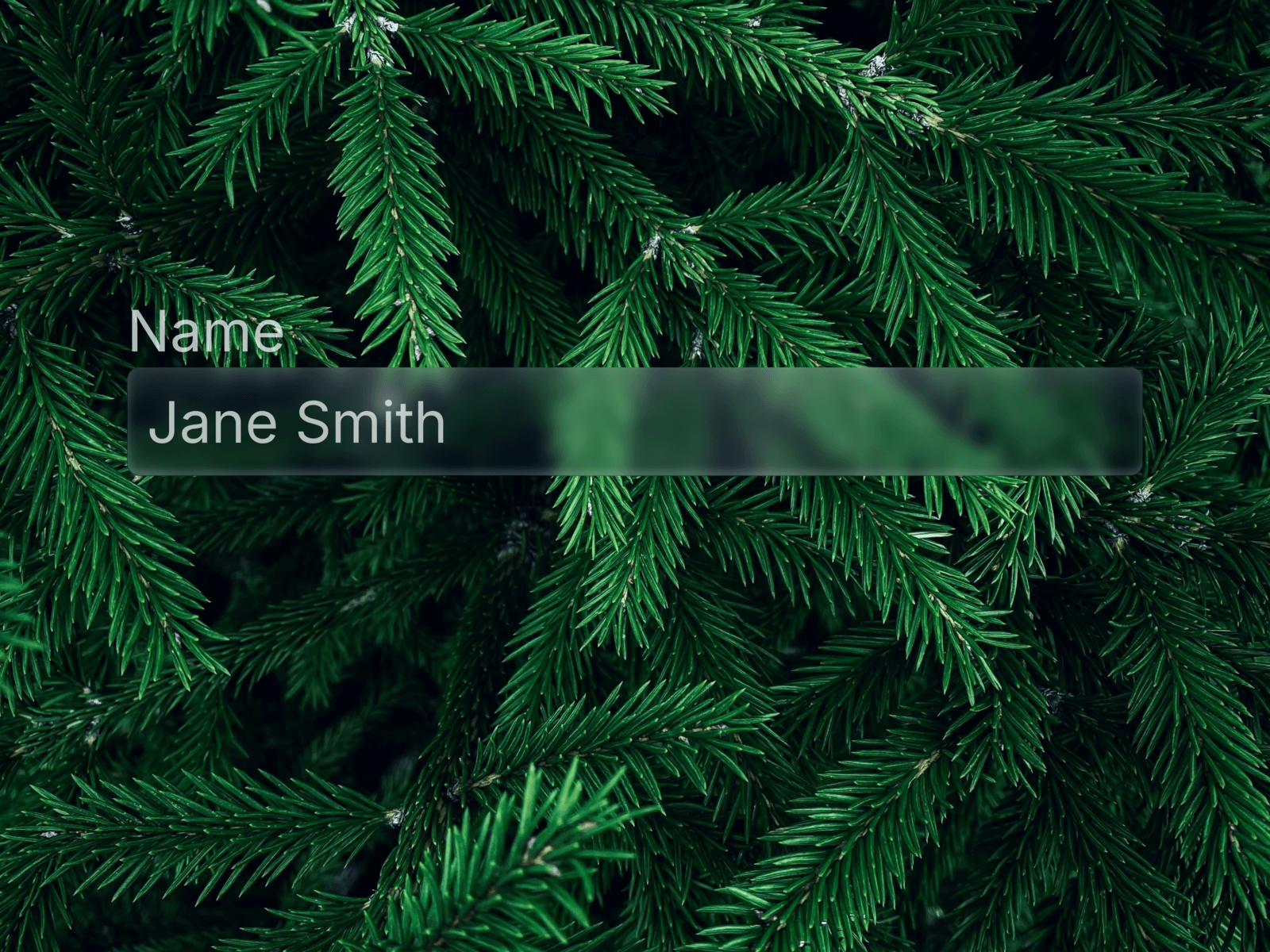
3 Liquid Glass card variants inspired by Apple's material design language. Each features cursor-tracking glow, magnetic hover pull, and press animations — built as one cohesive glass system that pairs with Glassdrop Buttons.
🧩 Variants
Basic — text-first card with accent divider line and optional CTA. Clean, minimal, works on any background
Media — full-bleed cover image with gradient overlay, eyebrow label, and automatic color grading
Icon — floating semantic badge above the glass surface for categorized or status-driven content
✦ Animations
Hover activates a glow that follows your cursor across the glass surface, paired with a subtle magnetic pull toward the pointer — making the card feel physical and responsive.
🎨 Customization
Every card exposes these properties directly in Framer:
Variant — switch between Basic, Media, and Icon
Accent Color — one token repaints eyebrow, divider, CTA, and icon badge simultaneously
Eyebrow Text — category or content type label
Show Eyebrow — toggle the label on or off
Title / Description — main content slots
Thumbnail — cover image for Media variant
Icon — badge icon for Icon variant
Has Button — show or hide the CTA
Button Label — custom CTA text
Button Icon — any Material Symbol name
Button Link — connect to any URL
🔍 Finding icons
Browse thousands of icons at fonts.google.com/icons — search for what you need, click on it and copy the name. Example icon names: arrow_forward, star, bookmark, surfing, info, check_circle, trending_up.
🚀 How to use
Purchase and open the Framer remix link
Copy the component to your project
Set your Accent Color via the property panel
Choose a variant and fill in your content
Drop into any frame — interactions work on publish
⚙ Requirements
Framer — any plan. No plugins or external dependencies.
Part of the Glassdrop system. Pairs with Glassdrop Buttons.

✦ What's included
3 Liquid Glass card variants inspired by Apple's material design language. Each features cursor-tracking glow, magnetic hover pull, and press animations — built as one cohesive glass system that pairs with Glassdrop Buttons.
🧩 Variants
Basic — text-first card with accent divider line and optional CTA. Clean, minimal, works on any background
Media — full-bleed cover image with gradient overlay, eyebrow label, and automatic color grading
Icon — floating semantic badge above the glass surface for categorized or status-driven content
✦ Animations
Hover activates a glow that follows your cursor across the glass surface, paired with a subtle magnetic pull toward the pointer — making the card feel physical and responsive.
🎨 Customization
Every card exposes these properties directly in Framer:
Variant — switch between Basic, Media, and Icon
Accent Color — one token repaints eyebrow, divider, CTA, and icon badge simultaneously
Eyebrow Text — category or content type label
Show Eyebrow — toggle the label on or off
Title / Description — main content slots
Thumbnail — cover image for Media variant
Icon — badge icon for Icon variant
Has Button — show or hide the CTA
Button Label — custom CTA text
Button Icon — any Material Symbol name
Button Link — connect to any URL
🔍 Finding icons
Browse thousands of icons at fonts.google.com/icons — search for what you need, click on it and copy the name. Example icon names: arrow_forward, star, bookmark, surfing, info, check_circle, trending_up.
🚀 How to use
Purchase and open the Framer remix link
Copy the component to your project
Set your Accent Color via the property panel
Choose a variant and fill in your content
Drop into any frame — interactions work on publish
⚙ Requirements
Framer — any plan. No plugins or external dependencies.
Part of the Glassdrop system. Pairs with Glassdrop Buttons.