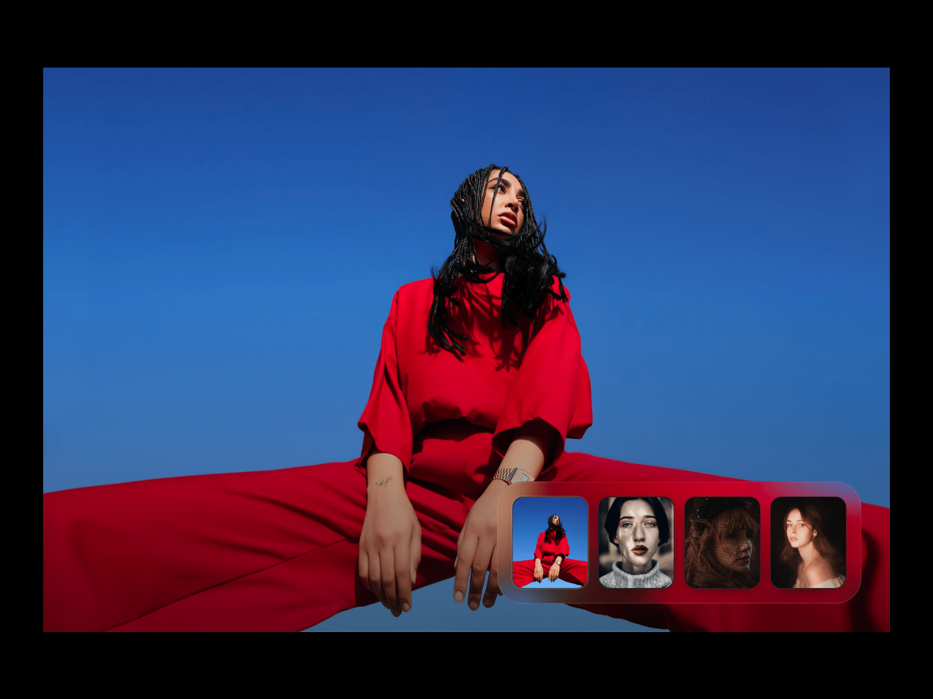
Hero BG Animation is an interactive hero background component designed to turn static images into an immersive visual experience. Add multiple images and transition between them using cinematic effects such as Silk Wipe, Iris Zoom, Liquid Drift, Editorial Bands, and Chromatic Slide.
Cinematic image transitions
5 built-in transition styles
Multiple image support
Smooth image scaling and motion
Adjustable transition duration
Adjustable animation speed
Transition intensity control
RGB split effect
Gloss sweep effect
Auto-play functionality
Custom auto-play delay
Resume-after interaction timing
Customizable image thumbnails
Interactive cursor lens
Multiple cursor lens modes
Add and manage multiple hero images.
Each image can be individually replaced or removed.
Choose from:
Silk Wipe
Iris Zoom
Liquid Drift
Editorial Bands
Chromatic Slide
Duration — Control transition length.
Speed — Adjust overall animation speed.
Intensity — Control the strength of the transition effects.
Image Scale — Adjust image zoom during transitions.
RGB Split — Control chromatic displacement.
Gloss Sweep — Adjust the glossy light sweep effect.
Customize the thumbnail navigation with:
Size
Ratio
Gap
Radius
Padding
Position
Inset
Active State
Accent Color
Numbers
Frosted Rail
Rail Padding
Add an interactive lens effect with:
Mode — Blur, Frosted Glass, Clarity, or Chromatic
Radius
Strength
Edge Softness
Glass Rim
Add your hero images to the Images property.
Select your preferred Transition style.
Adjust Duration, Speed, and Intensity to match your design.
Customize the image scale and optional RGB/Gloss effects.
Configure your Thumbnails and choose their position and appearance.
Enable Auto Play if you want the images to transition automatically.
Add Cursor Lens, Overlay, Background, and Caption effects as needed.
Configure the mobile layout and publish.

Hero BG Animation is an interactive hero background component designed to turn static images into an immersive visual experience. Add multiple images and transition between them using cinematic effects such as Silk Wipe, Iris Zoom, Liquid Drift, Editorial Bands, and Chromatic Slide.
Cinematic image transitions
5 built-in transition styles
Multiple image support
Smooth image scaling and motion
Adjustable transition duration
Adjustable animation speed
Transition intensity control
RGB split effect
Gloss sweep effect
Auto-play functionality
Custom auto-play delay
Resume-after interaction timing
Customizable image thumbnails
Interactive cursor lens
Multiple cursor lens modes
Add and manage multiple hero images.
Each image can be individually replaced or removed.
Choose from:
Silk Wipe
Iris Zoom
Liquid Drift
Editorial Bands
Chromatic Slide
Duration — Control transition length.
Speed — Adjust overall animation speed.
Intensity — Control the strength of the transition effects.
Image Scale — Adjust image zoom during transitions.
RGB Split — Control chromatic displacement.
Gloss Sweep — Adjust the glossy light sweep effect.
Customize the thumbnail navigation with:
Size
Ratio
Gap
Radius
Padding
Position
Inset
Active State
Accent Color
Numbers
Frosted Rail
Rail Padding
Add an interactive lens effect with:
Mode — Blur, Frosted Glass, Clarity, or Chromatic
Radius
Strength
Edge Softness
Glass Rim
Add your hero images to the Images property.
Select your preferred Transition style.
Adjust Duration, Speed, and Intensity to match your design.
Customize the image scale and optional RGB/Gloss effects.
Configure your Thumbnails and choose their position and appearance.
Enable Auto Play if you want the images to transition automatically.
Add Cursor Lens, Overlay, Background, and Caption effects as needed.
Configure the mobile layout and publish.


