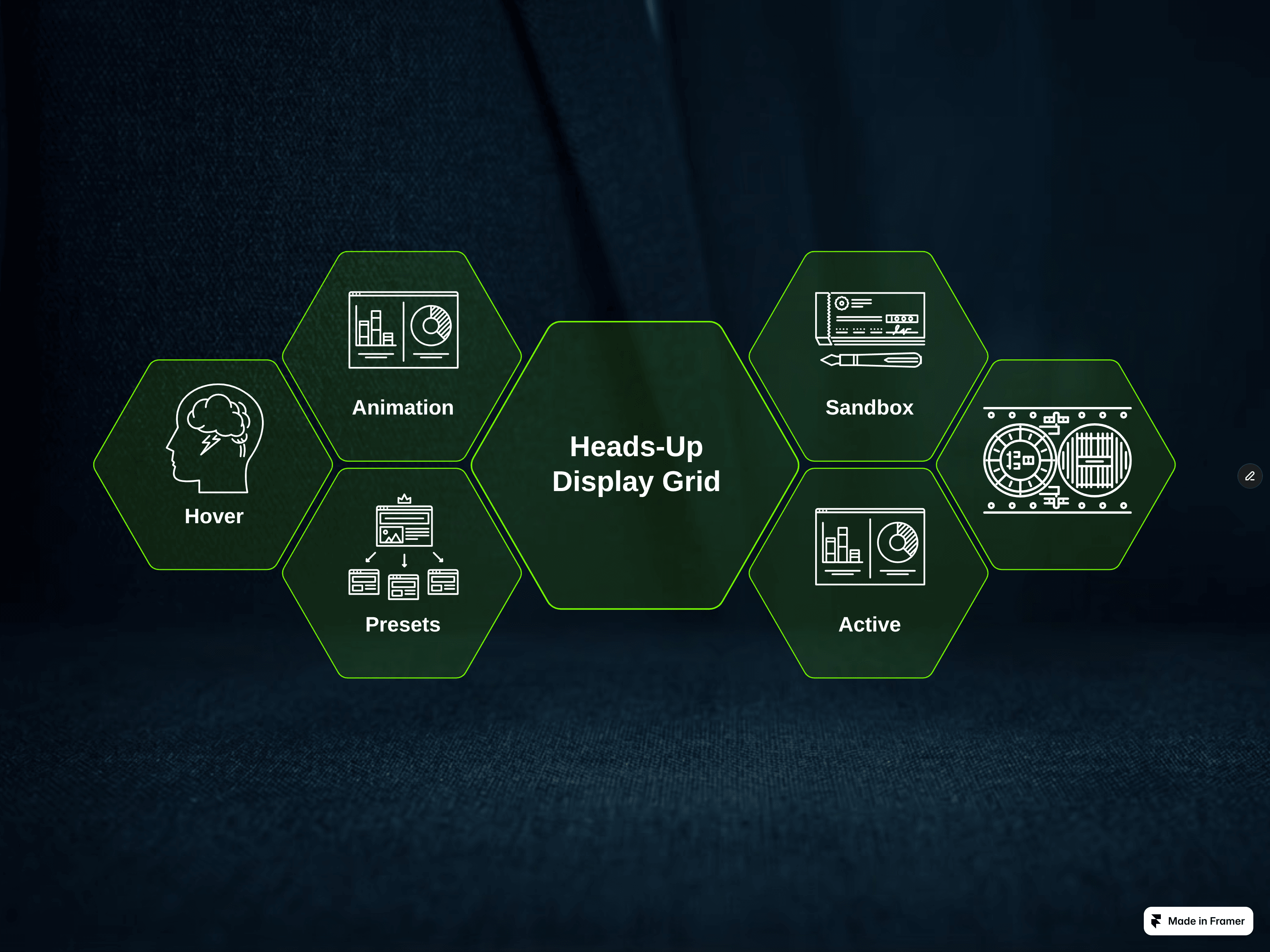
Hexagonal Heads-Up Display Grid is a fully customizable navigation and layout component for Framer based on a unique hexagonal structure. It is designed to function as an interactive web menu, a visual page element, or a graphic asset for digital presentations.
Adaptive Layout: Switch between horizontal and vertical display modes to easily configure responsive behavior across devices.
Property Panel Control: The entire layout and configuration are managed directly via the Framer properties panel without touching code.
Flexible Interaction: Micro-animations and the highlighting of clicked cells can be enabled or disabled depending on your design needs.
Visual Presets: Includes 5 ready-to-use styles: three outline variations with transparent or semi-transparent fills, and two with solid, opaque fills.
Custom Styling: Full control over the component’s primary color, text colors, and font sizes to match your project's branding.
The grid consists of 6 customizable cells. Each individual cell allows you to configure:
Short text labels (1–2 words)
Icons
Web links, including full support for anchor links

Hexagonal Heads-Up Display Grid is a fully customizable navigation and layout component for Framer based on a unique hexagonal structure. It is designed to function as an interactive web menu, a visual page element, or a graphic asset for digital presentations.
Adaptive Layout: Switch between horizontal and vertical display modes to easily configure responsive behavior across devices.
Property Panel Control: The entire layout and configuration are managed directly via the Framer properties panel without touching code.
Flexible Interaction: Micro-animations and the highlighting of clicked cells can be enabled or disabled depending on your design needs.
Visual Presets: Includes 5 ready-to-use styles: three outline variations with transparent or semi-transparent fills, and two with solid, opaque fills.
Custom Styling: Full control over the component’s primary color, text colors, and font sizes to match your project's branding.
The grid consists of 6 customizable cells. Each individual cell allows you to configure:
Short text labels (1–2 words)
Icons
Web links, including full support for anchor links


