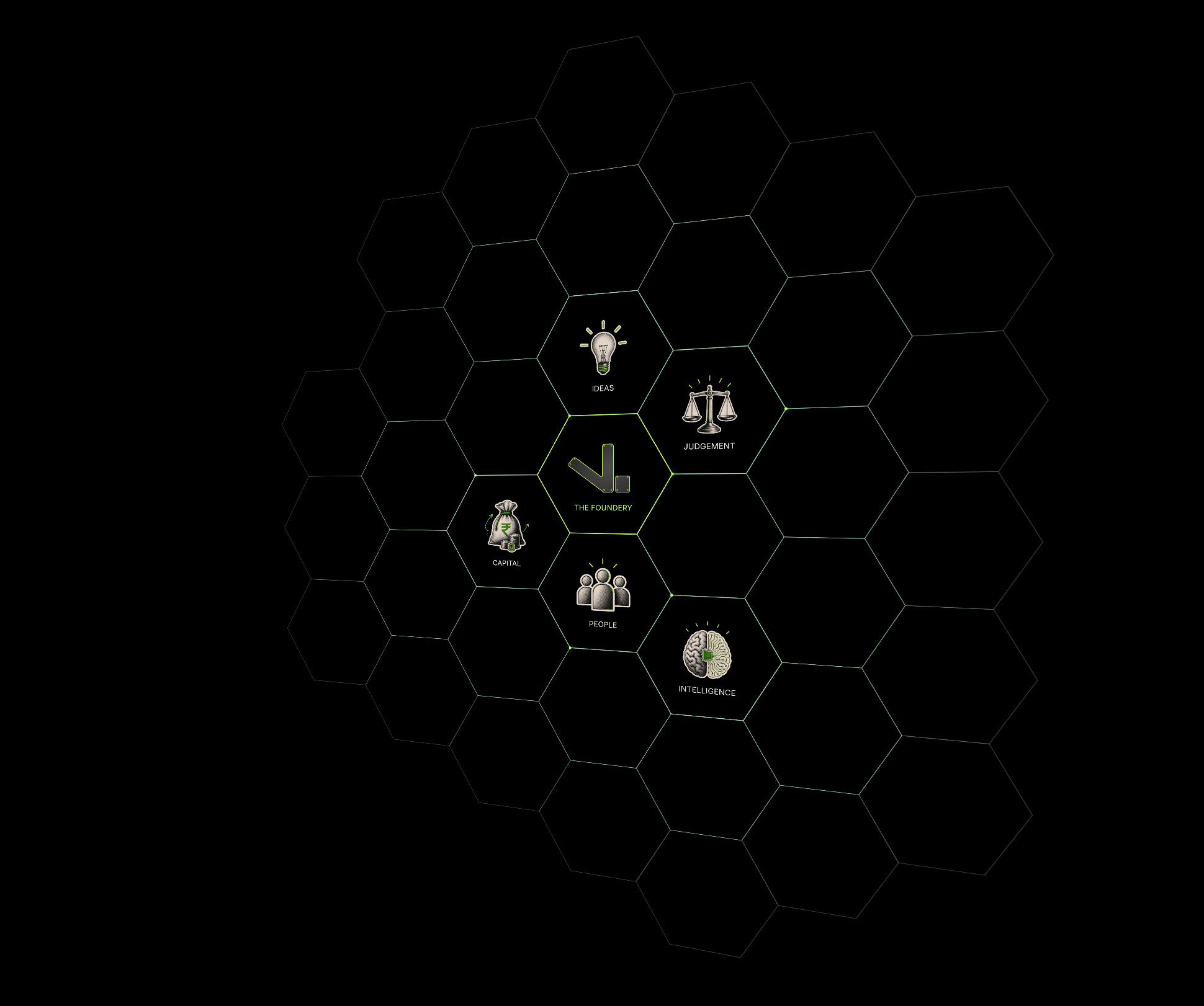
Honeycomb turns any set of ideas, values, or logos into a living hive. Cells sit on a flat-top hex grid around a central cell, each carrying its own image, label, or built-in icon, while accent dots trace the comb and rings of empty hexes fade softly into the background.
The whole comb responds to the pointer. Choose Hover follow and it tilts in 3D toward the cursor, Drag to rotate and visitors can grab and turn it, or Off for a clean static angle. Every movement is spring-smoothed and settles back to a resting tilt you set, so it feels alive without ever feeling busy.
Everything is driven by property controls, so no code is needed. Add or remove cells from the panel, place each one by column and row, pick colors and fonts, and dial in the depth, angle, and smoothness until it matches your brand.
Fully responsive, retina crisp, and light on performance. Drop it into a hero, an about section, an ecosystem diagram, or a values grid and it scales to fit its frame automatically.
Key features:
Interactive 3D tilt with three modes: Hover follow, Drag to rotate, or static
Spring-smoothed motion with adjustable max angle, smoothness, and resting tilt
Add, remove, and position cells directly from the properties panel
Per-cell image, text label, or one of five built-in line icons
Glowing accent dots that flow along the comb, with adjustable loop speed
Rings of empty outer hexes that fade out with distance for depth
Full control of colors, fonts, uppercase, hex size, and 3D perspective
Auto-fit to container, fully responsive, and touch friendly

Honeycomb turns any set of ideas, values, or logos into a living hive. Cells sit on a flat-top hex grid around a central cell, each carrying its own image, label, or built-in icon, while accent dots trace the comb and rings of empty hexes fade softly into the background.
The whole comb responds to the pointer. Choose Hover follow and it tilts in 3D toward the cursor, Drag to rotate and visitors can grab and turn it, or Off for a clean static angle. Every movement is spring-smoothed and settles back to a resting tilt you set, so it feels alive without ever feeling busy.
Everything is driven by property controls, so no code is needed. Add or remove cells from the panel, place each one by column and row, pick colors and fonts, and dial in the depth, angle, and smoothness until it matches your brand.
Fully responsive, retina crisp, and light on performance. Drop it into a hero, an about section, an ecosystem diagram, or a values grid and it scales to fit its frame automatically.
Key features:
Interactive 3D tilt with three modes: Hover follow, Drag to rotate, or static
Spring-smoothed motion with adjustable max angle, smoothness, and resting tilt
Add, remove, and position cells directly from the properties panel
Per-cell image, text label, or one of five built-in line icons
Glowing accent dots that flow along the comb, with adjustable loop speed
Rings of empty outer hexes that fade out with distance for depth
Full control of colors, fonts, uppercase, hex size, and 3D perspective
Auto-fit to container, fully responsive, and touch friendly