About Component
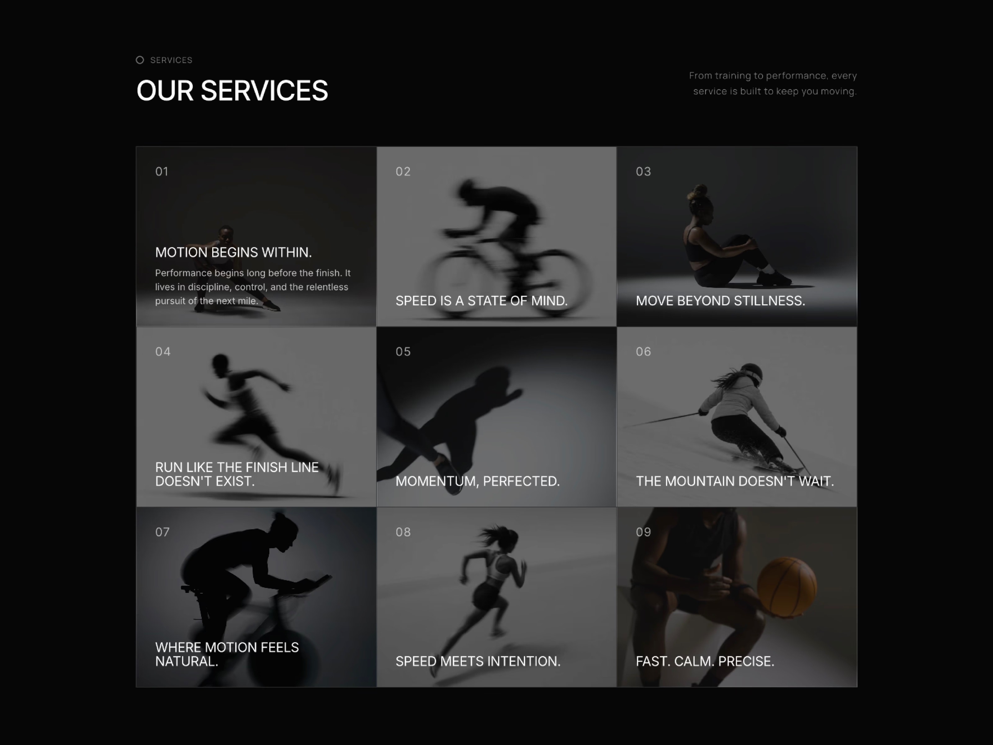
IndexGridSection is an editorial "table of contents" style grid for Framer. Hairline-bordered cells fill with an inverted color sweep on hover, revealing an image, video or description — ideal for services, capabilities or work index pages, ready with zero extra styling. Built with native property controls, semantic HTML and schema.org markup for stronger structure and search visibility.
Hover-fill reveal with inverted color sweep per cell Optional image or video background revealed on hover Independent font pickers for heading, title, description, number, side text and eyebrow Per-element uppercase toggles for full typographic control Cell number, media and description each independently configurable Adjustable columns and four cell shapes: square, 4:3, 3:2, wide Fully responsive — auto-collapses columns on tablet and mobile Demo Mode — live on-canvas preview of shape, columns and media Show Media Preview — reveal every cell's media at once Accessible by default — semantic HTML and schema.org structured data Works out of the box — no setup needed
Use Cases
Agency capability and service index pages
Studio and portfolio work index
Consulting service listings
SaaS feature index sections
Editorial and magazine-style tables of contents
Product or catalog index pages
Team or department overview grids
Design system or component index pages
Conference or event program listings
Corporate "what we do" sections
Nonprofit and organization program listings
University or department directory pages
Keywords
index grid, table of contents grid, hover reveal grid, capabilities grid, services grid, editorial grid, hover expand grid, image hover reveal, video hover reveal, framer index component, css grid hover, accessible grid, responsive grid framer, hover fill effect, capability showcase, services showcase, portfolio index, framer table of contents, grid gallery framer, index component framer

About Component
IndexGridSection is an editorial "table of contents" style grid for Framer. Hairline-bordered cells fill with an inverted color sweep on hover, revealing an image, video or description — ideal for services, capabilities or work index pages, ready with zero extra styling. Built with native property controls, semantic HTML and schema.org markup for stronger structure and search visibility.
Hover-fill reveal with inverted color sweep per cell Optional image or video background revealed on hover Independent font pickers for heading, title, description, number, side text and eyebrow Per-element uppercase toggles for full typographic control Cell number, media and description each independently configurable Adjustable columns and four cell shapes: square, 4:3, 3:2, wide Fully responsive — auto-collapses columns on tablet and mobile Demo Mode — live on-canvas preview of shape, columns and media Show Media Preview — reveal every cell's media at once Accessible by default — semantic HTML and schema.org structured data Works out of the box — no setup needed
Use Cases
Agency capability and service index pages
Studio and portfolio work index
Consulting service listings
SaaS feature index sections
Editorial and magazine-style tables of contents
Product or catalog index pages
Team or department overview grids
Design system or component index pages
Conference or event program listings
Corporate "what we do" sections
Nonprofit and organization program listings
University or department directory pages
Keywords
index grid, table of contents grid, hover reveal grid, capabilities grid, services grid, editorial grid, hover expand grid, image hover reveal, video hover reveal, framer index component, css grid hover, accessible grid, responsive grid framer, hover fill effect, capability showcase, services showcase, portfolio index, framer table of contents, grid gallery framer, index component framer
 Ahmet Loca


