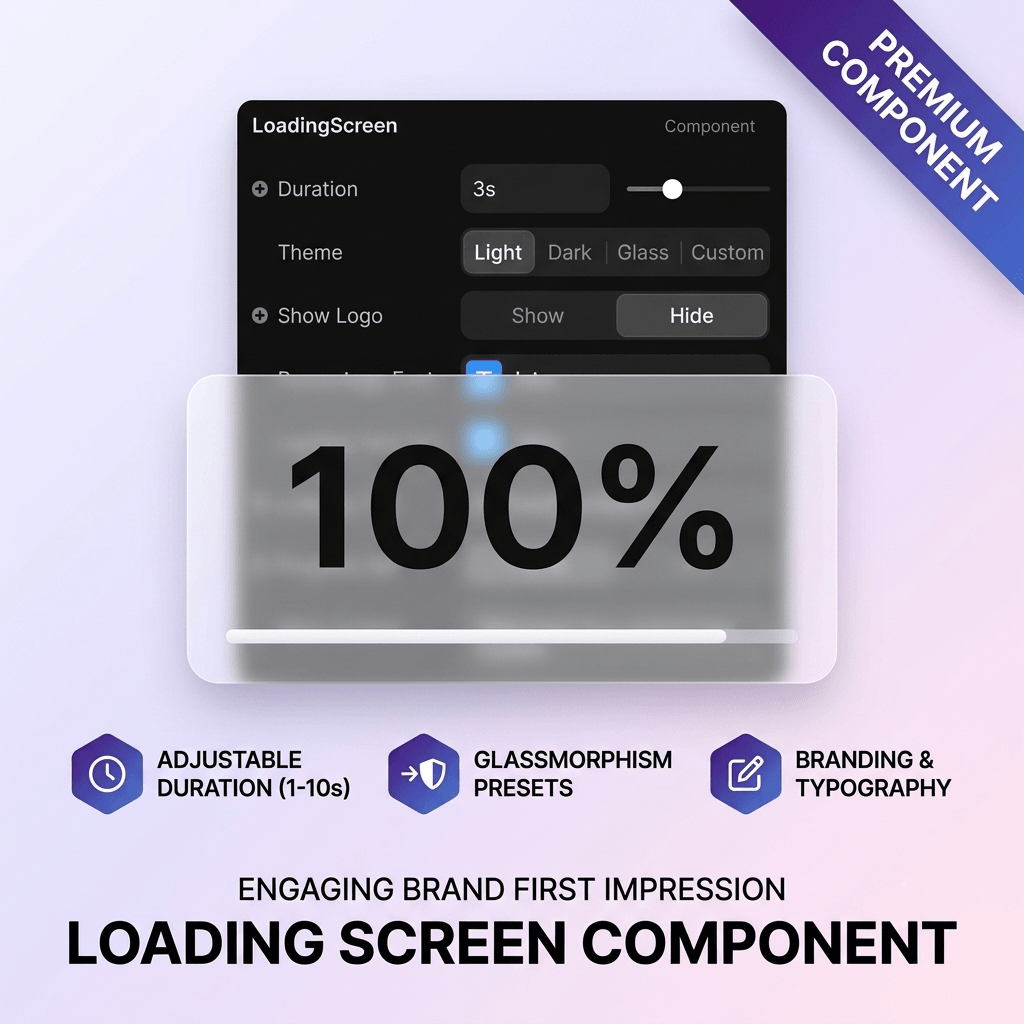
Elevate your brand's first impression with a highly customizable, theme-driven loading screen for Framer. Features a smooth 0–100% animated counter, glassmorphism presets, brand logo integration, and fluid fade transitions.3. Key Features Breakdown
⚡ Core Loading Engine & Transitions:
Synced Percentage Counter: Smooth 0% to 100% animated percentage counter synced directly with optional progress bar fills.
Adjustable Duration: Configurable loading speeds ranging from 1 to 10 seconds.
Fluid Entry/Exit Motion: Features automated fade-out transitions upon completion paired with fade-in and subtle scale-up effects for your main content.
🎨 4 Pre-Built Theme System:
Built-in Presets: Instantly switch between Light, Dark, Glass (glassmorphism with semi-transparent elements & backdrop blur), and Custom.
Complete Color Customization: Fully tailorable background colors, text colors, and progress bar fill/track colors.
Granular Typography Control: Separate font selectors for the percentage counter, loading subtitle text, and main content copy.
🖼 Branding & Visual Elements:
Brand Logo Integration: Optional centered logo display positioned above the percentage counter with adjustable sizing (40px to 200px).
Custom Messages: Personalize both the active loading message and the final reveal headline.
Bottom Progress Bar: Sleek, padded progress indicator bar anchored at the bottom of the viewport.
♿ Performance & Accessibility:
Accessible Image Engine: Built-in alt text metadata support for logos and responsive srcSet loading.
SSR & Canvas Safe: Optimized state handling to prevent canvas freezing and ensure zero flicker during live deployment.

Elevate your brand's first impression with a highly customizable, theme-driven loading screen for Framer. Features a smooth 0–100% animated counter, glassmorphism presets, brand logo integration, and fluid fade transitions.3. Key Features Breakdown
⚡ Core Loading Engine & Transitions:
Synced Percentage Counter: Smooth 0% to 100% animated percentage counter synced directly with optional progress bar fills.
Adjustable Duration: Configurable loading speeds ranging from 1 to 10 seconds.
Fluid Entry/Exit Motion: Features automated fade-out transitions upon completion paired with fade-in and subtle scale-up effects for your main content.
🎨 4 Pre-Built Theme System:
Built-in Presets: Instantly switch between Light, Dark, Glass (glassmorphism with semi-transparent elements & backdrop blur), and Custom.
Complete Color Customization: Fully tailorable background colors, text colors, and progress bar fill/track colors.
Granular Typography Control: Separate font selectors for the percentage counter, loading subtitle text, and main content copy.
🖼 Branding & Visual Elements:
Brand Logo Integration: Optional centered logo display positioned above the percentage counter with adjustable sizing (40px to 200px).
Custom Messages: Personalize both the active loading message and the final reveal headline.
Bottom Progress Bar: Sleek, padded progress indicator bar anchored at the bottom of the viewport.
♿ Performance & Accessibility:
Accessible Image Engine: Built-in alt text metadata support for logos and responsive srcSet loading.
SSR & Canvas Safe: Optimized state handling to prevent canvas freezing and ensure zero flicker during live deployment.