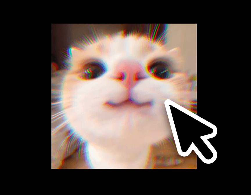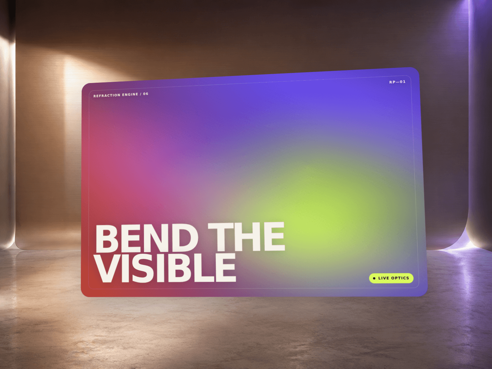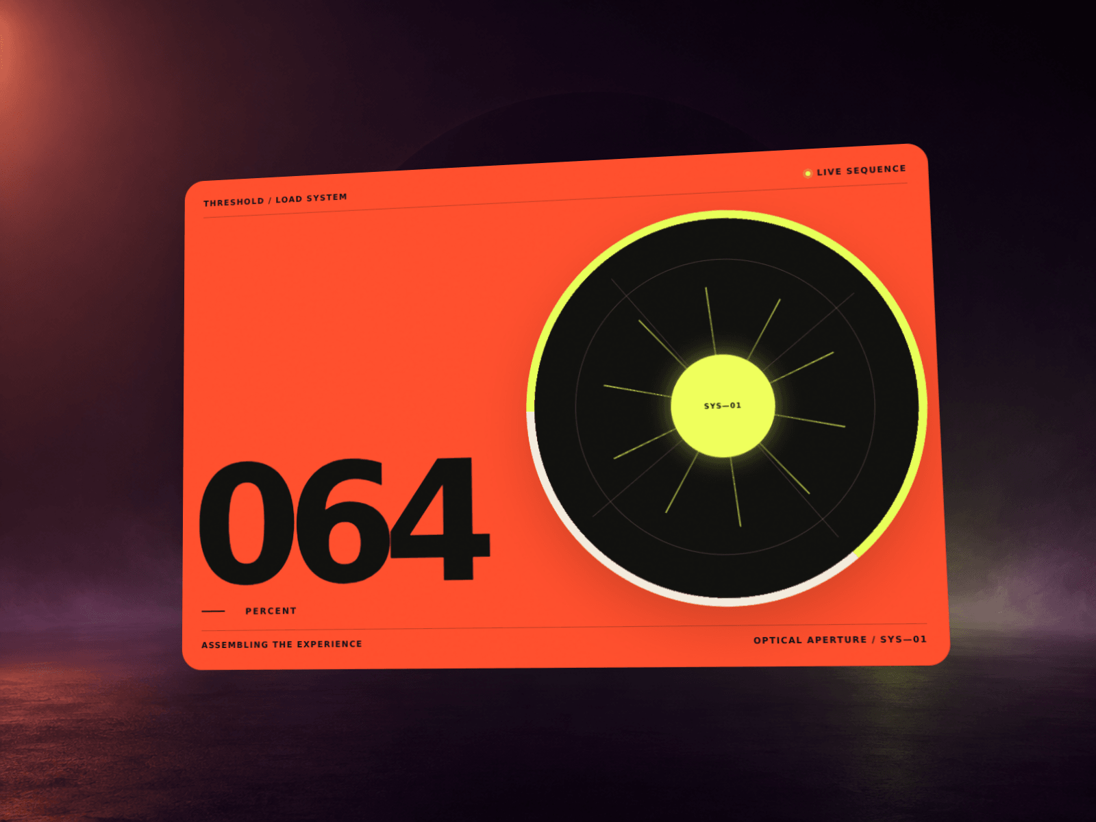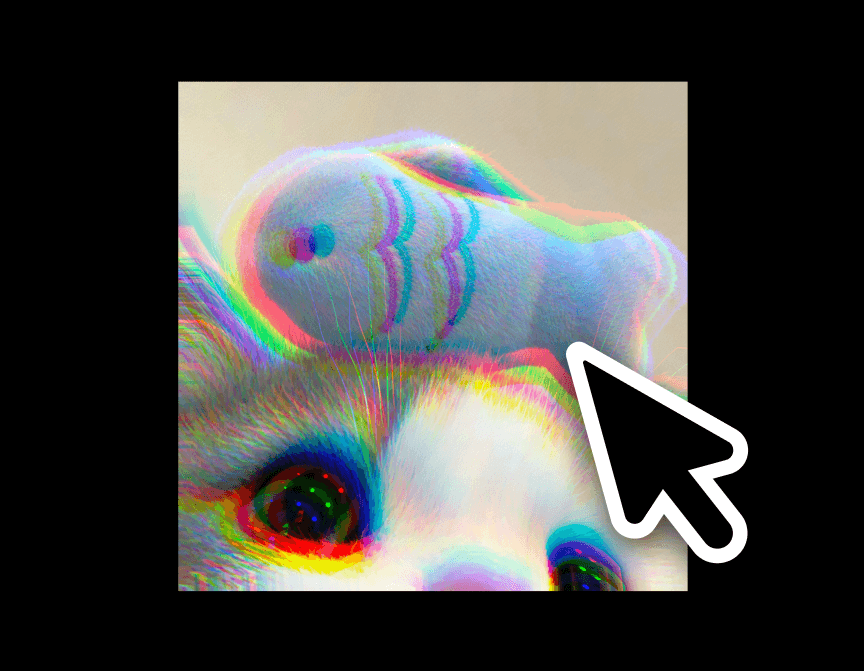
Prism Glitch Shader is a WebGL fragment-shader effect that splits an image (or a generated two-color gradient, if no image is used) into shifting chromatic-aberration and displacement bands — the "RGB split glitch" look, done as a real-time shader instead of a static overlay. It solves a common problem with existing glitch/distortion components: most are locked to one trigger and one visual, so designers either avoid them or end up faking the look with layered PNGs.
This one is built to be dropped over a hero image, product shot, or gallery thumbnail on almost any site. It can be revealed on hover, on scroll into view, by following the visitor's cursor, or run as a constant ambient loop — and works with just two colors if no image is supplied at all, so it also doubles as an animated gradient background.
Image — optional photo to apply the effect to; leave empty to use the color gradient instead.
Color From / Color To — the two colors used to build the animated gradient when no image is set (and as the static-fallback background).
Trigger — Hover, Scroll Into View, Follow Cursor, or Always On; controls what drives the effect.
Intensity — overall strength of the distortion.
RGB Split — amount of chromatic aberration (red/green/blue channel offset).
Noise Scale — size of the underlying wave/noise pattern (broad bands vs. fine detail).
Speed — animation speed of the noise field.
Grain — amount of film-grain noise layered on top.
Tint Color — optional color wash mixed into the effect; transparent by default (off).
Tint Opacity — strength of the tint wash.
Corner Radius — rounds the component's corners.
Reduce Motion — when on (default), visitors with "reduce motion" enabled see the static image/gradient instead of the animated shader.

Prism Glitch Shader is a WebGL fragment-shader effect that splits an image (or a generated two-color gradient, if no image is used) into shifting chromatic-aberration and displacement bands — the "RGB split glitch" look, done as a real-time shader instead of a static overlay. It solves a common problem with existing glitch/distortion components: most are locked to one trigger and one visual, so designers either avoid them or end up faking the look with layered PNGs.
This one is built to be dropped over a hero image, product shot, or gallery thumbnail on almost any site. It can be revealed on hover, on scroll into view, by following the visitor's cursor, or run as a constant ambient loop — and works with just two colors if no image is supplied at all, so it also doubles as an animated gradient background.
Image — optional photo to apply the effect to; leave empty to use the color gradient instead.
Color From / Color To — the two colors used to build the animated gradient when no image is set (and as the static-fallback background).
Trigger — Hover, Scroll Into View, Follow Cursor, or Always On; controls what drives the effect.
Intensity — overall strength of the distortion.
RGB Split — amount of chromatic aberration (red/green/blue channel offset).
Noise Scale — size of the underlying wave/noise pattern (broad bands vs. fine detail).
Speed — animation speed of the noise field.
Grain — amount of film-grain noise layered on top.
Tint Color — optional color wash mixed into the effect; transparent by default (off).
Tint Opacity — strength of the tint wash.
Corner Radius — rounds the component's corners.
Reduce Motion — when on (default), visitors with "reduce motion" enabled see the static image/gradient instead of the animated shader.
 Artem Kireev