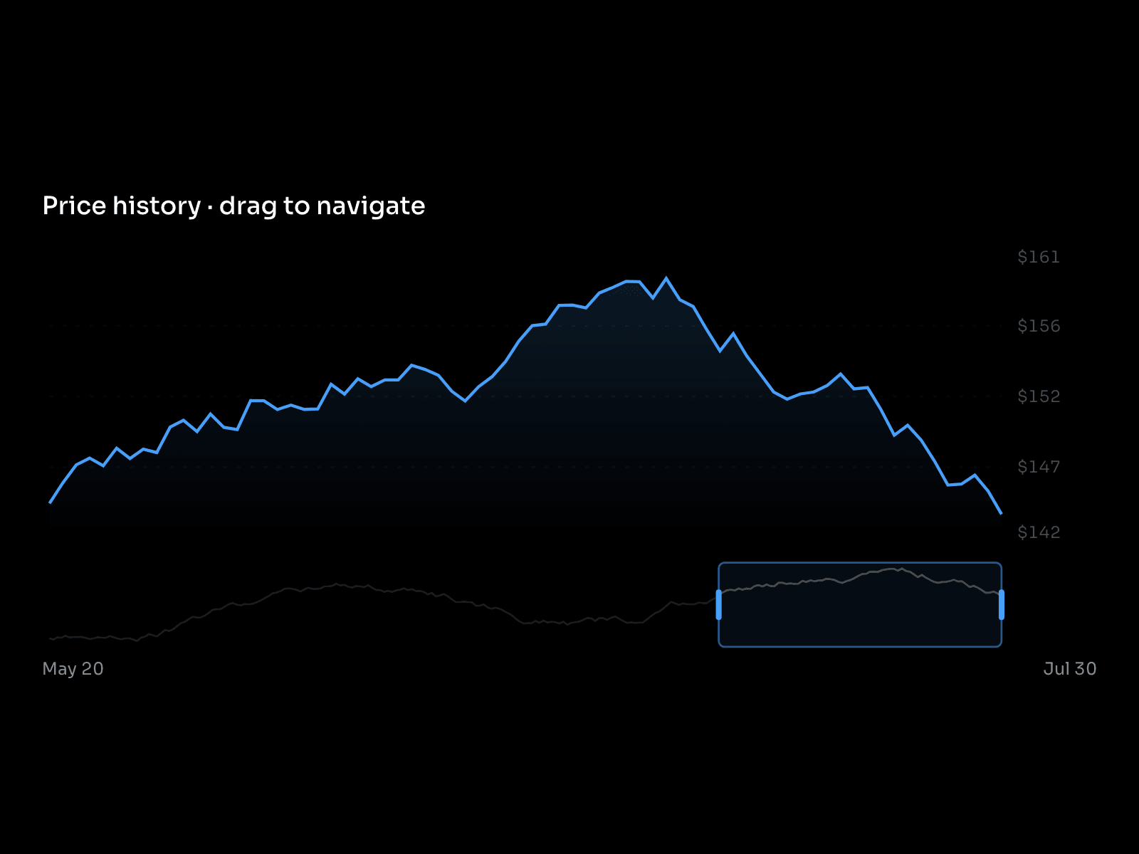
Price history you can steer. A detail chart sits above a compressed mini map of the full 240 day series, and you drag a brush window across the bottom to choose what the top chart shows.
What it does
Brush window. Drag the middle of the window to pan through history. Pull either edge to widen or narrow it, and the detail chart rescales to whatever you selected.
Two linked charts. The mini map always shows the whole series with your selection highlighted, so you never lose your place while zoomed in.
Crosshair readout. Hover the detail plot and a dashed guide follows the cursor with a card showing price and date at that exact point.
Axis that follows the window. Ticks and end labels derive from the selection, taking the min and max of the visible range and padding 10% each side, so a flat stretch still fills the plot.
Optional chrome. Price axis and Crosshair each turn off on their own when you want the bare chart.
Best for
Analytics and reporting products, portfolio and performance pages, anywhere you need to show a long series without forcing the reader to squint at 240 points at once.
How to use
1. Drop it on the canvas. Give it real width, it wants room for both charts.
2. Set the Title, or clear it if the section already has a heading.
3. Set Window between 12 and 239 days for the starting selection. 72 is a quarter and reads well as a default.
4. Turn Price axis off for a cleaner look, or Crosshair off if the component is decorative rather than interactive.
5. Pick a Theme and Accent.
6. In preview, drag the brush and pull its edges to confirm the range feels right.
The 240 day series is deterministic sample data. Swap it for your feed in the code file.

Price history you can steer. A detail chart sits above a compressed mini map of the full 240 day series, and you drag a brush window across the bottom to choose what the top chart shows.
What it does
Brush window. Drag the middle of the window to pan through history. Pull either edge to widen or narrow it, and the detail chart rescales to whatever you selected.
Two linked charts. The mini map always shows the whole series with your selection highlighted, so you never lose your place while zoomed in.
Crosshair readout. Hover the detail plot and a dashed guide follows the cursor with a card showing price and date at that exact point.
Axis that follows the window. Ticks and end labels derive from the selection, taking the min and max of the visible range and padding 10% each side, so a flat stretch still fills the plot.
Optional chrome. Price axis and Crosshair each turn off on their own when you want the bare chart.
Best for
Analytics and reporting products, portfolio and performance pages, anywhere you need to show a long series without forcing the reader to squint at 240 points at once.
How to use
1. Drop it on the canvas. Give it real width, it wants room for both charts.
2. Set the Title, or clear it if the section already has a heading.
3. Set Window between 12 and 239 days for the starting selection. 72 is a quarter and reads well as a default.
4. Turn Price axis off for a cleaner look, or Crosshair off if the component is decorative rather than interactive.
5. Pick a Theme and Accent.
6. In preview, drag the brush and pull its edges to confirm the range feels right.
The 240 day series is deterministic sample data. Swap it for your feed in the code file.
 Savva Sicevs