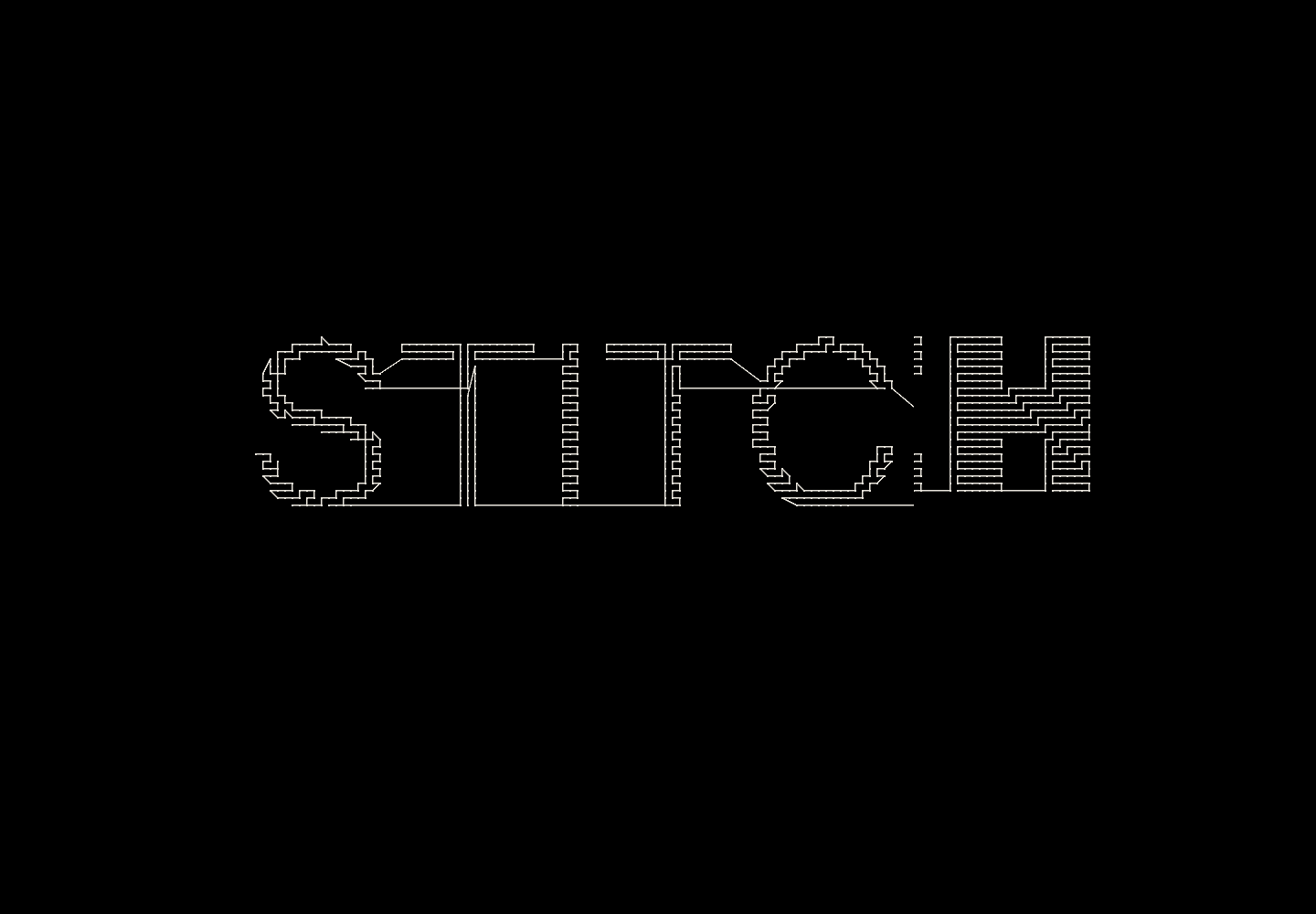
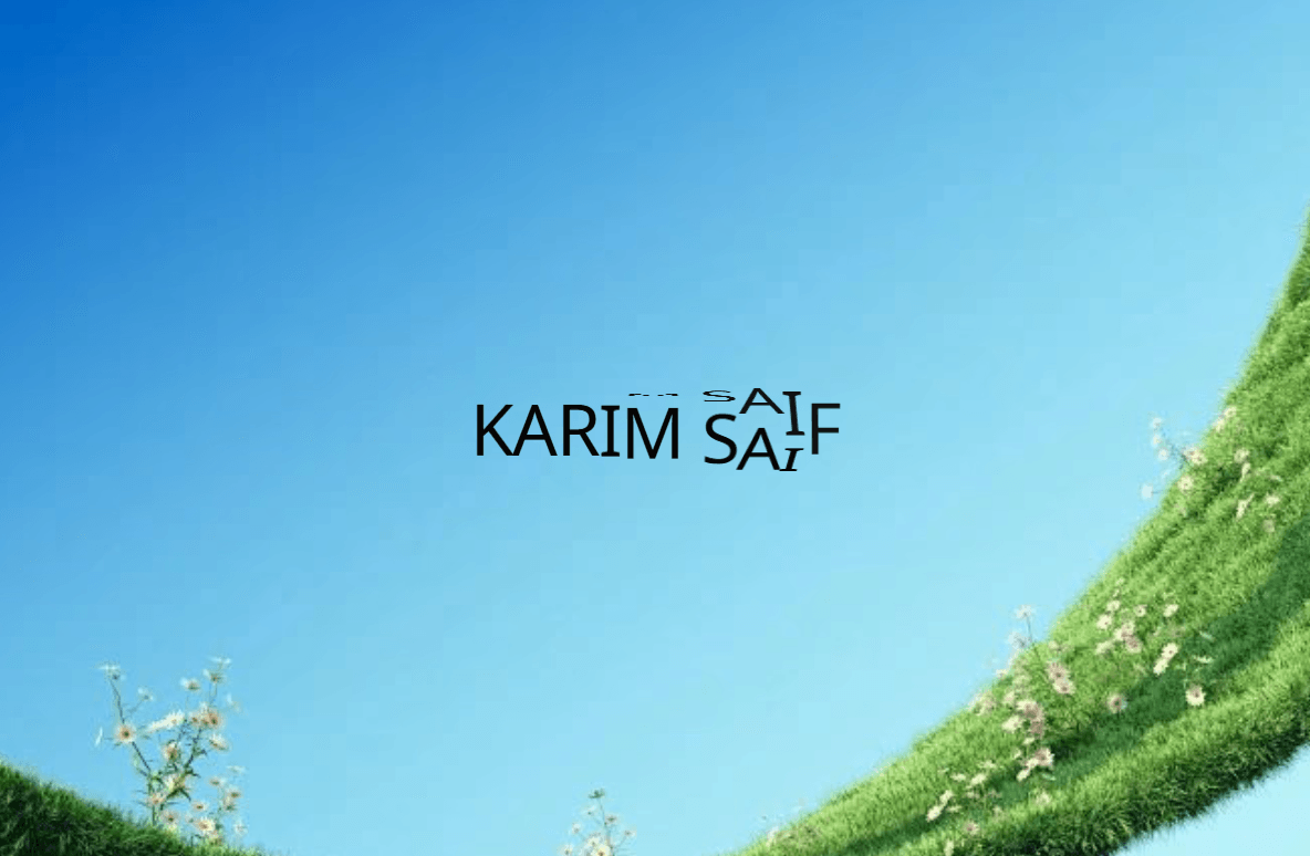
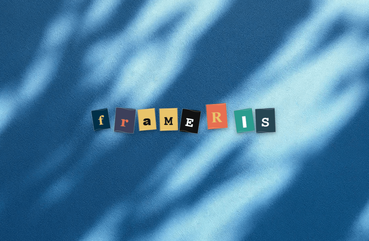
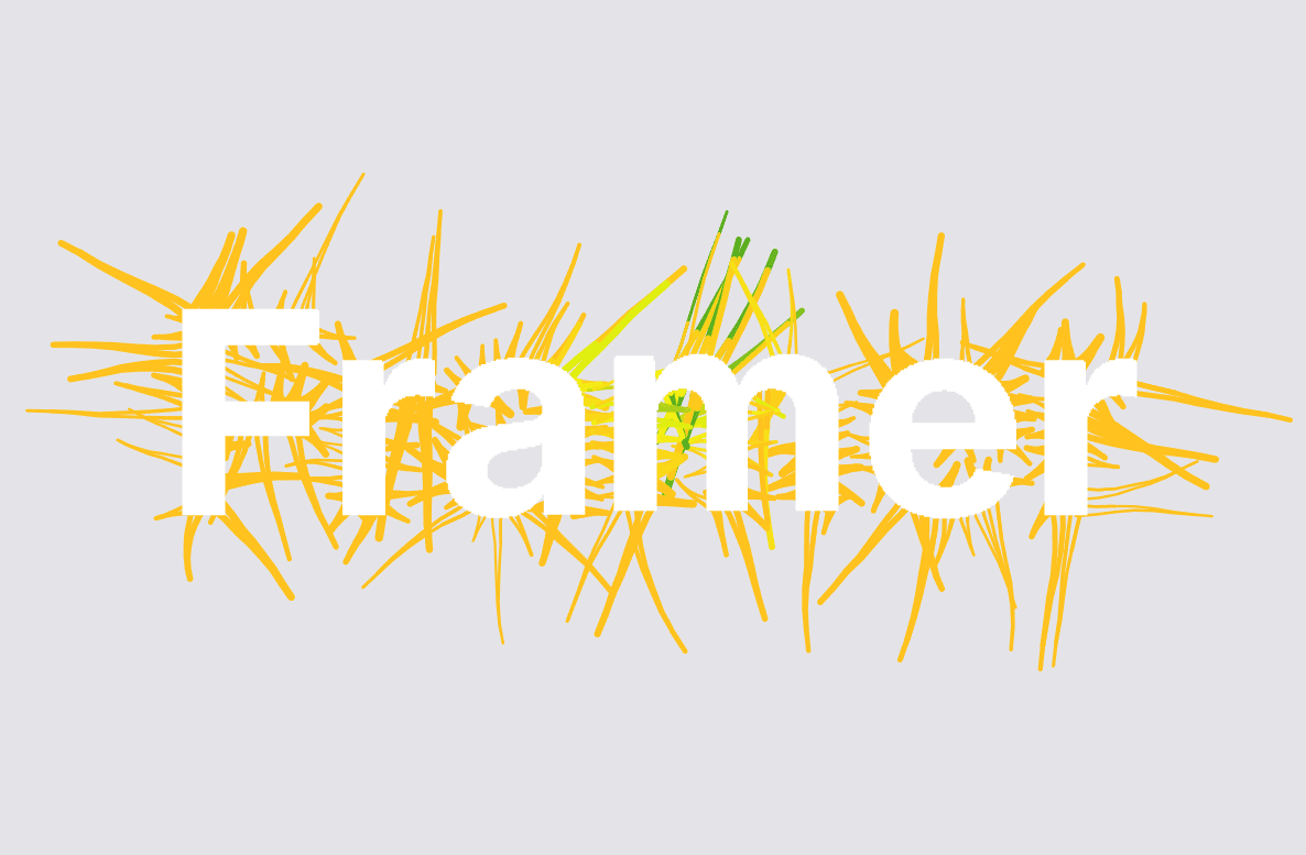
Text Stagger is a flexible, character-based typography interaction component for Framer that transforms ordinary text into an engaging animated experience. Instead of moving an entire text layer at once, the component splits the content into individual grapheme-safe characters and animates each character with a customizable staggered transition.
Text Stagger Typography is especially useful for designers who want subtle but expressive typography interactions without creating complicated animations from scratch.
Create interactive navigation links that respond beautifully when visitors hover over them. Different entrance and exit directions can make menus feel more dynamic while maintaining a clean visual hierarchy.
Add personality to primary and secondary calls-to-action. The character-by-character transition makes buttons feel responsive and interactive without requiring heavy visual effects.
Use staggered typography to create memorable interactions throughout a creative portfolio. It works particularly well for project titles, navigation, category filters, and personal branding.
Choose from six different animation styles for both the outgoing and incoming text:
Top — Characters move vertically from above.
Bottom — Characters move vertically from below.
Left — Characters enter or leave from the left.
Right — Characters enter or leave from the right.
Zoom — Characters scale into or out of view.
Blur — Characters transition through a configurable blur effect.
Support
If you have questions, find a bug, need help customizing the component, or have an idea for a future improvement, feel free to reach out.
Created by @Karim Saif
Email: karimsaif010@gmail.com

Text Stagger is a flexible, character-based typography interaction component for Framer that transforms ordinary text into an engaging animated experience. Instead of moving an entire text layer at once, the component splits the content into individual grapheme-safe characters and animates each character with a customizable staggered transition.
Text Stagger Typography is especially useful for designers who want subtle but expressive typography interactions without creating complicated animations from scratch.
Create interactive navigation links that respond beautifully when visitors hover over them. Different entrance and exit directions can make menus feel more dynamic while maintaining a clean visual hierarchy.
Add personality to primary and secondary calls-to-action. The character-by-character transition makes buttons feel responsive and interactive without requiring heavy visual effects.
Use staggered typography to create memorable interactions throughout a creative portfolio. It works particularly well for project titles, navigation, category filters, and personal branding.
Choose from six different animation styles for both the outgoing and incoming text:
Top — Characters move vertically from above.
Bottom — Characters move vertically from below.
Left — Characters enter or leave from the left.
Right — Characters enter or leave from the right.
Zoom — Characters scale into or out of view.
Blur — Characters transition through a configurable blur effect.
Support
If you have questions, find a bug, need help customizing the component, or have an idea for a future improvement, feel free to reach out.
Created by @Karim Saif
Email: karimsaif010@gmail.com