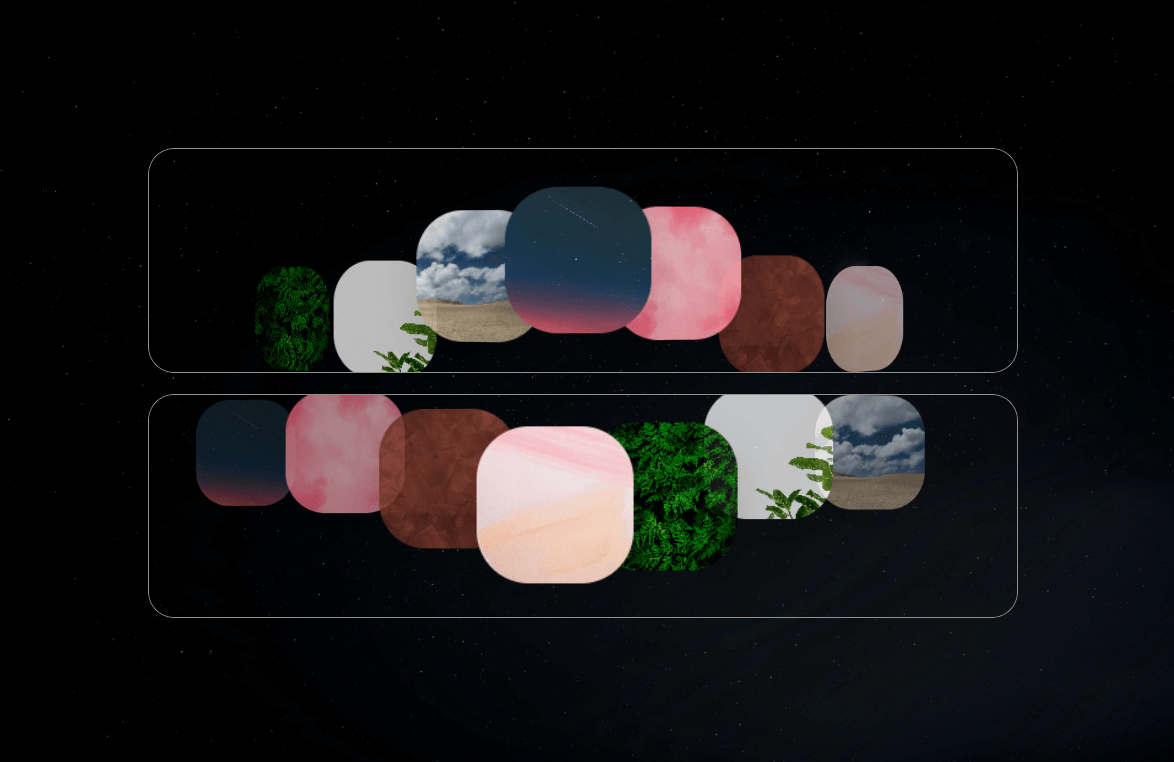
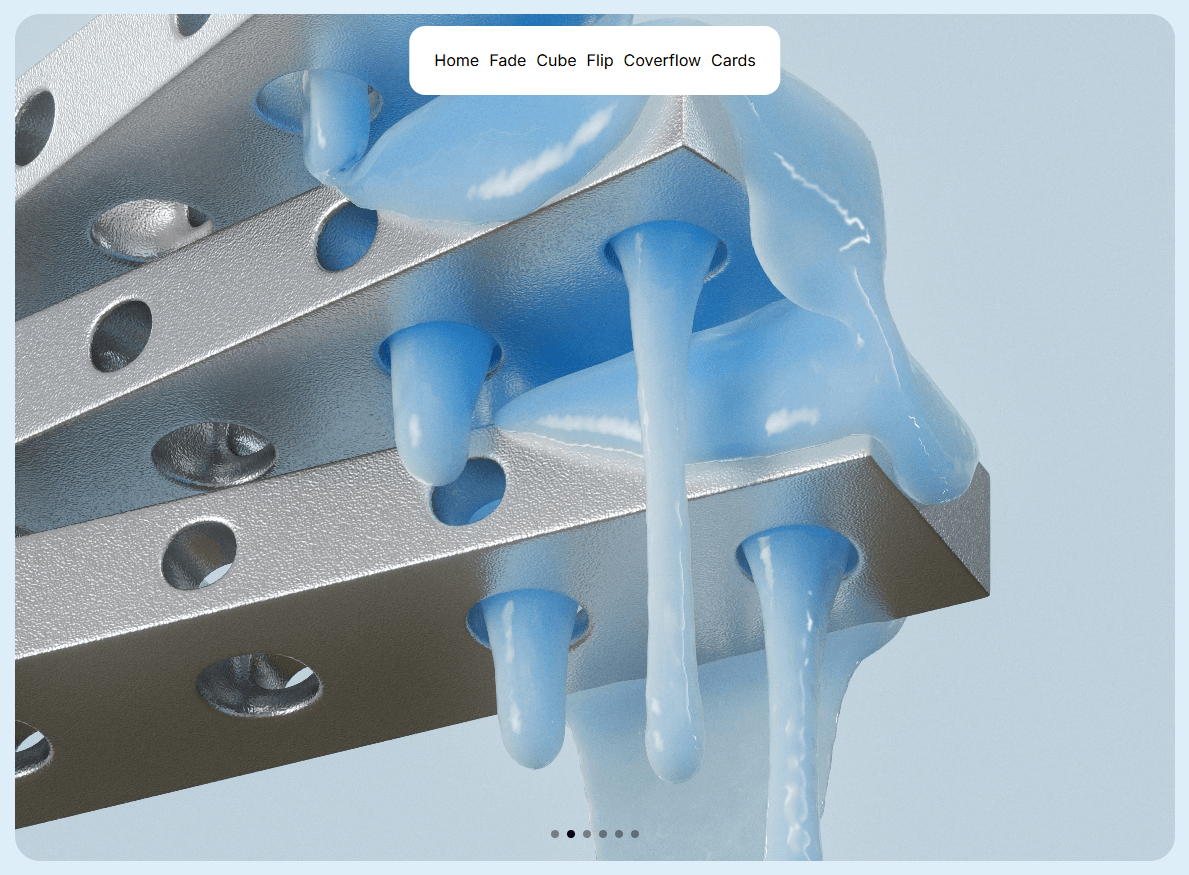
Thumbnail Slider is a flexible, highly interactive media showcase component for Framer. Featuring an overlay thumbnail navigation gallery, it supports both vertical and horizontal layouts, touch drag gestures, optimized image preloading, and property controls.
Dual Overlay Orientations: Switch between a right-side vertical thumbnail gallery and a bottom-aligned horizontal gallery.
Smart Auto-Scrolling Thumbnails: Active thumbnail previews automatically scroll into view as slides navigate.
Touch & Drag Swipe Gestures: Built-in gesture engine supporting directional swipe navigation across mobile and desktop.
Autoplay & Pause Logic: Automatic slide cycling with configurable delays, pause-on-hover, and pause-on-focus.
Adjacent Image Preloading: Background preloading for adjacent slides to deliver instant transitions.
Accessible Architecture: Includes ARIA live region updates for screen readers, keyboard focus handling, and per-slide alt text.
Content
Slides: Array list to upload images and set individual accessibility alt text.
Layout
Orientation: Choose between Vertical (right-aligned overlay) and Horizontal (bottom-aligned overlay).
Aspect Ratio: Toggle to enforce a locked width-to-height ratio on the container.
Ratio: Numerical value defining the aspect ratio (e.g., 1.77 for 16:9).
Thumb Size: Dimensions for thumbnail preview buttons (40px to 120px).
Behavior
Autoplay: Enables automated slide transitions.
Delay (ms): Time interval between slide updates.
Infinite Loop: Restarts playback from the first slide after reaching the end.
Pause Hover: Pauses transitions while hovering over the component.
Pause Focus: Pauses transitions while interactive focus is inside the slider.
Style & Accessibility
Radius: Corner rounding applied to the main container.
Aria Label: Accessibility description for screen readers.
For support, feedback, or feature requests:
X / Twitter: @Karim Saif
Email: hello@karimsaif.com

Thumbnail Slider is a flexible, highly interactive media showcase component for Framer. Featuring an overlay thumbnail navigation gallery, it supports both vertical and horizontal layouts, touch drag gestures, optimized image preloading, and property controls.
Dual Overlay Orientations: Switch between a right-side vertical thumbnail gallery and a bottom-aligned horizontal gallery.
Smart Auto-Scrolling Thumbnails: Active thumbnail previews automatically scroll into view as slides navigate.
Touch & Drag Swipe Gestures: Built-in gesture engine supporting directional swipe navigation across mobile and desktop.
Autoplay & Pause Logic: Automatic slide cycling with configurable delays, pause-on-hover, and pause-on-focus.
Adjacent Image Preloading: Background preloading for adjacent slides to deliver instant transitions.
Accessible Architecture: Includes ARIA live region updates for screen readers, keyboard focus handling, and per-slide alt text.
Content
Slides: Array list to upload images and set individual accessibility alt text.
Layout
Orientation: Choose between Vertical (right-aligned overlay) and Horizontal (bottom-aligned overlay).
Aspect Ratio: Toggle to enforce a locked width-to-height ratio on the container.
Ratio: Numerical value defining the aspect ratio (e.g., 1.77 for 16:9).
Thumb Size: Dimensions for thumbnail preview buttons (40px to 120px).
Behavior
Autoplay: Enables automated slide transitions.
Delay (ms): Time interval between slide updates.
Infinite Loop: Restarts playback from the first slide after reaching the end.
Pause Hover: Pauses transitions while hovering over the component.
Pause Focus: Pauses transitions while interactive focus is inside the slider.
Style & Accessibility
Radius: Corner rounding applied to the main container.
Aria Label: Accessibility description for screen readers.
For support, feedback, or feature requests:
X / Twitter: @Karim Saif
Email: hello@karimsaif.com