LUMINA — Editorial Portfolio for Creative Directors
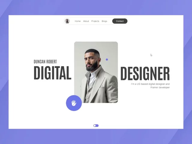
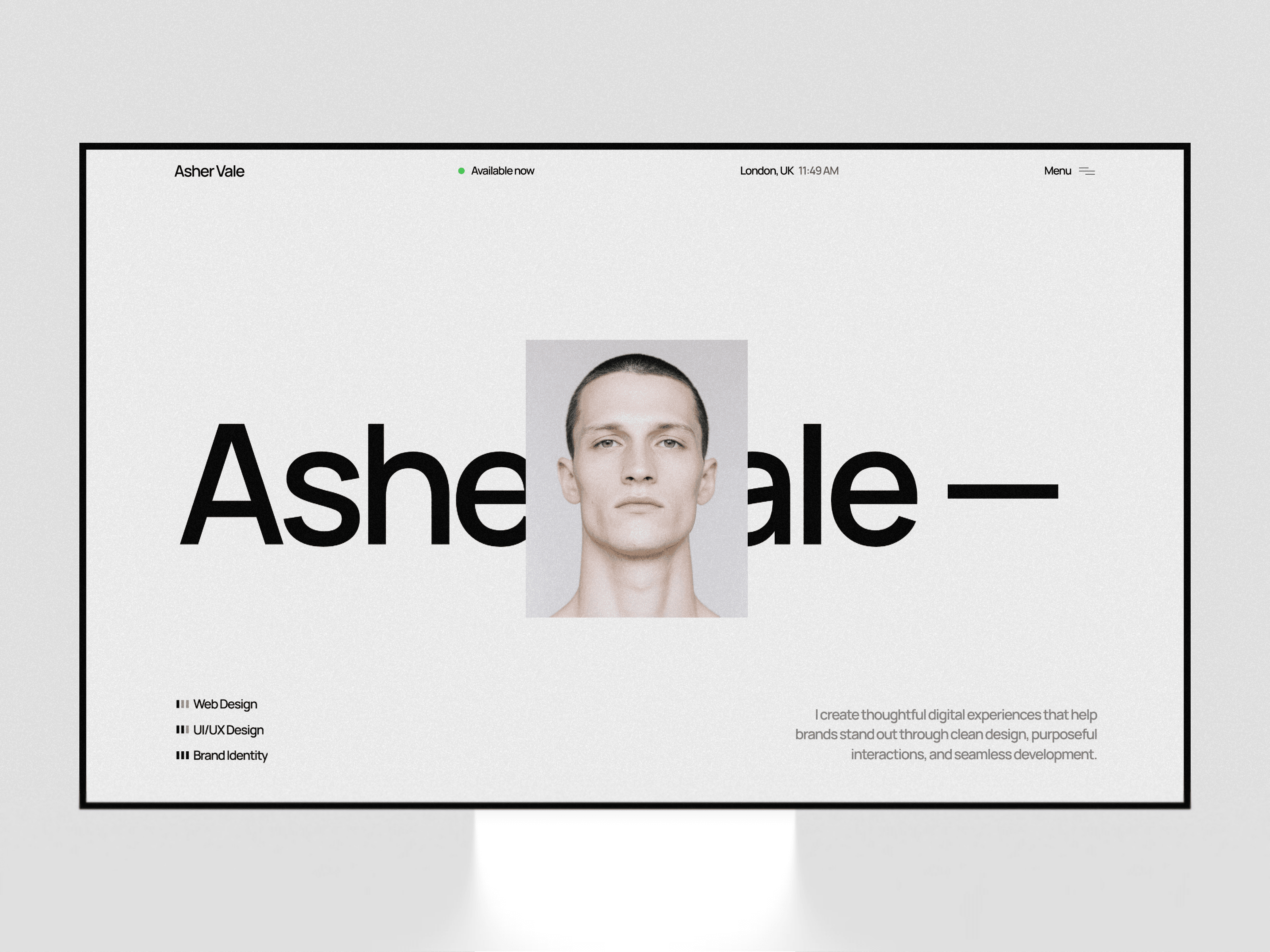
A bold, editorial-style portfolio template built for creative directors, brand strategists, and design studios who want their work to feel like a statement, not a resume. The homepage opens with a full-bleed, high-contrast hero image paired with oversized kinetic typography, immediately setting a confident, magazine-like tone.
The site is structured around three core sections: a Services block that breaks down offerings (brand identity, web design/development, art direction) in a clean numbered list; a Portfolio grid that showcases case studies with large imagery and short, evocative titles; and a Testimonials carousel with rotating client photos and quotes to build credibility.
Typography leans heavy and expressive, balanced against generous white space and monochrome/black-and-white photography for a polished, high-fashion editorial feel. Dedicated About and Contact pages round out the structure, with a sticky call-to-action ("Get in touch") keeping conversion front and center throughout the scroll.
Everything is built with Framer's native components and property controls, so users can swap copy, imagery, and branding without touching code — while still preserving the sharp, art-directed layout underneath.
Bonus: There are two extra components included on the Resources Design page that may prove useful for further customization.

LUMINA — Editorial Portfolio for Creative Directors
A bold, editorial-style portfolio template built for creative directors, brand strategists, and design studios who want their work to feel like a statement, not a resume. The homepage opens with a full-bleed, high-contrast hero image paired with oversized kinetic typography, immediately setting a confident, magazine-like tone.
The site is structured around three core sections: a Services block that breaks down offerings (brand identity, web design/development, art direction) in a clean numbered list; a Portfolio grid that showcases case studies with large imagery and short, evocative titles; and a Testimonials carousel with rotating client photos and quotes to build credibility.
Typography leans heavy and expressive, balanced against generous white space and monochrome/black-and-white photography for a polished, high-fashion editorial feel. Dedicated About and Contact pages round out the structure, with a sticky call-to-action ("Get in touch") keeping conversion front and center throughout the scroll.
Everything is built with Framer's native components and property controls, so users can swap copy, imagery, and branding without touching code — while still preserving the sharp, art-directed layout underneath.
Bonus: There are two extra components included on the Resources Design page that may prove useful for further customization.