Arc — Editorial Wealth Management Template
A ledger-inspired, documentary-style Framer template for financial, advisory, and professional-services brands who want to look considered rather than corporate.
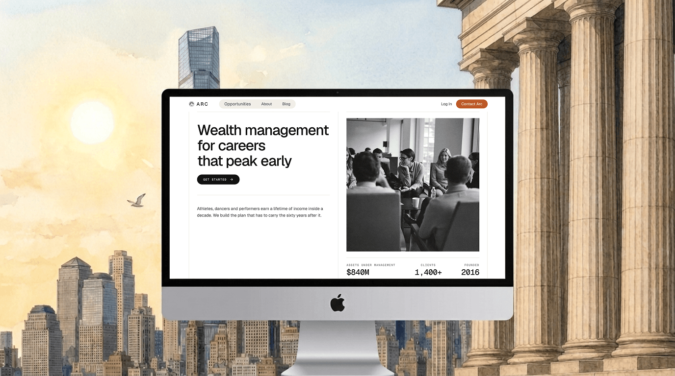
Arc is built around a distinctive "ledger" design system — thin rule lines, bordered grid sections, warm paper tones, and hand-set typography that reads like a well-kept archive, not a typical SaaS landing page. Every choice reinforces one idea: precision over hype. No stock-photo heroes, no gradient blobs — just clean rules, considered spacing, and engraving-style illustrations doing the work glossy imagery usually does.
8 responsive pages (Desktop, Tablet, Phone):
Home — hero, proof section, pricing comparison, advisor grid, CMS case-study cards, closing CTA
About — narrative sections, hand-drawn illustrations, team grid, timeline
Opportunities — services in a segmented bento grid with ledger dividers
Blog — CMS card grid with a full-bleed library-spread hero
Blog Article — large-format title, centered artwork, back-to-index nav
Login — looping video background with a centered auth card
Contact — full-viewport video, floating lead form, working submit
404 — on-brand illustrated error page
2 live CMS collections (Case Studies, Articles) with real schema — title, slug, summary, category, cover, rich text — ready for your content.
Reusable components: shared Button with gesture hover states, Case Study Card, Article Card, and synced Nav/Footer template.
Design system:
Type: Geist + Geist Mono, full preset scale across breakpoints
Color: warm paper/cream/ink with one deliberate accent
Icons: hand-drawn Streamline Freehand
Motion: subtle, physics-based hover — no bouncy defaults
Good for: wealth management, RIAs, advisors, insurance, accounting and legal — any brand whose pitch is "we're careful with something that matters.

Arc — Editorial Wealth Management Template
A ledger-inspired, documentary-style Framer template for financial, advisory, and professional-services brands who want to look considered rather than corporate.
Arc is built around a distinctive "ledger" design system — thin rule lines, bordered grid sections, warm paper tones, and hand-set typography that reads like a well-kept archive, not a typical SaaS landing page. Every choice reinforces one idea: precision over hype. No stock-photo heroes, no gradient blobs — just clean rules, considered spacing, and engraving-style illustrations doing the work glossy imagery usually does.
8 responsive pages (Desktop, Tablet, Phone):
Home — hero, proof section, pricing comparison, advisor grid, CMS case-study cards, closing CTA
About — narrative sections, hand-drawn illustrations, team grid, timeline
Opportunities — services in a segmented bento grid with ledger dividers
Blog — CMS card grid with a full-bleed library-spread hero
Blog Article — large-format title, centered artwork, back-to-index nav
Login — looping video background with a centered auth card
Contact — full-viewport video, floating lead form, working submit
404 — on-brand illustrated error page
2 live CMS collections (Case Studies, Articles) with real schema — title, slug, summary, category, cover, rich text — ready for your content.
Reusable components: shared Button with gesture hover states, Case Study Card, Article Card, and synced Nav/Footer template.
Design system:
Type: Geist + Geist Mono, full preset scale across breakpoints
Color: warm paper/cream/ink with one deliberate accent
Icons: hand-drawn Streamline Freehand
Motion: subtle, physics-based hover — no bouncy defaults
Good for: wealth management, RIAs, advisors, insurance, accounting and legal — any brand whose pitch is "we're careful with something that matters.