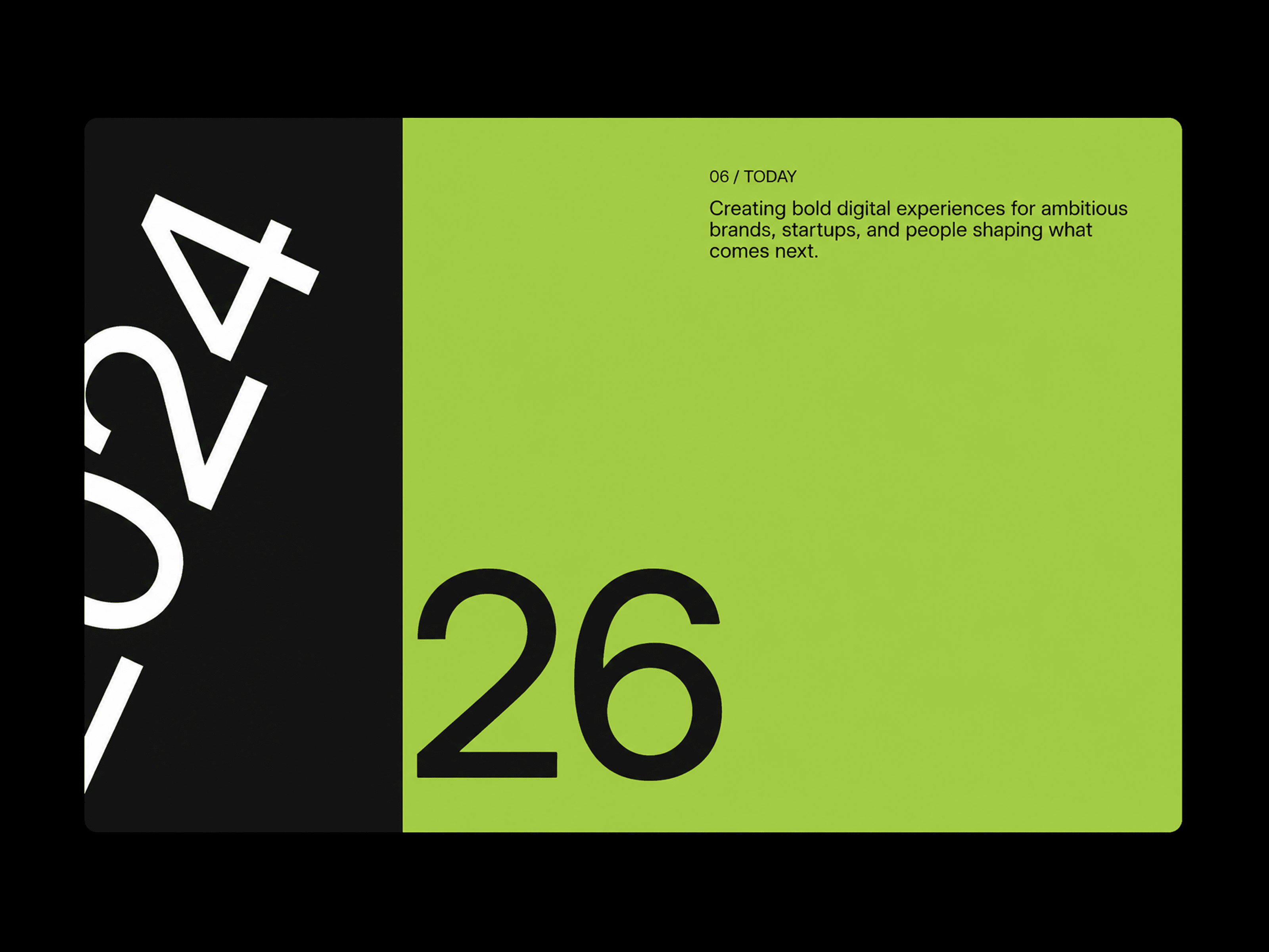
Accordion Panels is an interactive Framer code component designed to showcase categories, services, features, or content groups through a smooth expandable pill-based layout. One panel stays open while the others collapse into narrow vertical pills. Clicking any pill smoothly expands it while collapsing the previously active panel, creating a clean and engaging interaction.
Expand any panel with a simple click.
Keep one panel expanded while the remaining panels collapse into compact pills.
Animate panel width and height precisely without stretching text or images.
Expanded content smoothly enters from the direction the panel was clicked.
Collapsed labels rotate vertically for a compact, editorial-style layout.
Automatically switches to a stacked layout on smaller screens.
Keyboard accessible with Enter and Space controls.
Animations are disabled in the Framer Canvas and during export for clean static rendering.
Pill Panels includes Framer property controls for panels, content, colors, typography, spacing, sizing, imagery, corner radius, and animation behavior.
Panels — Add, remove, and reorder panels.
Content — Edit labels, headings, descriptions, and images.
Colors — Set individual background and text colors for every panel.
Typography — Customize label, heading, and description fonts.
Layout — Adjust panel gap, collapsed pill size, padding, and responsive breakpoint.
Images — Control image size, aspect ratio, corner radius, and spacing.
Shape — Use automatic pill-shaped corners or set a custom collapsed radius.
Animation — Customize transition type, duration, easing, and content delay.
Description — Control the maximum width of supporting text.

Accordion Panels is an interactive Framer code component designed to showcase categories, services, features, or content groups through a smooth expandable pill-based layout. One panel stays open while the others collapse into narrow vertical pills. Clicking any pill smoothly expands it while collapsing the previously active panel, creating a clean and engaging interaction.
Expand any panel with a simple click.
Keep one panel expanded while the remaining panels collapse into compact pills.
Animate panel width and height precisely without stretching text or images.
Expanded content smoothly enters from the direction the panel was clicked.
Collapsed labels rotate vertically for a compact, editorial-style layout.
Automatically switches to a stacked layout on smaller screens.
Keyboard accessible with Enter and Space controls.
Animations are disabled in the Framer Canvas and during export for clean static rendering.
Pill Panels includes Framer property controls for panels, content, colors, typography, spacing, sizing, imagery, corner radius, and animation behavior.
Panels — Add, remove, and reorder panels.
Content — Edit labels, headings, descriptions, and images.
Colors — Set individual background and text colors for every panel.
Typography — Customize label, heading, and description fonts.
Layout — Adjust panel gap, collapsed pill size, padding, and responsive breakpoint.
Images — Control image size, aspect ratio, corner radius, and spacing.
Shape — Use automatic pill-shaped corners or set a custom collapsed radius.
Animation — Customize transition type, duration, easing, and content delay.
Description — Control the maximum width of supporting text.