About Component
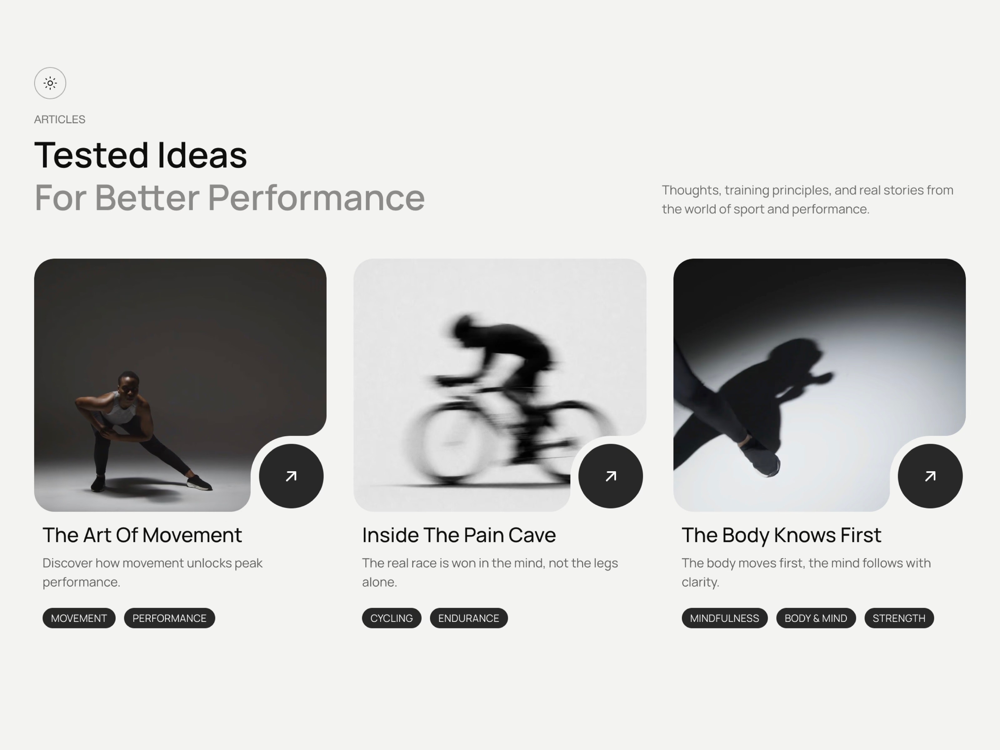
BlogArticleCards is a theme-aware blog and article card grid for Framer. Each card pairs a photo or looping video with a signature quarter-circle notch button in the corner, a real clickable headline, a short summary, and up to three color-coded category tags. Flip instantly between light paper and dark glass themes with a built-in toggle, or lock in your own brand colors with Custom mode. Perfect for teams who want a polished, editorial-style listing without CSS.
Theme toggle — flip between light paper and dark glass instantly Signature notch corner button with an animated arrow link Supports image or looping video per card, your choice Up to three color-coded category tags per article Custom text color override per tag for full brand control Native Framer font controls for heading, title, tags and more Adjustable card and tag corner radius Eyebrow label and muted secondary heading line built in Optional heading description text alongside the title Fully responsive — auto-stacks on mobile and tablet Accessible by default — semantic article tags, real links, ARIA labels Ships with three ready-to-use demo articles and images Video autoplay pauses automatically off-screen for performance Works out of the box — no setup needed
Use Cases
Blog homepage & article listing pages
Magazine & editorial layouts
News & media publication sites
Agency blog & content hub sections
SaaS resource & guide libraries
Personal blog & writer portfolios
Sports & fitness content sites
Knowledge base & documentation intros
Newsletter & community platform pages
Podcast & video series showcase pages
Keywords
blog cards, article cards, blog grid, article grid, blog post card, framer blog component, notch card button, theme toggle cards, dark light mode cards, video card framer, image card, category tag cards, editorial card grid, magazine card layout, news card grid, content card framer, blog preview cards, article preview grid, responsive blog grid, accessible cards

About Component
BlogArticleCards is a theme-aware blog and article card grid for Framer. Each card pairs a photo or looping video with a signature quarter-circle notch button in the corner, a real clickable headline, a short summary, and up to three color-coded category tags. Flip instantly between light paper and dark glass themes with a built-in toggle, or lock in your own brand colors with Custom mode. Perfect for teams who want a polished, editorial-style listing without CSS.
Theme toggle — flip between light paper and dark glass instantly Signature notch corner button with an animated arrow link Supports image or looping video per card, your choice Up to three color-coded category tags per article Custom text color override per tag for full brand control Native Framer font controls for heading, title, tags and more Adjustable card and tag corner radius Eyebrow label and muted secondary heading line built in Optional heading description text alongside the title Fully responsive — auto-stacks on mobile and tablet Accessible by default — semantic article tags, real links, ARIA labels Ships with three ready-to-use demo articles and images Video autoplay pauses automatically off-screen for performance Works out of the box — no setup needed
Use Cases
Blog homepage & article listing pages
Magazine & editorial layouts
News & media publication sites
Agency blog & content hub sections
SaaS resource & guide libraries
Personal blog & writer portfolios
Sports & fitness content sites
Knowledge base & documentation intros
Newsletter & community platform pages
Podcast & video series showcase pages
Keywords
blog cards, article cards, blog grid, article grid, blog post card, framer blog component, notch card button, theme toggle cards, dark light mode cards, video card framer, image card, category tag cards, editorial card grid, magazine card layout, news card grid, content card framer, blog preview cards, article preview grid, responsive blog grid, accessible cards
 Ahmet Loca


