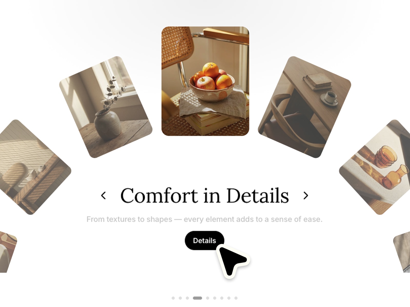
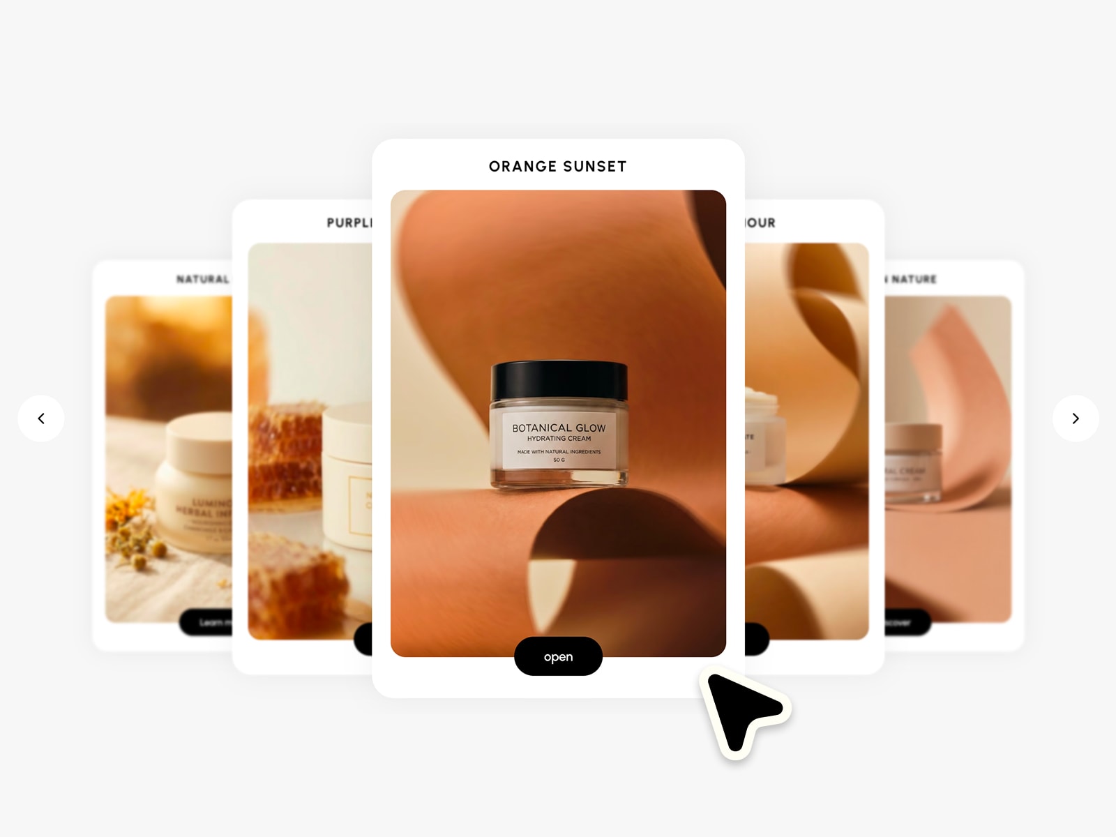
Create expressive image carousels with layered cards, smooth motion and natural interactions. Fully responsive, easy to customize and ready to use in seconds. Make it completely your own with flexible controls for layout, styling and motion :)
Easily adapt every part of the component to match your own brand and style.
Images ✦ Titles ✦ Subtitles ✦ Tags ✦ Links ✦ Headlines ✦ Typography ✦ Colors ✦ Card size ✦ Fan spread ✦ Rotation ✦ Scale ✦ Animation speed ✦ Drag & Scroll ✦ Per-device layout
Landing pages ✦ Product showcases ✦ Creative portfolios ✦ Editorial layouts ✦ Travel stories ✦ Brand presentations ✦ Case studies ✦ Image galleries
Optimized layouts for Desktop, Tablet and Mobile with smooth touch interactions.
Drag & swipe ✦ Scroll navigation ✦ Keyboard navigation ✦ Click to focus ✦ Optional links ✦ Hover animations ✦ Page indicators
https://decisive-reassurance-155626.framer.app
––––––––
❤ Thank you so much for your support! I genuinely appreciate every download. I hope you have fun customizing this component and making it your own. Happy building!

Create expressive image carousels with layered cards, smooth motion and natural interactions. Fully responsive, easy to customize and ready to use in seconds. Make it completely your own with flexible controls for layout, styling and motion :)
Easily adapt every part of the component to match your own brand and style.
Images ✦ Titles ✦ Subtitles ✦ Tags ✦ Links ✦ Headlines ✦ Typography ✦ Colors ✦ Card size ✦ Fan spread ✦ Rotation ✦ Scale ✦ Animation speed ✦ Drag & Scroll ✦ Per-device layout
Landing pages ✦ Product showcases ✦ Creative portfolios ✦ Editorial layouts ✦ Travel stories ✦ Brand presentations ✦ Case studies ✦ Image galleries
Optimized layouts for Desktop, Tablet and Mobile with smooth touch interactions.
Drag & swipe ✦ Scroll navigation ✦ Keyboard navigation ✦ Click to focus ✦ Optional links ✦ Hover animations ✦ Page indicators
https://decisive-reassurance-155626.framer.app
––––––––
❤ Thank you so much for your support! I genuinely appreciate every download. I hope you have fun customizing this component and making it your own. Happy building!