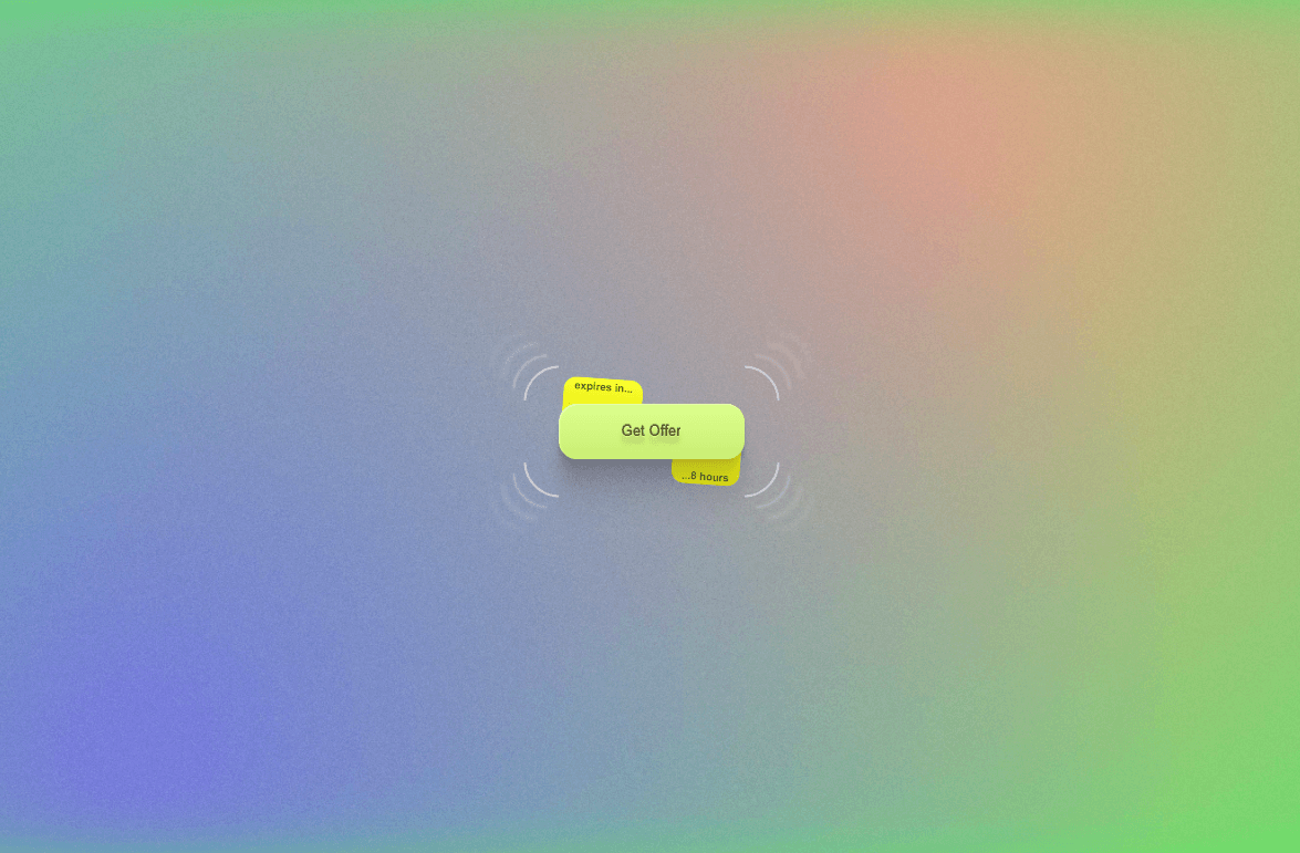
Drawer Offer Button is an eye-catching, highly interactive call-to-action component for Framer. Designed with dynamic top and bottom "drawer" popouts, reactive corner SVG accents, multi-layered depth shadows, and realistic press dynamics, it’s built to grab attention for promotional campaigns, limited-time deals, and high-converting landing pages.
Dual Drawer Reveal: On hover, top and bottom message badges slide out smoothly with subtle tilt transforms—ideal for micro-copy like "Expires in..." and "...8 hours".
Dynamic Corner Decorators: Four SVG corner accents expand outward on hover with custom color drop-shadows, framing the main action button.
Tactile Spring Physics: Features custom cubic-bezier transitions for hover scaling, dynamic layered box-shadows, and a responsive active/pressed compression feedback loop.
Full Accessibility & SSR Safety: Leverages useIsStaticRenderer to handle Canvas preview rendering seamlessly, complete with keyboard focus rings, custom ARIA labels, and explicit link/button state toggling.
All aspects are directly editable via Framer’s Property Panel:
Text & Links: Set custom text for the main CTA as well as the top and bottom drawers. Fully customizable links with optional "Open in New Tab" support.
Typography & Focus: Integrated Framer Font controls (family, weight, letter spacing) and a customizable keyboard focus ring color.
Colors & Shadows: Independent color controls for the main button, drawer badges, text fills, corner SVG accents, and multi-stage shadow opacity.
Made with 💛 by @Karim Saif

Drawer Offer Button is an eye-catching, highly interactive call-to-action component for Framer. Designed with dynamic top and bottom "drawer" popouts, reactive corner SVG accents, multi-layered depth shadows, and realistic press dynamics, it’s built to grab attention for promotional campaigns, limited-time deals, and high-converting landing pages.
Dual Drawer Reveal: On hover, top and bottom message badges slide out smoothly with subtle tilt transforms—ideal for micro-copy like "Expires in..." and "...8 hours".
Dynamic Corner Decorators: Four SVG corner accents expand outward on hover with custom color drop-shadows, framing the main action button.
Tactile Spring Physics: Features custom cubic-bezier transitions for hover scaling, dynamic layered box-shadows, and a responsive active/pressed compression feedback loop.
Full Accessibility & SSR Safety: Leverages useIsStaticRenderer to handle Canvas preview rendering seamlessly, complete with keyboard focus rings, custom ARIA labels, and explicit link/button state toggling.
All aspects are directly editable via Framer’s Property Panel:
Text & Links: Set custom text for the main CTA as well as the top and bottom drawers. Fully customizable links with optional "Open in New Tab" support.
Typography & Focus: Integrated Framer Font controls (family, weight, letter spacing) and a customizable keyboard focus ring color.
Colors & Shadows: Independent color controls for the main button, drawer badges, text fills, corner SVG accents, and multi-stage shadow opacity.
Made with 💛 by @Karim Saif