GitHub Contribution Calendar for Framer
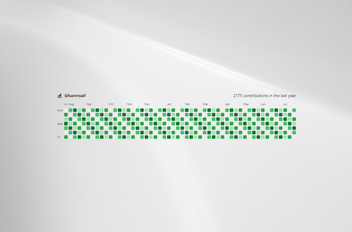
A highly customizable, production-ready React component designed specifically for Framer. Display live GitHub activity, mock sample data, or custom static datasets with complete visual control directly from the Framer canvas property panel.
Live GitHub API Integration: Stream live contribution graphs directly from any public GitHub profile with built-in API debouncing, cancellation, and graceful fallback handling.
Sample & Manual Modes: Test layout designs effortlessly using built-in deterministic sample data or pass structured custom contribution arrays directly.
Pre-built Aesthetic Variants: Choose from default, minimal, city-lights, glass, neon, outline, soft, dots, aurora, cyberpunk, terminal, apple-vision, and liquid-glass.
Preset & Custom Color Schemes: Includes standard GitHub color scales (green, blue, purple, orange, gray) alongside custom 5-level hex/RGBA color picker overrides.
Custom Cell Geometries: Instantly toggle grid shapes between rounded, square, circle, squircle, and dots.
Flexible Sizing & Spacing: Adjust cell dimensions, grid gaps, glow radius intensities, and container width behaviors (fill or hug).
Header & Labels Axis Controls: Hide or display headers, total contribution counters, user icons, month labels, and weekday markers (Mon, Wed, Fri).
Interactive Tooltips & Accessibility: Native tooltips position dynamically on mouse hover, paired with ARIA grid attributes (role="grid", aria-label) and standard keyboard navigation (Tab, Enter, Space).
Made with 💛 by @Karim Saif

GitHub Contribution Calendar for Framer
A highly customizable, production-ready React component designed specifically for Framer. Display live GitHub activity, mock sample data, or custom static datasets with complete visual control directly from the Framer canvas property panel.
Live GitHub API Integration: Stream live contribution graphs directly from any public GitHub profile with built-in API debouncing, cancellation, and graceful fallback handling.
Sample & Manual Modes: Test layout designs effortlessly using built-in deterministic sample data or pass structured custom contribution arrays directly.
Pre-built Aesthetic Variants: Choose from default, minimal, city-lights, glass, neon, outline, soft, dots, aurora, cyberpunk, terminal, apple-vision, and liquid-glass.
Preset & Custom Color Schemes: Includes standard GitHub color scales (green, blue, purple, orange, gray) alongside custom 5-level hex/RGBA color picker overrides.
Custom Cell Geometries: Instantly toggle grid shapes between rounded, square, circle, squircle, and dots.
Flexible Sizing & Spacing: Adjust cell dimensions, grid gaps, glow radius intensities, and container width behaviors (fill or hug).
Header & Labels Axis Controls: Hide or display headers, total contribution counters, user icons, month labels, and weekday markers (Mon, Wed, Fri).
Interactive Tooltips & Accessibility: Native tooltips position dynamically on mouse hover, paired with ARIA grid attributes (role="grid", aria-label) and standard keyboard navigation (Tab, Enter, Space).
Made with 💛 by @Karim Saif