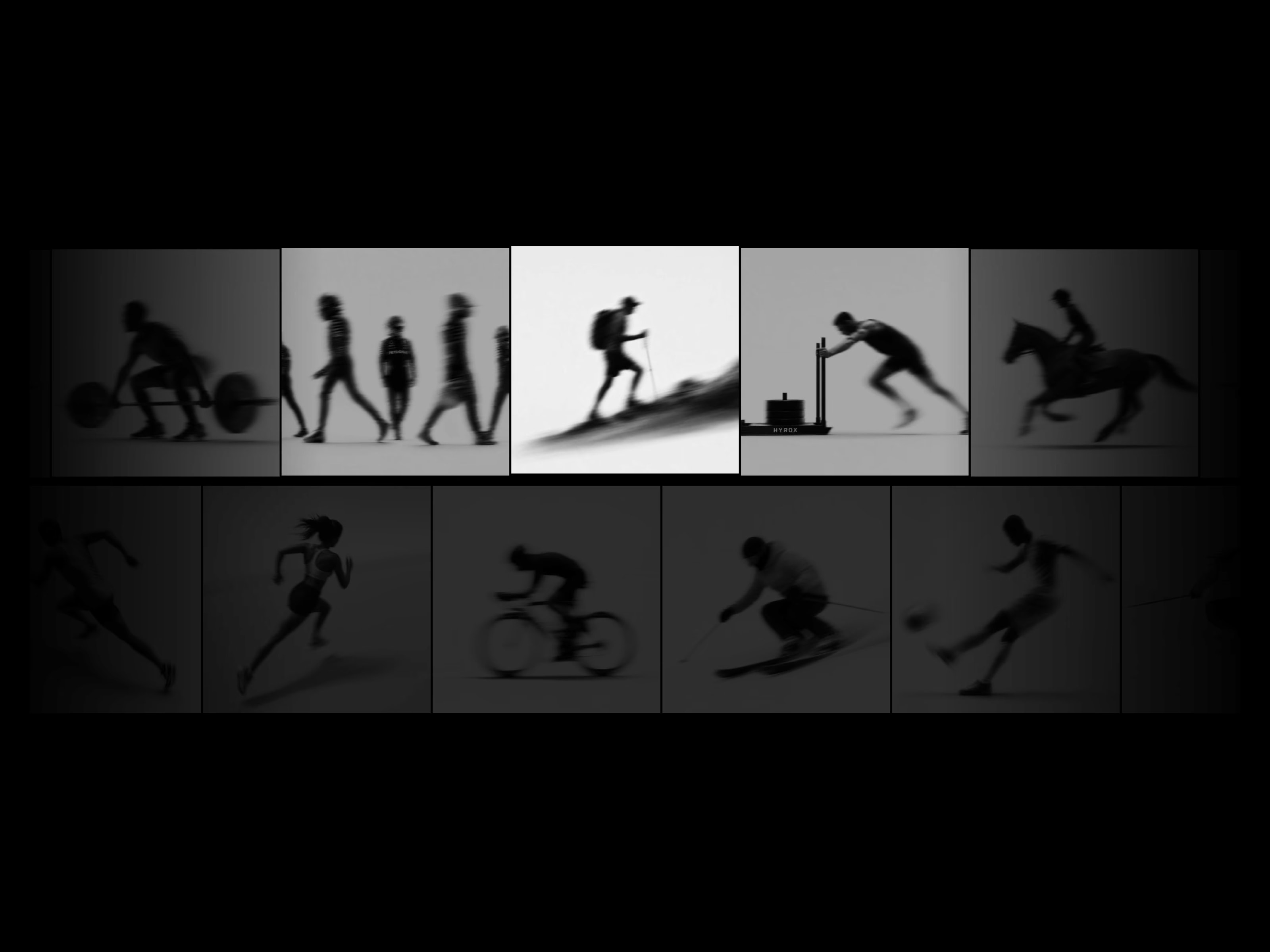
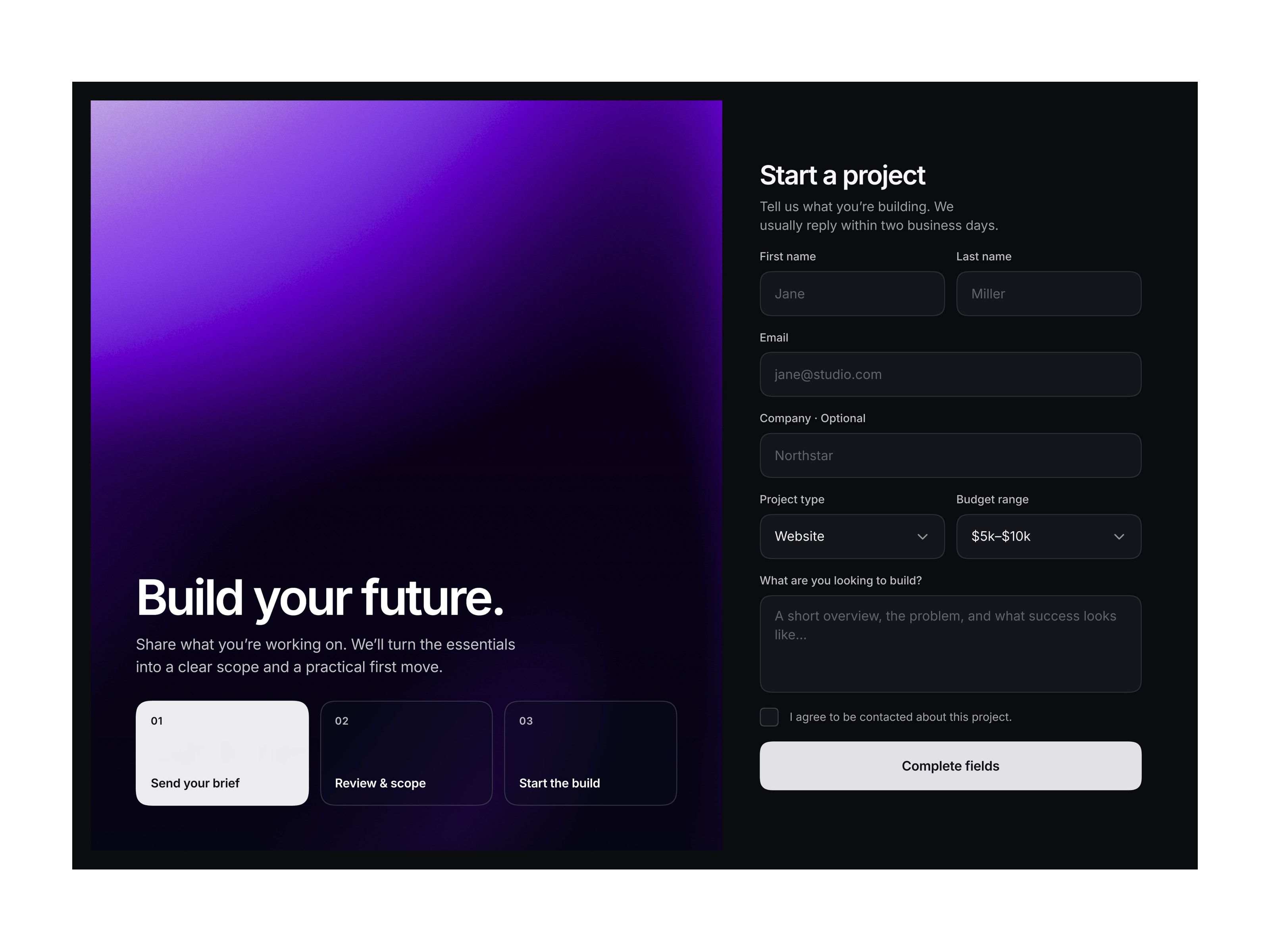
Create a striking first impression with the Hero Feature Tabs component. Designed specifically for wide layouts and hero sections, this component utilizes a beautiful 3-column structure: a bold main title on the left, rich media (images or videos) with descriptions in the center, and a clean, interactive tab list on the right.
It is engineered for storytelling. The component features intelligent auto-rotation, automatically cycling through your tabs. If you use a video, it smartly syncs the rotation timer with the video's actual duration. It is completely responsive; when the screen hits your defined Mobile Breakpoint, the 3-column layout gracefully collapses into a stacked, mobile-friendly vertical design. With exhaustive controls over padding, typography, colors, and corner radii, it integrates flawlessly into any modern SaaS or agency website.
Functions (Key Features):
📐 3-Column Layout: A professional structure separating the section title, media showcase, and tab navigation.
🎥 Smart Video Sync: Mix images and videos. The auto-rotation timer automatically adapts to match the length of any playing video.
📱 Responsive Design: Automatically transforms from a horizontal 3-column layout to a stacked vertical layout on mobile devices.
📏 Width Control: Dial in the exact percentage width for the Left (Title) and Right (Tabs) columns to perfect your layout.
🎨 Deep Customization: Control everything from the active/inactive tab colors to the inner padding and border radius of the media box.

Create a striking first impression with the Hero Feature Tabs component. Designed specifically for wide layouts and hero sections, this component utilizes a beautiful 3-column structure: a bold main title on the left, rich media (images or videos) with descriptions in the center, and a clean, interactive tab list on the right.
It is engineered for storytelling. The component features intelligent auto-rotation, automatically cycling through your tabs. If you use a video, it smartly syncs the rotation timer with the video's actual duration. It is completely responsive; when the screen hits your defined Mobile Breakpoint, the 3-column layout gracefully collapses into a stacked, mobile-friendly vertical design. With exhaustive controls over padding, typography, colors, and corner radii, it integrates flawlessly into any modern SaaS or agency website.
Functions (Key Features):
📐 3-Column Layout: A professional structure separating the section title, media showcase, and tab navigation.
🎥 Smart Video Sync: Mix images and videos. The auto-rotation timer automatically adapts to match the length of any playing video.
📱 Responsive Design: Automatically transforms from a horizontal 3-column layout to a stacked vertical layout on mobile devices.
📏 Width Control: Dial in the exact percentage width for the Left (Title) and Right (Tabs) columns to perfect your layout.
🎨 Deep Customization: Control everything from the active/inactive tab colors to the inner padding and border radius of the media box.