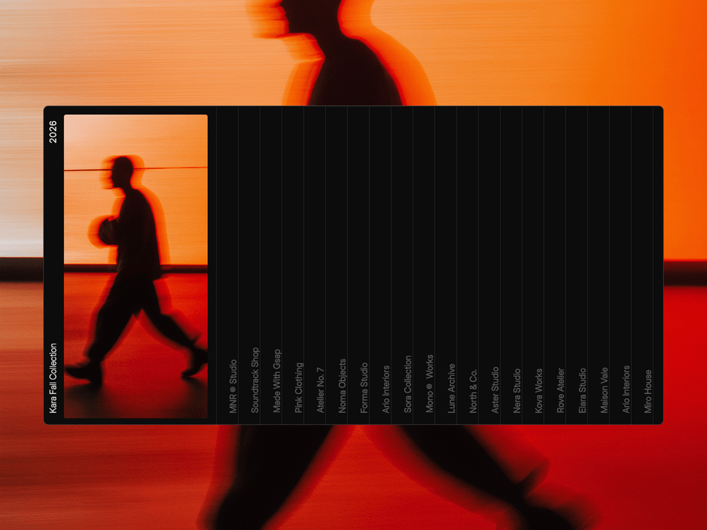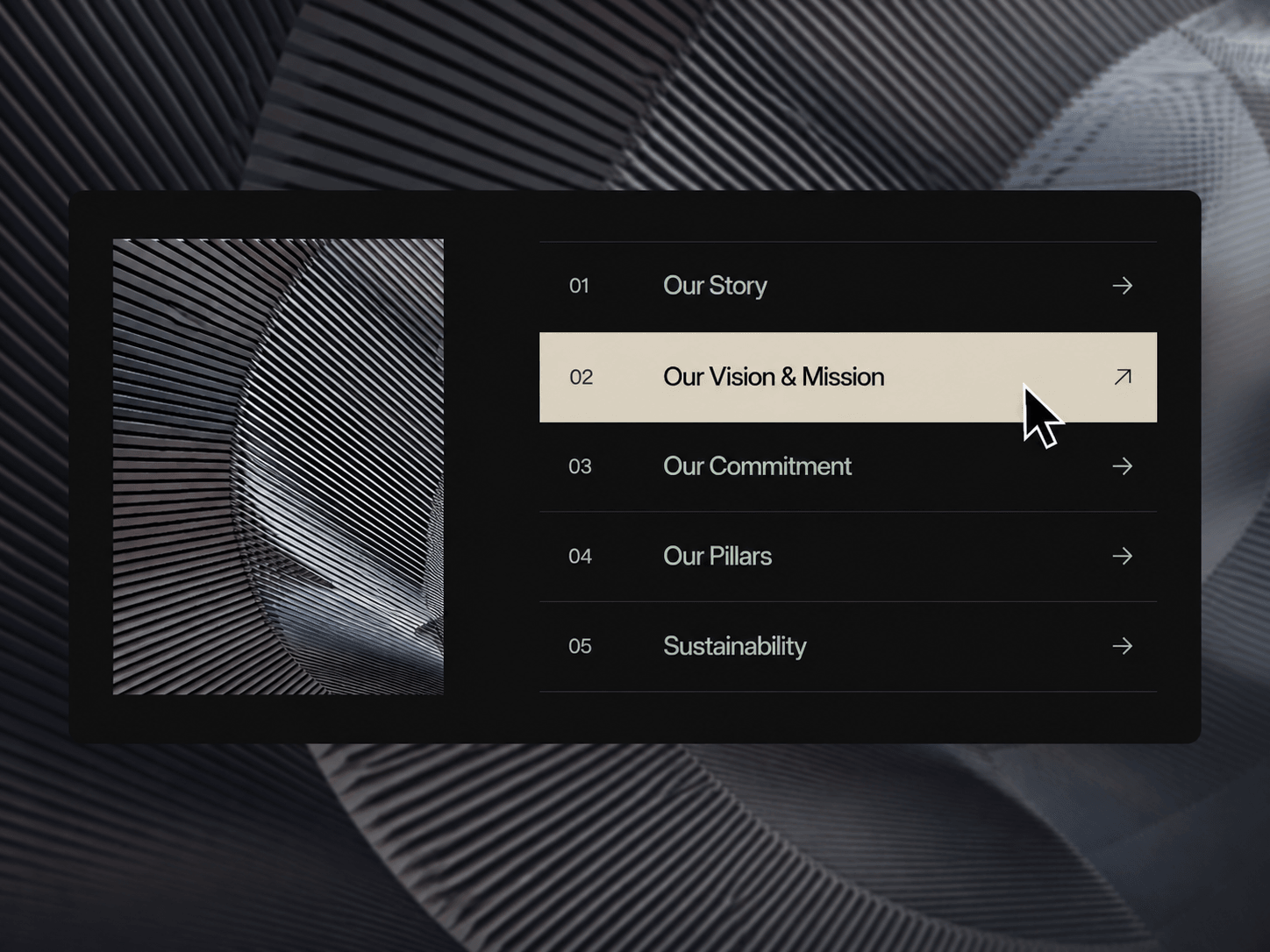
Flow Reveal Rows is a polished Framer component that pairs a structured list of content with a dynamic visual panel. As users move between rows, the shared highlight smoothly follows the active item while its corresponding image transitions into view. Each row can also include its own link and optional new-tab behavior.
Dynamic visual reveal for each row
Smooth shared active-row indicator
Directional image transitions
Upload images or use direct image URLs
Custom numbers, titles, and icons
Individual links with new-tab support
Fully responsive mobile layout
Custom mobile breakpoint
Touch-friendly mobile interaction
Static-renderer optimized for Framer
Custom hover and image transitions
Build the component around your brand with complete control over typography, spacing, colors, sizing, icons, image layout, borders, and animation behavior.
Row content, images, links, and numbering
Image width, height, radius, and spacing
Row height, padding, spacing, and number-to-title gap
Title and number typography
Background, text, active text, highlight, and divider colors
Icon style, weight, size, and rotation
Hover and image transition settings
Mobile breakpoint and responsive image height
Each row is connected to its own visual. Moving across the list activates the corresponding row, slides the shared highlight into position, and transitions the matching image into the preview area. The transition direction follows the user's movement through the list, creating a fluid, connected browsing experience. On mobile, the layout automatically switches to a stacked, touch-friendly experience.

Flow Reveal Rows is a polished Framer component that pairs a structured list of content with a dynamic visual panel. As users move between rows, the shared highlight smoothly follows the active item while its corresponding image transitions into view. Each row can also include its own link and optional new-tab behavior.
Dynamic visual reveal for each row
Smooth shared active-row indicator
Directional image transitions
Upload images or use direct image URLs
Custom numbers, titles, and icons
Individual links with new-tab support
Fully responsive mobile layout
Custom mobile breakpoint
Touch-friendly mobile interaction
Static-renderer optimized for Framer
Custom hover and image transitions
Build the component around your brand with complete control over typography, spacing, colors, sizing, icons, image layout, borders, and animation behavior.
Row content, images, links, and numbering
Image width, height, radius, and spacing
Row height, padding, spacing, and number-to-title gap
Title and number typography
Background, text, active text, highlight, and divider colors
Icon style, weight, size, and rotation
Hover and image transition settings
Mobile breakpoint and responsive image height
Each row is connected to its own visual. Moving across the list activates the corresponding row, slides the shared highlight into position, and transitions the matching image into the preview area. The transition direction follows the user's movement through the list, creating a fluid, connected browsing experience. On mobile, the layout automatically switches to a stacked, touch-friendly experience.