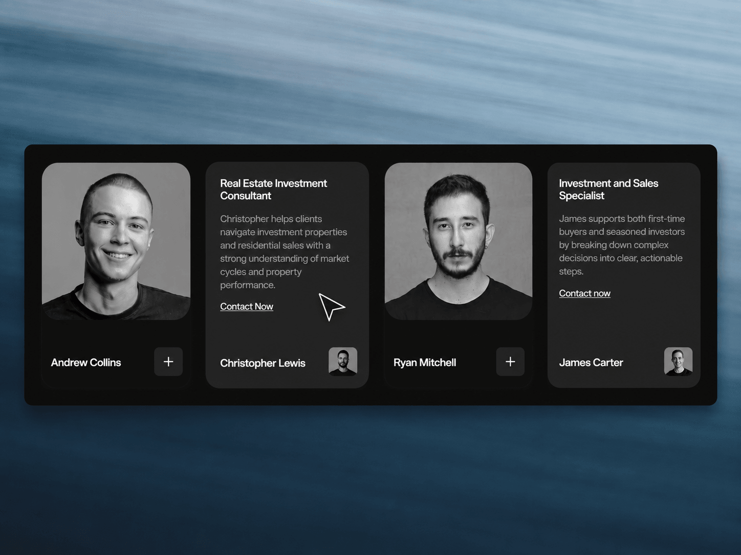
Click to reveal Carousel is an interactive Framer component for presenting team members, consultants, creators, or professionals in a clean, visual card layout. Users can drag through the profiles and click to open individual cards, making it easy to explore people without taking up unnecessary space.
Drag through profiles to explore different people.
Click a card to reveal the selected profile.
Smooth interactions designed for a polished browsing experience.
Compact layout that keeps multiple profiles organized.
Perfect for showcasing people alongside their roles and information.
Responsive interaction designed for modern Framer websites.
Profile Cards includes flexible controls to adapt the content and visual style to your brand, portfolio, or website.
Profiles — Add and edit names, roles, descriptions, and profile images.
Content — Customize profile information and CTA text.
Images — Replace profile photos with your own visuals.
Colors — Adjust backgrounds, text, buttons, and card colors.
Typography — Customize fonts, sizes, weights, and spacing.
Layout — Fine-tune card sizing, spacing, padding, and alignment.
Profile Cards displays a collection of profiles that visitors can drag through to browse. Clicking a profile opens its expanded content, allowing users to quickly explore each person while keeping the overall layout clean and interactive.

Click to reveal Carousel is an interactive Framer component for presenting team members, consultants, creators, or professionals in a clean, visual card layout. Users can drag through the profiles and click to open individual cards, making it easy to explore people without taking up unnecessary space.
Drag through profiles to explore different people.
Click a card to reveal the selected profile.
Smooth interactions designed for a polished browsing experience.
Compact layout that keeps multiple profiles organized.
Perfect for showcasing people alongside their roles and information.
Responsive interaction designed for modern Framer websites.
Profile Cards includes flexible controls to adapt the content and visual style to your brand, portfolio, or website.
Profiles — Add and edit names, roles, descriptions, and profile images.
Content — Customize profile information and CTA text.
Images — Replace profile photos with your own visuals.
Colors — Adjust backgrounds, text, buttons, and card colors.
Typography — Customize fonts, sizes, weights, and spacing.
Layout — Fine-tune card sizing, spacing, padding, and alignment.
Profile Cards displays a collection of profiles that visitors can drag through to browse. Clicking a profile opens its expanded content, allowing users to quickly explore each person while keeping the overall layout clean and interactive.
 Saqlain Nasir