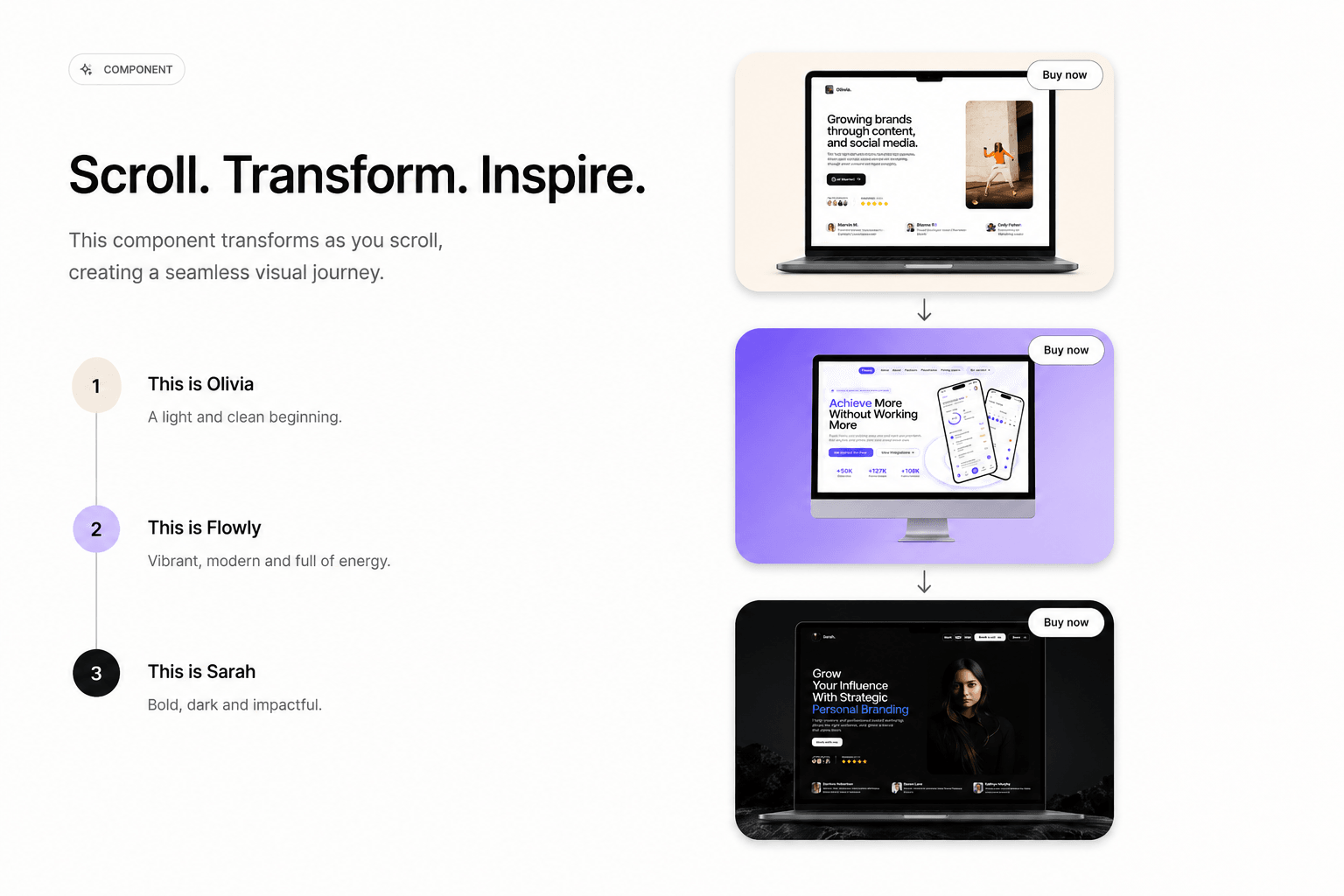
Scroll Showcase Card animates through multiple portfolio projects as the visitor scrolls — each with its own title, device-mockup image, and CTA badge linking out. Instead of a static card, it becomes a mini scrollytelling section: titles crossfade ("This is Olivia" → "This is Flowly" → "This is Sarah"), the mockup image swaps, and a floating "Buy now" CTA updates to link to that specific project.
Getting Started Remix the file, copy the whole stack (sticky container + scroll-triggers group), and paste it into your project. Edit each project's title, image, and CTA in the property panel — the animation keeps working since the trigger structure comes with it.
Great for agencies and freelancers who want a "featured work" section that feels alive, not a static row of thumbnails.
Key Features
3 built-in project slots, each with its own Title, Image, and CTA
Scroll-linked transitions — driven by scroll progress, not click/hover
Per-slot CTA tag text + link (each project can point to a different case study/URL)
Adjustable scroll breakpoints to control when each slot triggers
Smooth Framer Motion spring animations
Fully editable via property panel — no code needed
Works with light or dark image backgrounds
How It Works The package includes a pre-built layer structure — a sticky container holding the animated card, plus a Scroll-triggers group with 4 sections that drive the transitions.
Remix the file
Select the whole stack — Container (Sticky-container + Scroll animation component) plus Scroll-triggers — and copy it
Paste into your project's page
Edit each project's Title, Image, and CTA in the property panel
Resize trigger section heights to control how long each project stays on screen
Note: Copy the entire stack together, not just the inner card — the scroll-triggers drive the animation, so it won't work correctly on its own.

Scroll Showcase Card animates through multiple portfolio projects as the visitor scrolls — each with its own title, device-mockup image, and CTA badge linking out. Instead of a static card, it becomes a mini scrollytelling section: titles crossfade ("This is Olivia" → "This is Flowly" → "This is Sarah"), the mockup image swaps, and a floating "Buy now" CTA updates to link to that specific project.
Getting Started Remix the file, copy the whole stack (sticky container + scroll-triggers group), and paste it into your project. Edit each project's title, image, and CTA in the property panel — the animation keeps working since the trigger structure comes with it.
Great for agencies and freelancers who want a "featured work" section that feels alive, not a static row of thumbnails.
Key Features
3 built-in project slots, each with its own Title, Image, and CTA
Scroll-linked transitions — driven by scroll progress, not click/hover
Per-slot CTA tag text + link (each project can point to a different case study/URL)
Adjustable scroll breakpoints to control when each slot triggers
Smooth Framer Motion spring animations
Fully editable via property panel — no code needed
Works with light or dark image backgrounds
How It Works The package includes a pre-built layer structure — a sticky container holding the animated card, plus a Scroll-triggers group with 4 sections that drive the transitions.
Remix the file
Select the whole stack — Container (Sticky-container + Scroll animation component) plus Scroll-triggers — and copy it
Paste into your project's page
Edit each project's Title, Image, and CTA in the property panel
Resize trigger section heights to control how long each project stays on screen
Note: Copy the entire stack together, not just the inner card — the scroll-triggers drive the animation, so it won't work correctly on its own.
 Waaiz Hussain