About Component
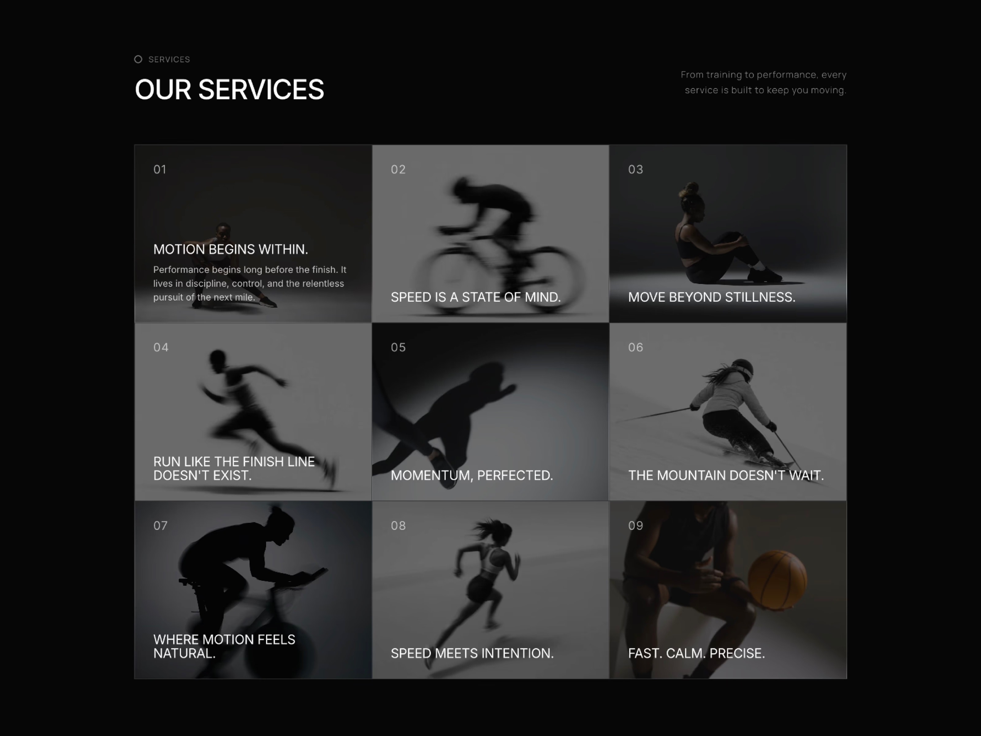
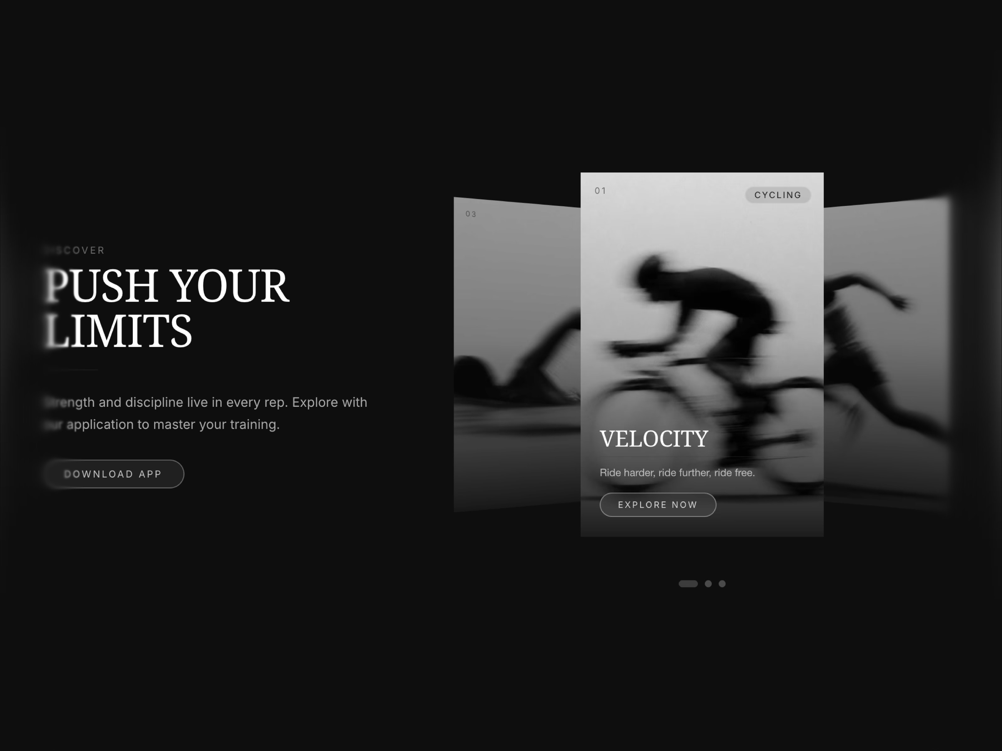
ServicesSection Pro is a cinematic 3D coverflow carousel for Framer. Slides tilt, scale and drift into depth as visitors drag, click or use arrow keys, while a live paper (light) and glass (dark) theme toggle sits right on the canvas. Every text role, from eyebrow to tag, has its own font, uppercase and color settings. Fully accessible, fully responsive and dependency-free.
Cinematic 3D coverflow tilt, scale and depth animation Drag, keyboard arrow, click and autoplay navigation Autoplay pauses on focus, with a manual pause and play button Live paper (light) and glass (dark) theme toggle button Parallax image effect on the active slide Staggered title, divider and description reveal Separate font, uppercase and color controls for every text role Theme aware button colors for both paper and glass modes Customizable tag pill and slide number styling Selectable H1-H3 heading tag for clean SEO structure Screen reader announces the active slide Unlimited slides with title, description, tag, link and image Auto switches to stacked layout under 768px Works right out of the box, no setup
Use Cases
App and product landing pages,
Travel and tourism websites,
Nature/wildlife/education platforms,
SaaS marketing pages,
Portfolio and case study sliders,
Museum/aquarium/science websites,
E-commerce collection highlights,
Event and conference websites,
Agency and studio showcase pages,
Editorial and storytelling layouts,
Fashion and lifestyle landing pages
Keywords
coverflow carousel, 3d carousel framer, image slider framer, coverflow slider, drag carousel, autoplay carousel, glassmorphism carousel, dark light theme carousel, accessible carousel, parallax slider, interactive carousel framer, hero carousel, product carousel, app showcase slider, theme toggle slider, framer slider component, responsive carousel, keyboard accessible slider, aria carousel, staggered reveal slider, customizable typography carousel, framer card slider

About Component
ServicesSection Pro is a cinematic 3D coverflow carousel for Framer. Slides tilt, scale and drift into depth as visitors drag, click or use arrow keys, while a live paper (light) and glass (dark) theme toggle sits right on the canvas. Every text role, from eyebrow to tag, has its own font, uppercase and color settings. Fully accessible, fully responsive and dependency-free.
Cinematic 3D coverflow tilt, scale and depth animation Drag, keyboard arrow, click and autoplay navigation Autoplay pauses on focus, with a manual pause and play button Live paper (light) and glass (dark) theme toggle button Parallax image effect on the active slide Staggered title, divider and description reveal Separate font, uppercase and color controls for every text role Theme aware button colors for both paper and glass modes Customizable tag pill and slide number styling Selectable H1-H3 heading tag for clean SEO structure Screen reader announces the active slide Unlimited slides with title, description, tag, link and image Auto switches to stacked layout under 768px Works right out of the box, no setup
Use Cases
App and product landing pages,
Travel and tourism websites,
Nature/wildlife/education platforms,
SaaS marketing pages,
Portfolio and case study sliders,
Museum/aquarium/science websites,
E-commerce collection highlights,
Event and conference websites,
Agency and studio showcase pages,
Editorial and storytelling layouts,
Fashion and lifestyle landing pages
Keywords
coverflow carousel, 3d carousel framer, image slider framer, coverflow slider, drag carousel, autoplay carousel, glassmorphism carousel, dark light theme carousel, accessible carousel, parallax slider, interactive carousel framer, hero carousel, product carousel, app showcase slider, theme toggle slider, framer slider component, responsive carousel, keyboard accessible slider, aria carousel, staggered reveal slider, customizable typography carousel, framer card slider
 Ahmet Loca