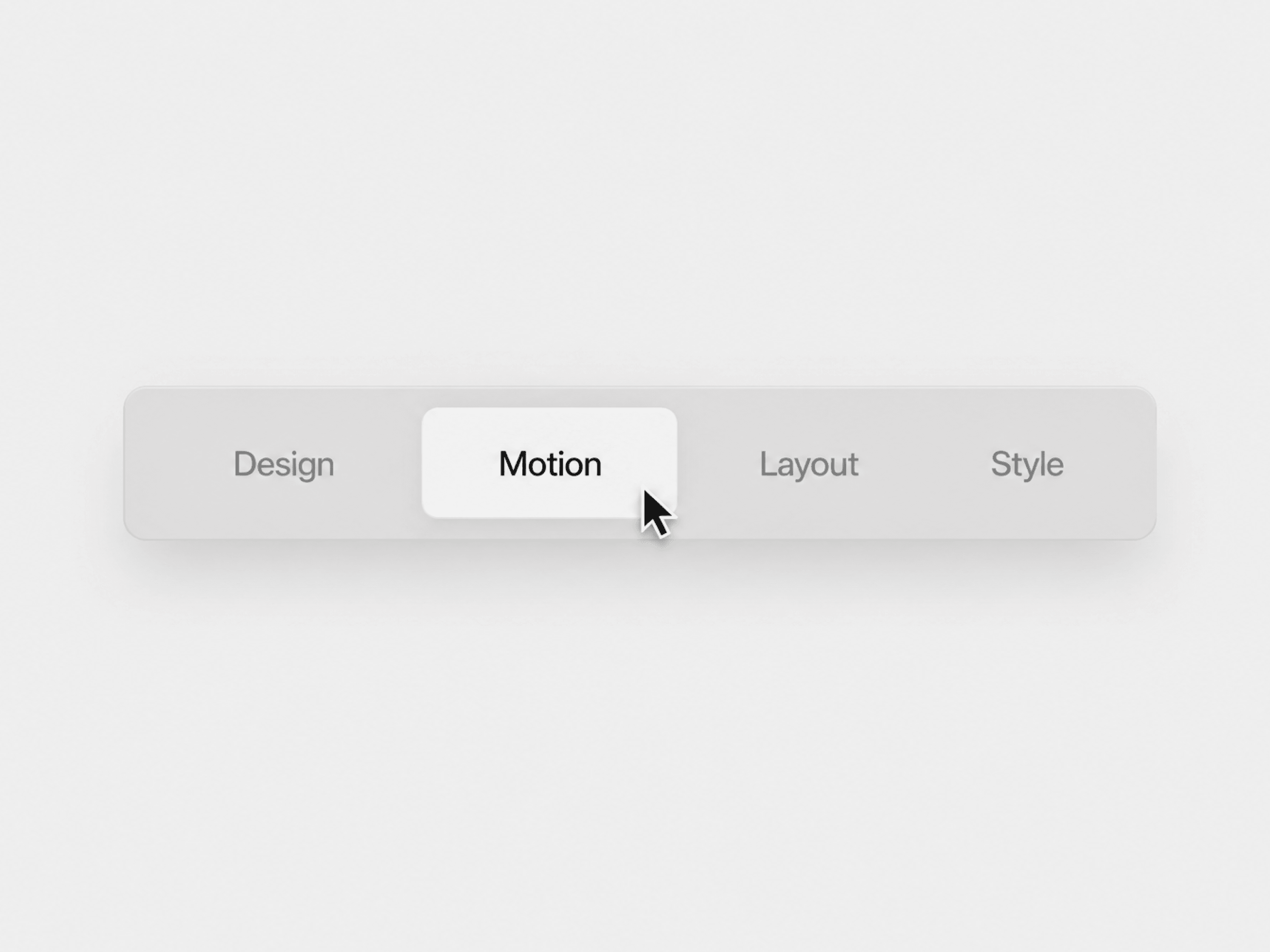
Smart Toggle is a flexible Framer component for switching between multiple options with a smooth sliding active indicator. It supports both click and hover interactions, making it useful for navigation, filters, categories, pricing options, product variations, or any interface where users need to switch between choices. Each option can also include its own link for direct navigation.
Switch between options using Click or Hover interaction.
Smooth glide animation moves behind the active option.
Only the active option receives the active text color.
Each option can include a custom link and open in the same or a new tab.
Set a default active option when the component loads.
Static-render safe for Framer canvas previews and exports.
Interactive Toggle includes organized Framer property controls for customizing the options, interaction behavior, typography, track, active glide, spacing, colors, shadows, and animation.
Options — Add, remove, and reorder options with custom labels, values, links, and new-tab settings.
Default Active — Choose which option is active by default.
Interaction — Choose between Click or Hover to control how the toggle responds.
Track — Customize track color, border color, border width, radius, padding, and shadow.
Item Spacing — Adjust horizontal padding, vertical padding, gap, and individual item radius.
Glide — Customize the active indicator color, radius, shadow, and inset.
Text Colors — Set separate colors for active and inactive options.
Font — Control the typeface and extended typography settings including size and weight.
Transition — Customize the glide animation using Framer’s built-in Transition control.
When an option becomes active, the glide smoothly moves behind it while the text color updates to reflect the active state.
Credits to Osmo.supply for the inspiration.

Smart Toggle is a flexible Framer component for switching between multiple options with a smooth sliding active indicator. It supports both click and hover interactions, making it useful for navigation, filters, categories, pricing options, product variations, or any interface where users need to switch between choices. Each option can also include its own link for direct navigation.
Switch between options using Click or Hover interaction.
Smooth glide animation moves behind the active option.
Only the active option receives the active text color.
Each option can include a custom link and open in the same or a new tab.
Set a default active option when the component loads.
Static-render safe for Framer canvas previews and exports.
Interactive Toggle includes organized Framer property controls for customizing the options, interaction behavior, typography, track, active glide, spacing, colors, shadows, and animation.
Options — Add, remove, and reorder options with custom labels, values, links, and new-tab settings.
Default Active — Choose which option is active by default.
Interaction — Choose between Click or Hover to control how the toggle responds.
Track — Customize track color, border color, border width, radius, padding, and shadow.
Item Spacing — Adjust horizontal padding, vertical padding, gap, and individual item radius.
Glide — Customize the active indicator color, radius, shadow, and inset.
Text Colors — Set separate colors for active and inactive options.
Font — Control the typeface and extended typography settings including size and weight.
Transition — Customize the glide animation using Framer’s built-in Transition control.
When an option becomes active, the glide smoothly moves behind it while the text color updates to reflect the active state.
Credits to Osmo.supply for the inspiration.