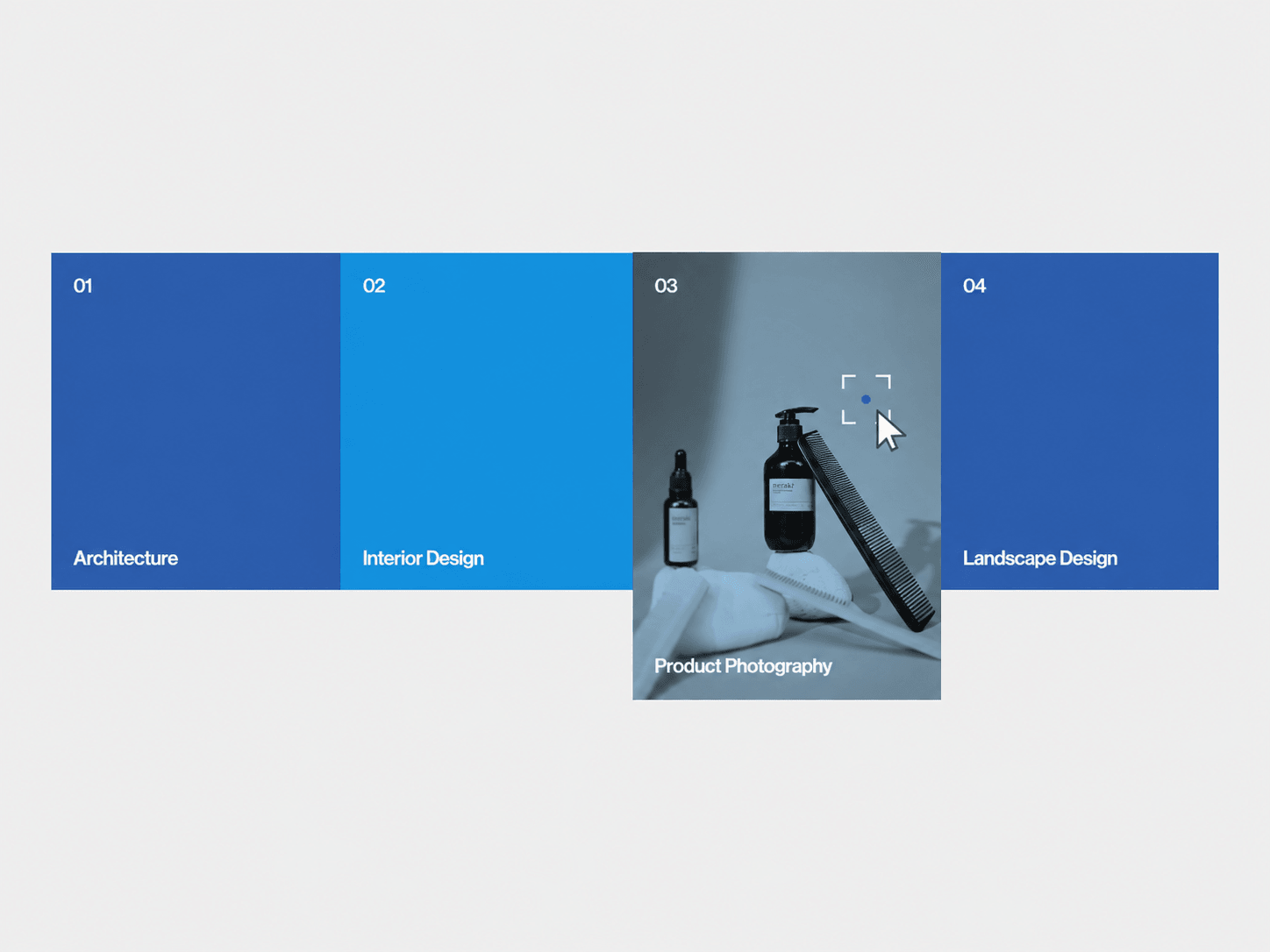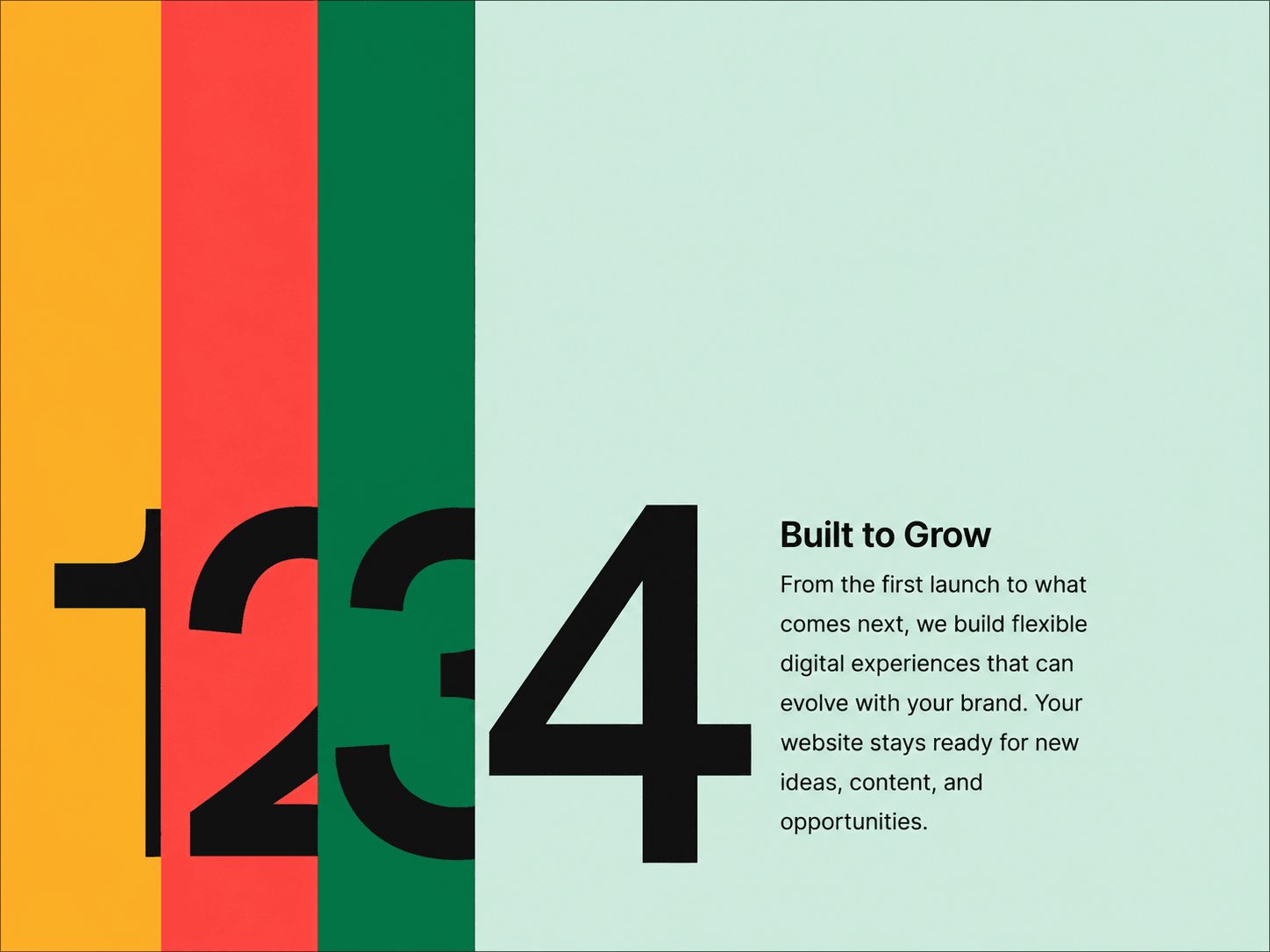
Scroll Stack Panels is a scroll-driven Framer component that turns full-viewport sections into a layered stacking experience. As visitors scroll, each panel smoothly slides in from the right and settles into place, leaving a visible strip of the previous panels behind. It works especially well for agency websites, storytelling sections, case studies, services, and feature presentations.
Full-viewport panels that slide in as you scroll.
Previous panels remain visible as layered slivers.
Smooth spring-based scroll movement.
Adjustable reveal and hold timing between panels.
Responsive behavior across desktop, tablet, and mobile.
Mobile automatically switches the content layout into a stacked format.
Static-render safe for Framer canvas and exports.
Panels — Add, remove, reorder, and customize each panel.
Content — Edit titles, descriptions, and large numbers.
Panel Colors — Set individual background, title, and description colors.
Panel Height — Control the total scroll length of each panel.
Reveal Ratio — Adjust how quickly each panel enters before its hold period.
Stack Sliver — Set separate stacked strip widths for desktop, tablet, and mobile.
Scroll Smoothing — Customize the spring transition controlling scroll movement.
Heading & Description Width — Control the maximum width of both text areas.
Spacing — Adjust number-to-content and heading-to-description gaps.
Panel Padding — Control the spacing around the content group.
Borders — Customize border width and color.
Container Background — Set the overall background color.
The component creates a tall scroll section with a sticky viewport. As the page moves, each panel transitions from the right side of the screen into its final position. Once settled, it stays partially offset so the previous panels remain visible behind it, gradually creating the stacked effect.

Scroll Stack Panels is a scroll-driven Framer component that turns full-viewport sections into a layered stacking experience. As visitors scroll, each panel smoothly slides in from the right and settles into place, leaving a visible strip of the previous panels behind. It works especially well for agency websites, storytelling sections, case studies, services, and feature presentations.
Full-viewport panels that slide in as you scroll.
Previous panels remain visible as layered slivers.
Smooth spring-based scroll movement.
Adjustable reveal and hold timing between panels.
Responsive behavior across desktop, tablet, and mobile.
Mobile automatically switches the content layout into a stacked format.
Static-render safe for Framer canvas and exports.
Panels — Add, remove, reorder, and customize each panel.
Content — Edit titles, descriptions, and large numbers.
Panel Colors — Set individual background, title, and description colors.
Panel Height — Control the total scroll length of each panel.
Reveal Ratio — Adjust how quickly each panel enters before its hold period.
Stack Sliver — Set separate stacked strip widths for desktop, tablet, and mobile.
Scroll Smoothing — Customize the spring transition controlling scroll movement.
Heading & Description Width — Control the maximum width of both text areas.
Spacing — Adjust number-to-content and heading-to-description gaps.
Panel Padding — Control the spacing around the content group.
Borders — Customize border width and color.
Container Background — Set the overall background color.
The component creates a tall scroll section with a sticky viewport. As the page moves, each panel transitions from the right side of the screen into its final position. Once settled, it stays partially offset so the previous panels remain visible behind it, gradually creating the stacked effect.