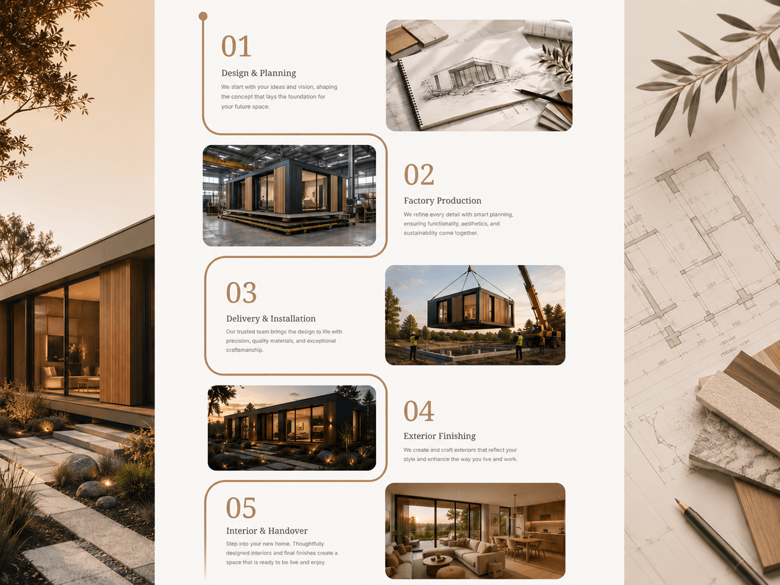
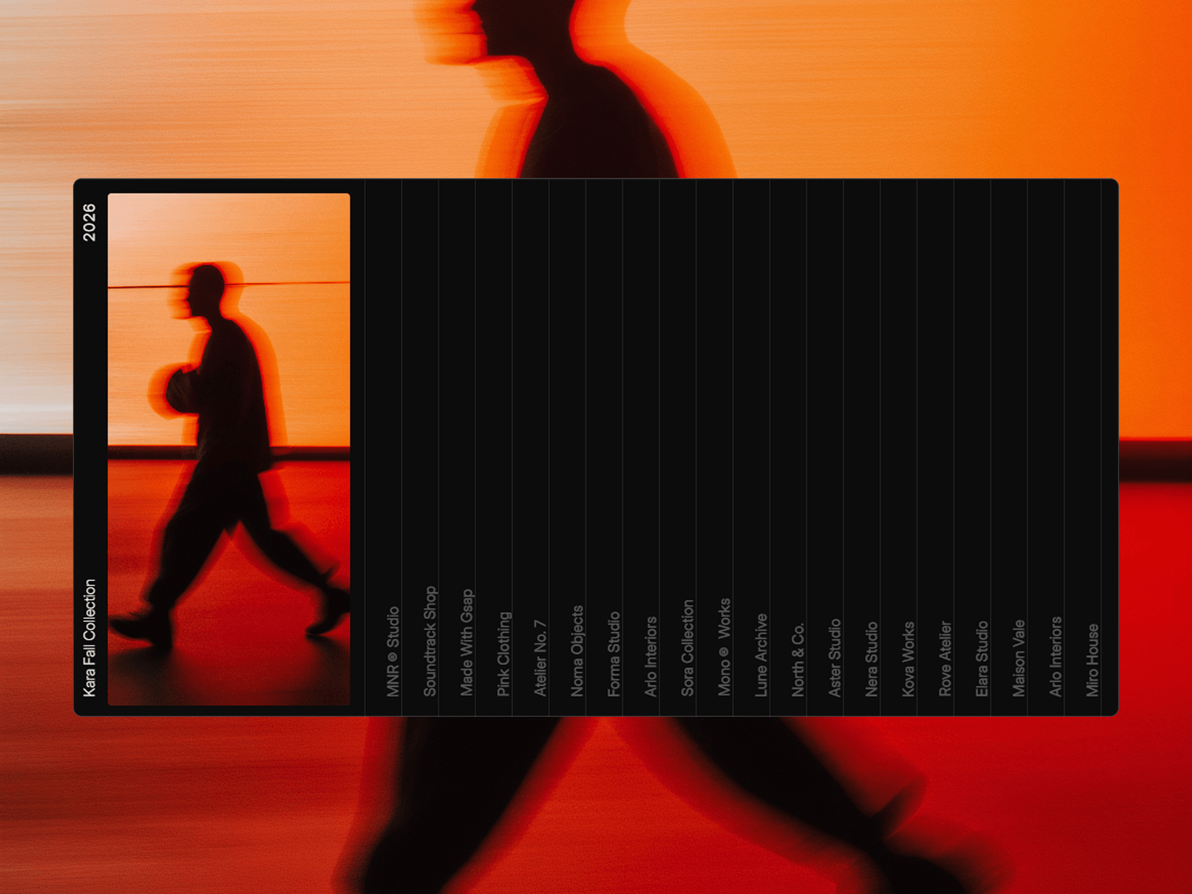
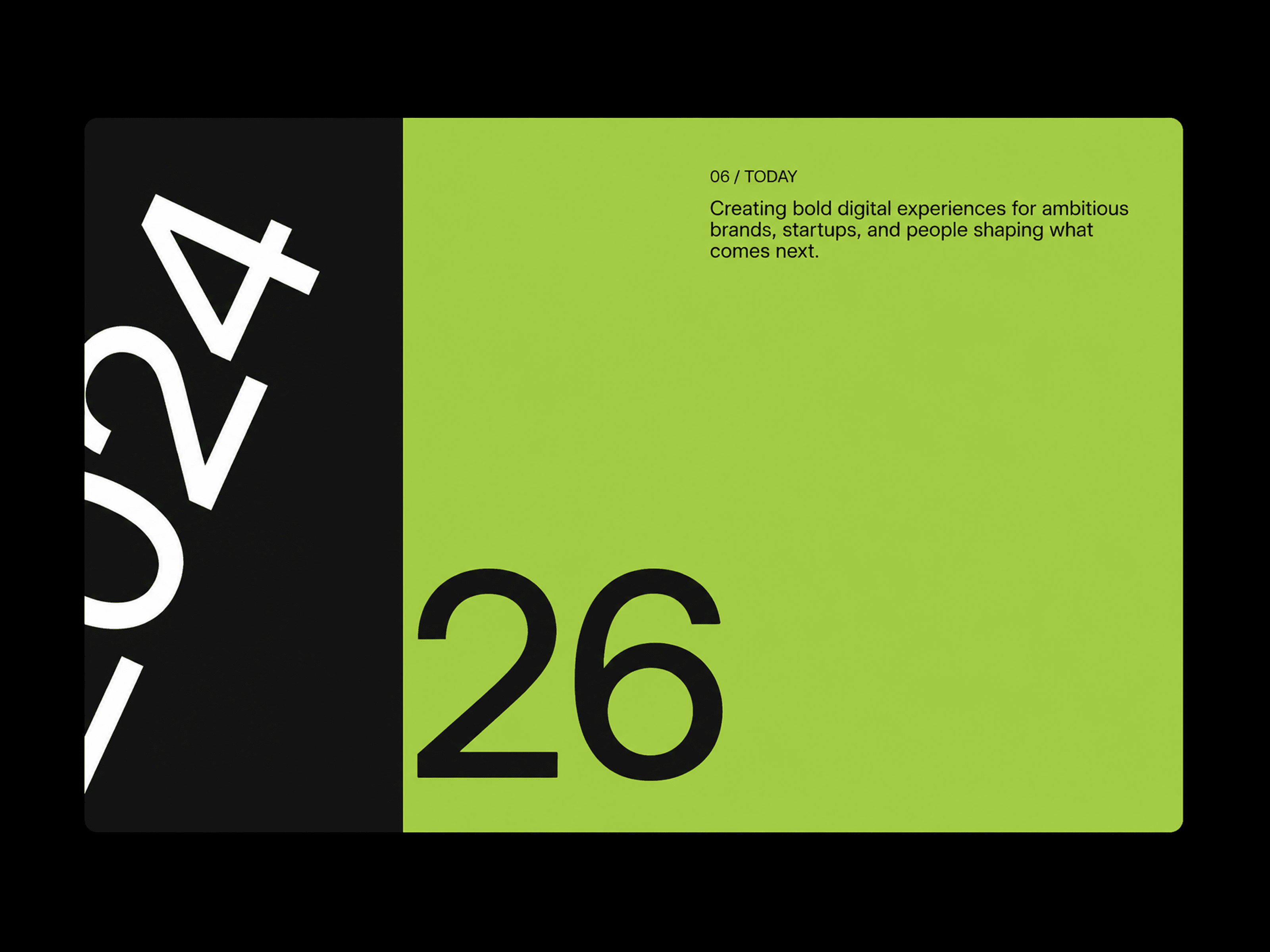
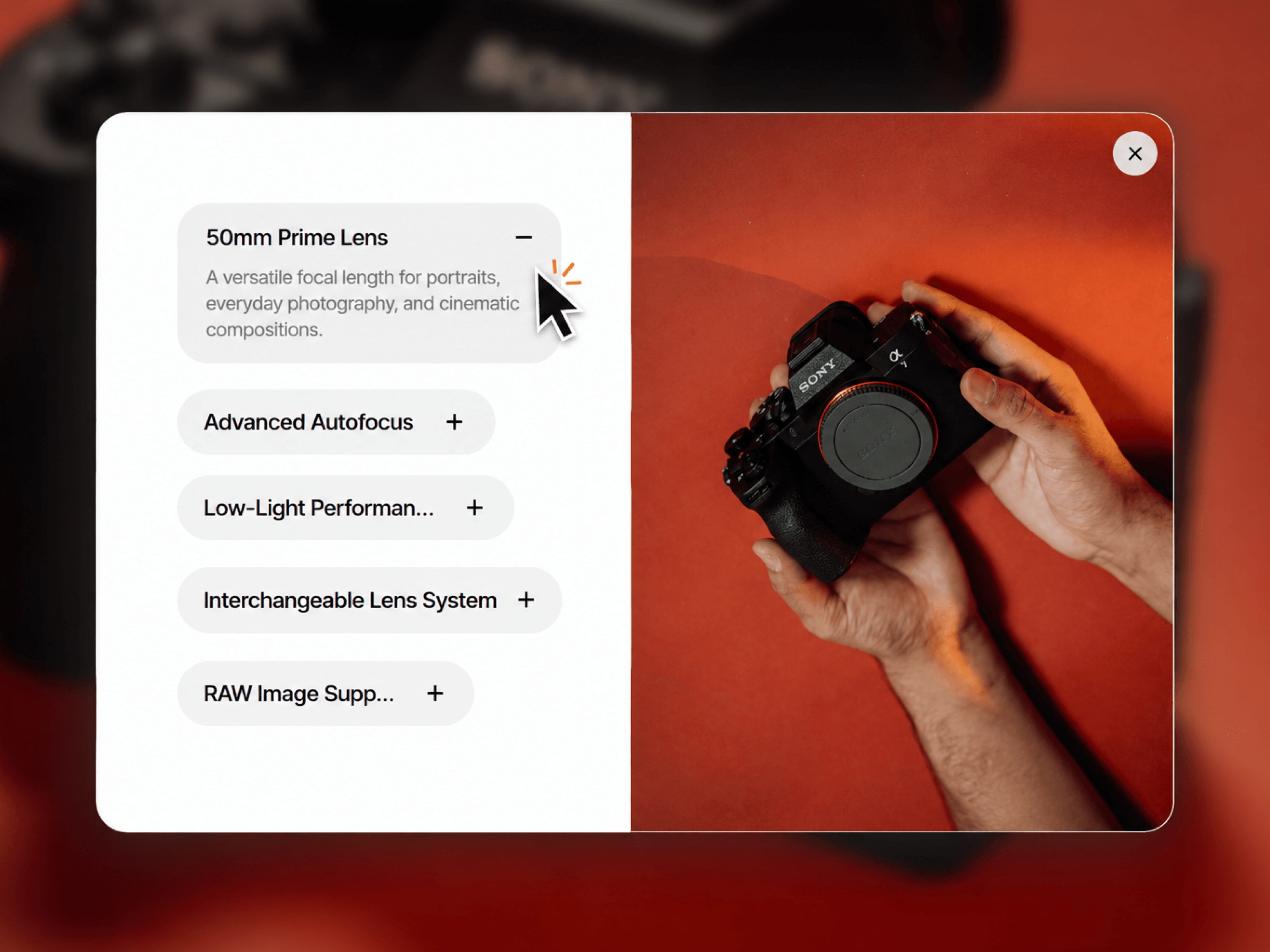
A component for presenting multiple pieces of content in a clean, layered card layout. Each card combines a heading, description, and visual to create an engaging section that works across different types of websites and content. Use it for features, services, products, case studies, processes, collections, stories, or anything you want to present in a structured visual format.
Stacked cards with a clean layered presentation.
Add a heading, description, and image to each card.
Ideal for features, products, services, case studies, stories, and more.
Strong visual hierarchy without overwhelming the page.
Responsive layout for different screen sizes.
Designed to fit naturally into modern landing pages and websites.
Stacked Showcase includes Framer property controls for customizing your content, imagery, typography, colors, spacing, sizing, and card layout.
Cards — Add, remove, and reorder content cards.
Content — Edit headings and descriptions for every card.
Images — Add unique visuals to each card.
Typography — Customize fonts, sizes, weights, and line heights.
Colors — Control card backgrounds, text, and other visual elements.
Spacing — Adjust gaps, padding, and overall card positioning.
Layout — Fine-tune the size and arrangement of the stacked cards.
Responsive — Adjust the presentation across desktop, tablet, and mobile.
The component places your content into a series of stacked cards, creating a layered visual rhythm as users move through the section. Each card keeps its own content and image while maintaining a consistent structure, making it easy to showcase almost any type of content without rebuilding the layout from scratch.

A component for presenting multiple pieces of content in a clean, layered card layout. Each card combines a heading, description, and visual to create an engaging section that works across different types of websites and content. Use it for features, services, products, case studies, processes, collections, stories, or anything you want to present in a structured visual format.
Stacked cards with a clean layered presentation.
Add a heading, description, and image to each card.
Ideal for features, products, services, case studies, stories, and more.
Strong visual hierarchy without overwhelming the page.
Responsive layout for different screen sizes.
Designed to fit naturally into modern landing pages and websites.
Stacked Showcase includes Framer property controls for customizing your content, imagery, typography, colors, spacing, sizing, and card layout.
Cards — Add, remove, and reorder content cards.
Content — Edit headings and descriptions for every card.
Images — Add unique visuals to each card.
Typography — Customize fonts, sizes, weights, and line heights.
Colors — Control card backgrounds, text, and other visual elements.
Spacing — Adjust gaps, padding, and overall card positioning.
Layout — Fine-tune the size and arrangement of the stacked cards.
Responsive — Adjust the presentation across desktop, tablet, and mobile.
The component places your content into a series of stacked cards, creating a layered visual rhythm as users move through the section. Each card keeps its own content and image while maintaining a consistent structure, making it easy to showcase almost any type of content without rebuilding the layout from scratch.
 Saqlain Nasir