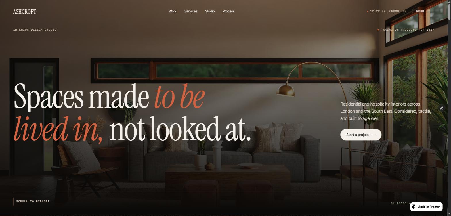
Ashcroft is a one-page portfolio built for interior designers, architecture practices
and anyone whose work is photographed rather than screenshotted.
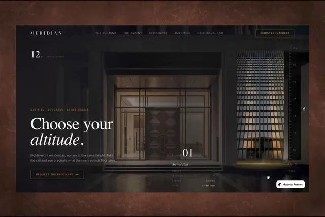
It is deliberately dark. Warm near-black, bone, clay and antique brass — a palette
chosen so that timber, plaster and linen photograph well against it, instead of the
cold blue-grey that most dark templates leave your imagery sitting in. Instrument
Serif carries the display type, Inter Tight the interface, Geist Mono the labels.
Every section is animated, and none of it is decoration for its own sake. A shutter
preloader hands the page over to a headline that reveals line by line. A statement
lights up word by word as you scroll through it. Selected work travels sideways in a
pinned gallery while each photograph drifts against its own frame. Services open into
detail while a photograph trails your cursor. A materials ribbon speeds up — and
reverses — with the direction of your scroll.
The motion is built on GSAP, Lenis and Framer Motion, each doing the job it is
actually best at, and all of it respects prefers-reduced-motion.
12 animated sections — preloader, nav, hero, statement, work gallery, materials marquee, services, studio, testimonials, FAQ, contact, footer
Pinned horizontal work gallery with per-card image parallax and a scroll progress bar
Scroll-lit statement that brightens word by word, and stays readable at every point
Cursor-trailing photograph on the services accordion, pointer devices only
Shutter preloader with a filling wordmark and a counter, once per visit
Live London clock in the header and footer, any IANA timezone
Magnetic buttons and a full-screen menu with a masked link reveal
Auto-fitting footer wordmark that meets both edges exactly, whatever you type
Film grain layer to stop large flat blacks from banding on 8-bit displays
Velocity-reactive marquee that speeds up and reverses with the scroll

Ashcroft is a one-page portfolio built for interior designers, architecture practices
and anyone whose work is photographed rather than screenshotted.
It is deliberately dark. Warm near-black, bone, clay and antique brass — a palette
chosen so that timber, plaster and linen photograph well against it, instead of the
cold blue-grey that most dark templates leave your imagery sitting in. Instrument
Serif carries the display type, Inter Tight the interface, Geist Mono the labels.
Every section is animated, and none of it is decoration for its own sake. A shutter
preloader hands the page over to a headline that reveals line by line. A statement
lights up word by word as you scroll through it. Selected work travels sideways in a
pinned gallery while each photograph drifts against its own frame. Services open into
detail while a photograph trails your cursor. A materials ribbon speeds up — and
reverses — with the direction of your scroll.
The motion is built on GSAP, Lenis and Framer Motion, each doing the job it is
actually best at, and all of it respects prefers-reduced-motion.
12 animated sections — preloader, nav, hero, statement, work gallery, materials marquee, services, studio, testimonials, FAQ, contact, footer
Pinned horizontal work gallery with per-card image parallax and a scroll progress bar
Scroll-lit statement that brightens word by word, and stays readable at every point
Cursor-trailing photograph on the services accordion, pointer devices only
Shutter preloader with a filling wordmark and a counter, once per visit
Live London clock in the header and footer, any IANA timezone
Magnetic buttons and a full-screen menu with a masked link reveal
Auto-fitting footer wordmark that meets both edges exactly, whatever you type
Film grain layer to stop large flat blacks from banding on 8-bit displays
Velocity-reactive marquee that speeds up and reverses with the scroll