About this Component
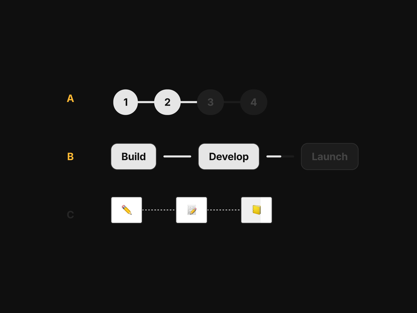
Showcase multi-step experiences in a seamless and engaging way. Each step is connected through a single animated path that fills progressively, creating a clear sense of flow and simplicity.
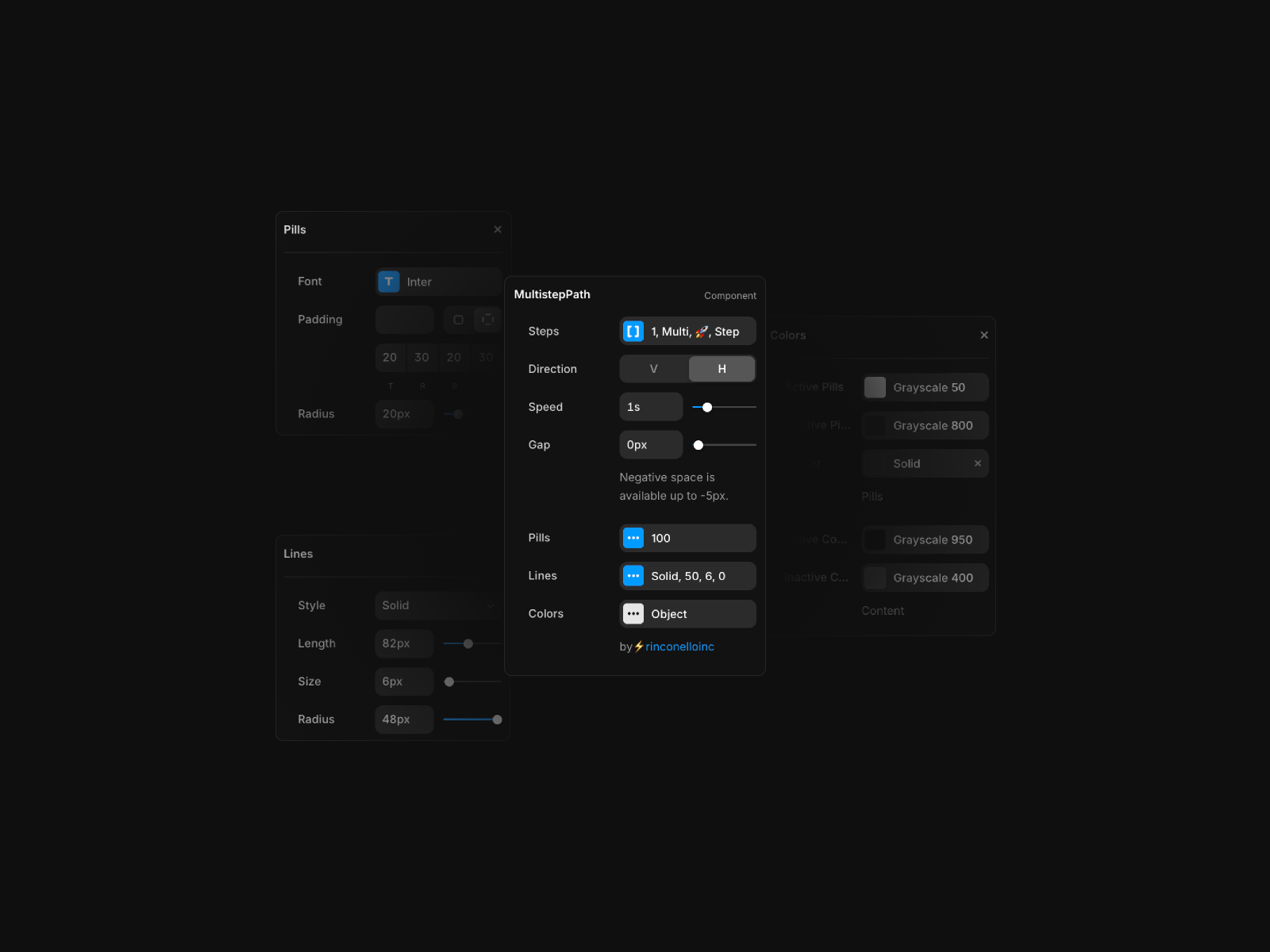
You can add unlimited steps, choose between text or emojis, control the direction of the path, customize the animation speed, and refine every detail of the pills, lines, and colors. Designed for clarity and flexibility, this component helps you communicate progress with a minimal, modern, and user-friendly aesthetic.
 Multiple Variants made
Key features
- Add as many steps as you need, using text, emojis or both.
- Switch between horizontal or vertical layouts for full structural flexibility.
- Fine-tune how fast the path loads to match the rhythm of your interface.
- Customize fonts, padding, pill design, borders, colors, line length, radius and more to blend perfectly with your brand.
Best uses cases
- Visualizing multi-step onboarding or setup flows.
- Highlighting progress in tutorials, checklists or guided experiences.
- Adding subtle motion to elevate product storytelling and UX clarity.


