
Nobody books a doctor from a website that feels like a startup.
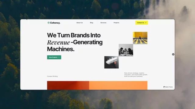
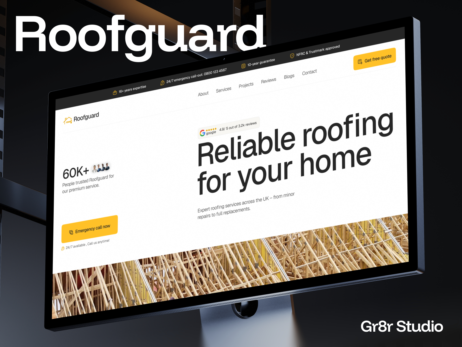
Healthcare products get built by SaaS designers, so they end up looking like SaaS. Dark gradients, glowing cards, a dashboard floating at an angle.
Then a patient arrives: usually anxious, often on a phone, sometimes at 2am - and the site signals the wrong thing entirely.
What actually works in health is closer to boring.
→ Light surfaces, high contrast, real whitespace
→ Faces of practitioners, not abstract 3D
→ Booking visible without scrolling
→ Plain words instead of product language
The pattern I keep coming back to: match the emotional state of the person arriving.
A developer tool visitor is curious. A patient is worried. Those are not the same person and they should not get the same interface.
Free to duplicate 👉 https://framer.link/kQfBwmN