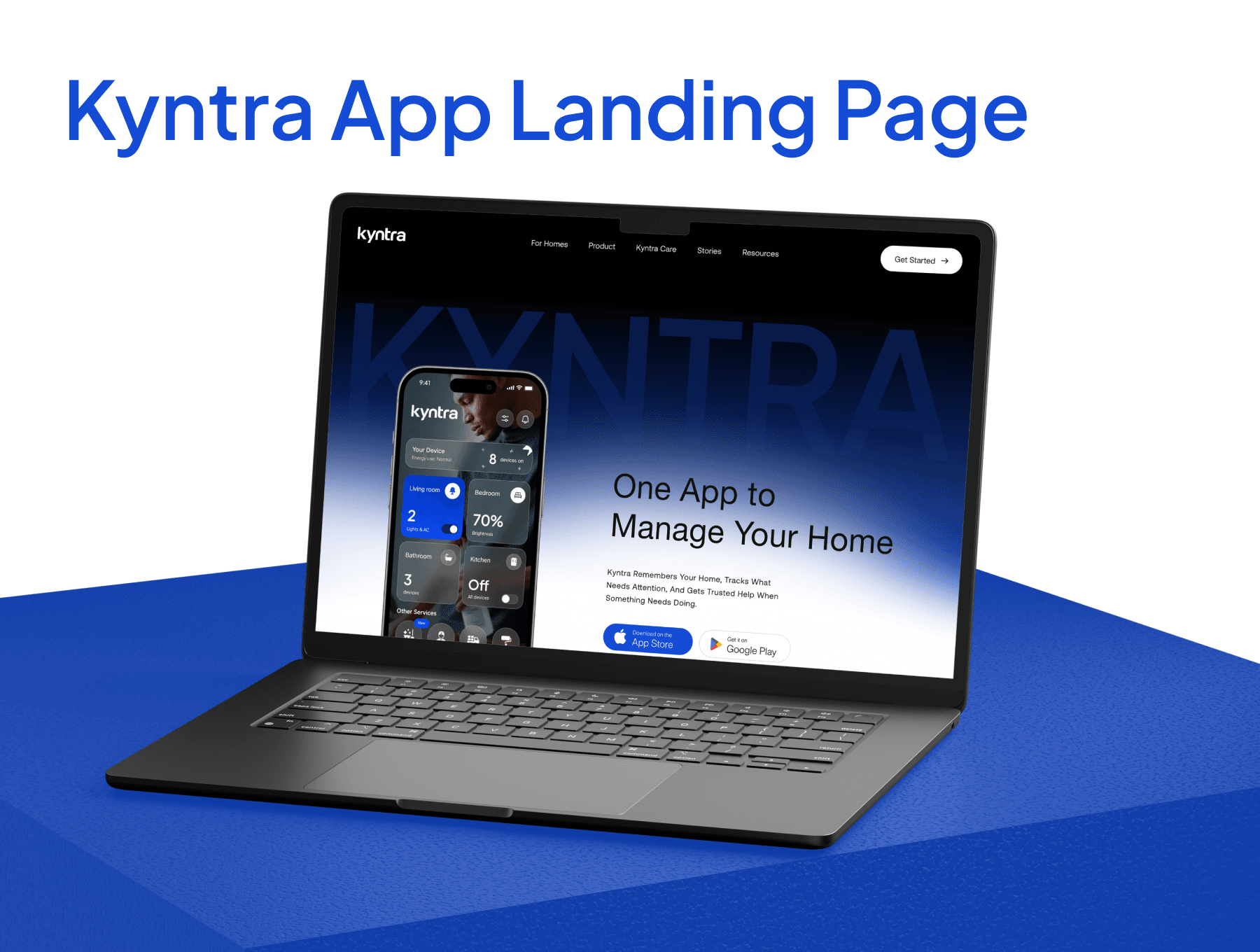
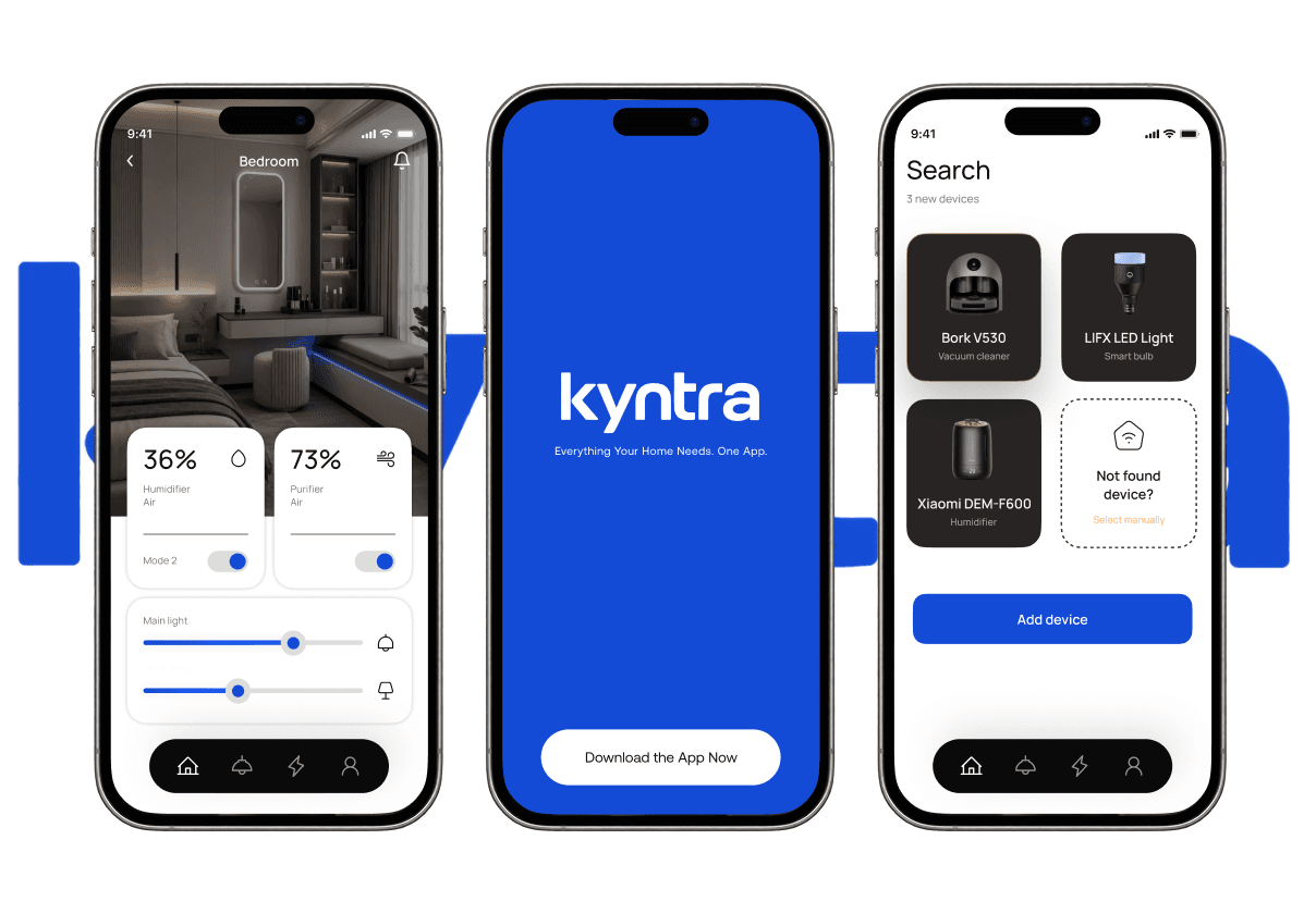
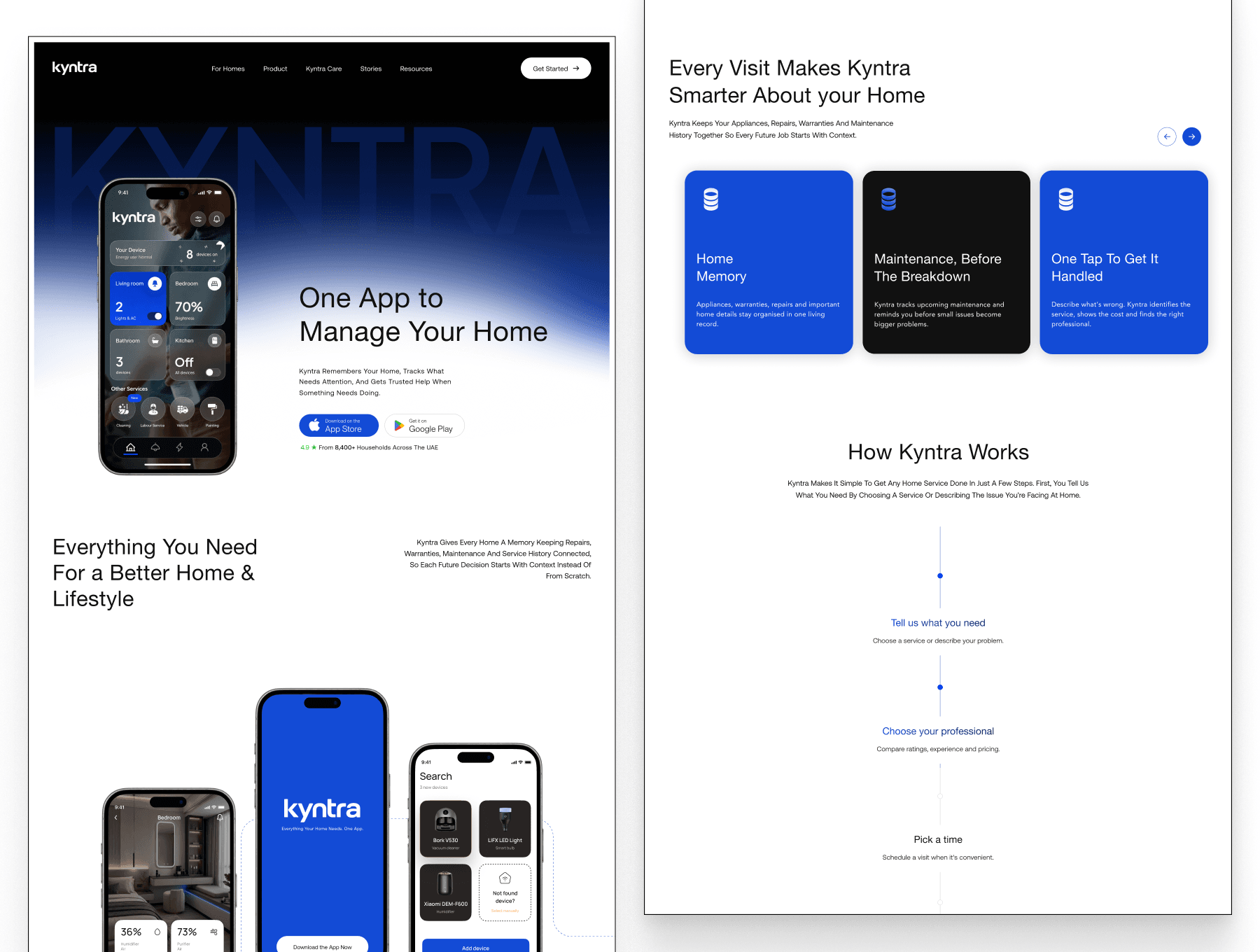
Hi everyone! We've just released Kyntra, a one-page landing template for a home-services app.
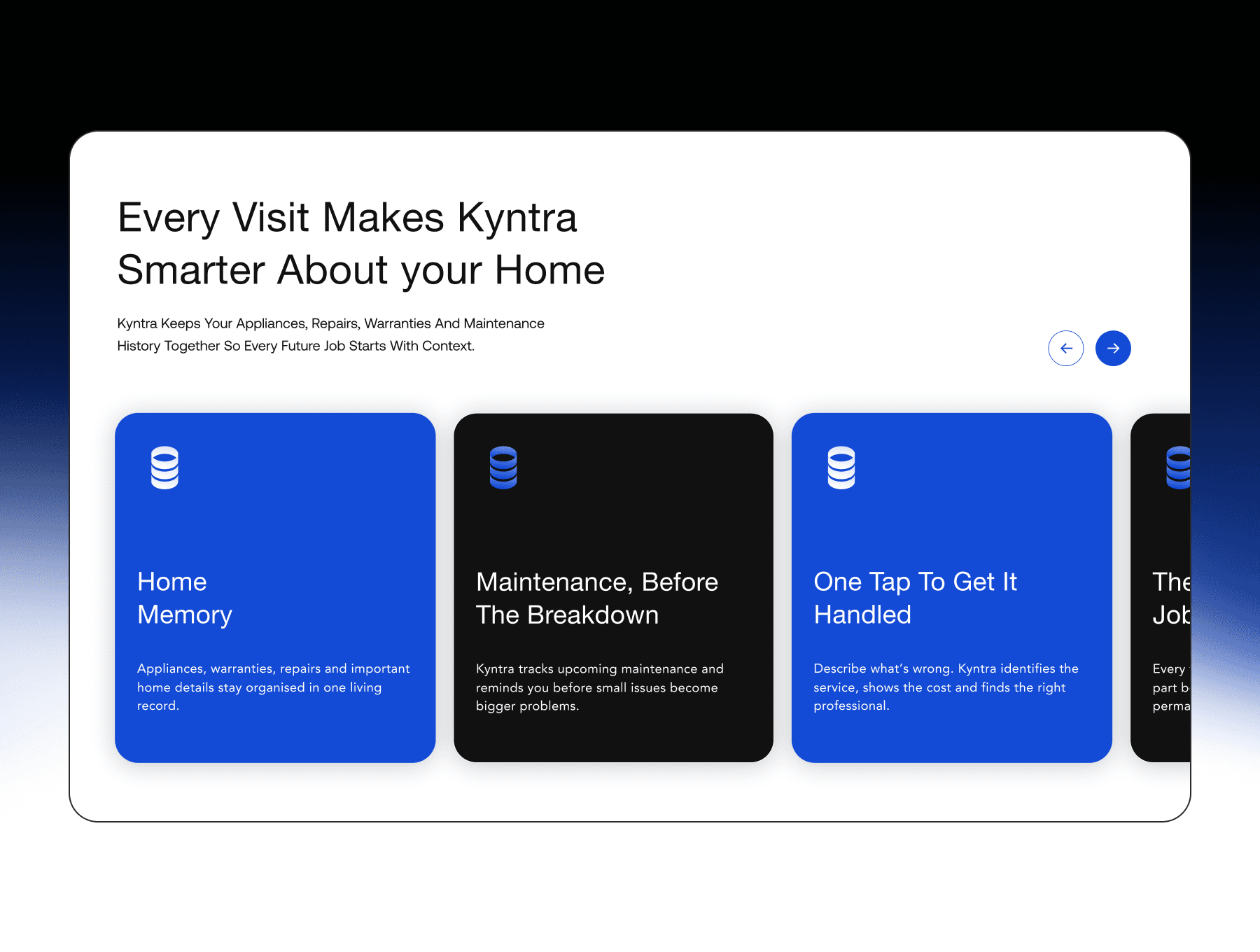
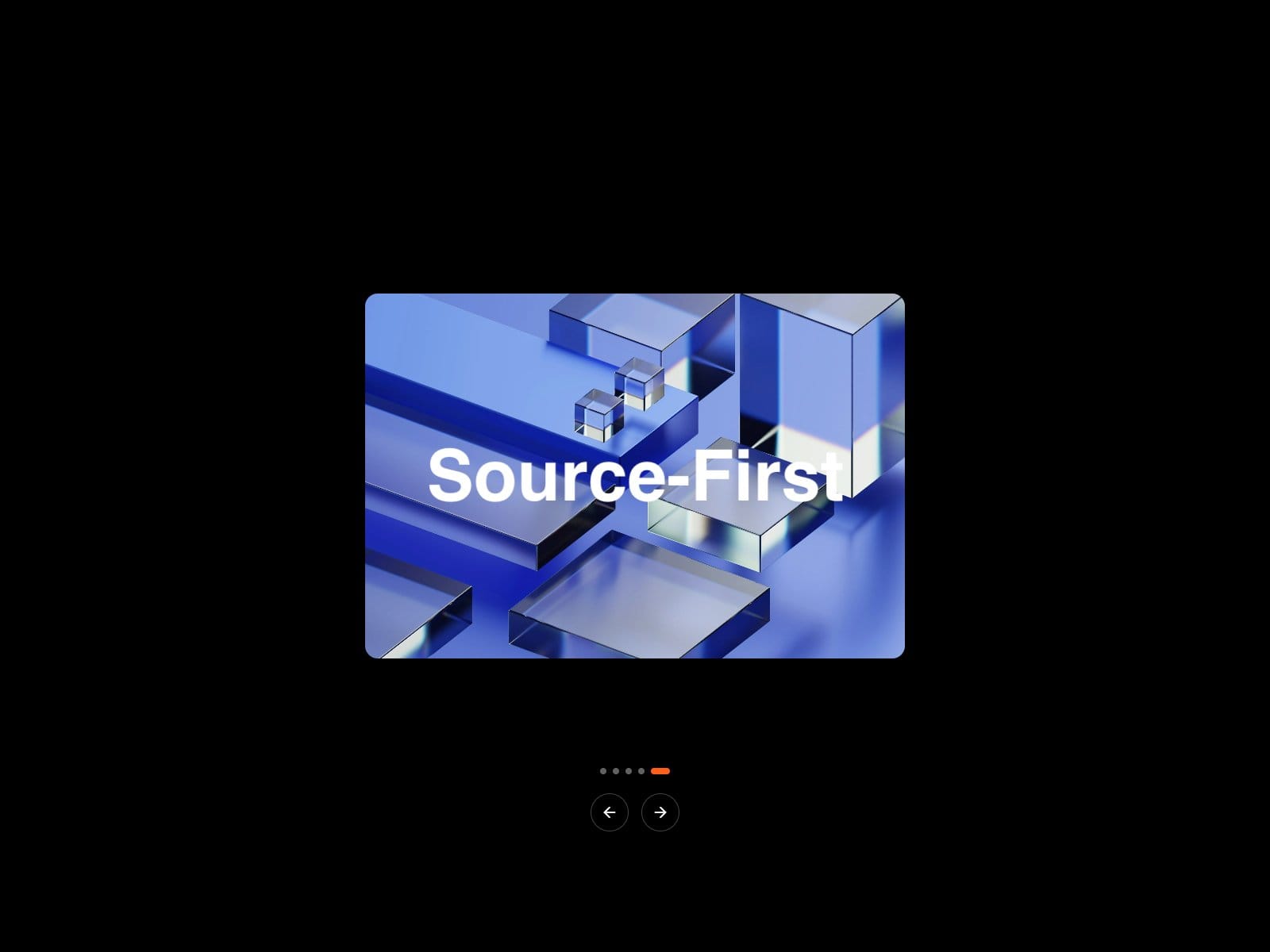
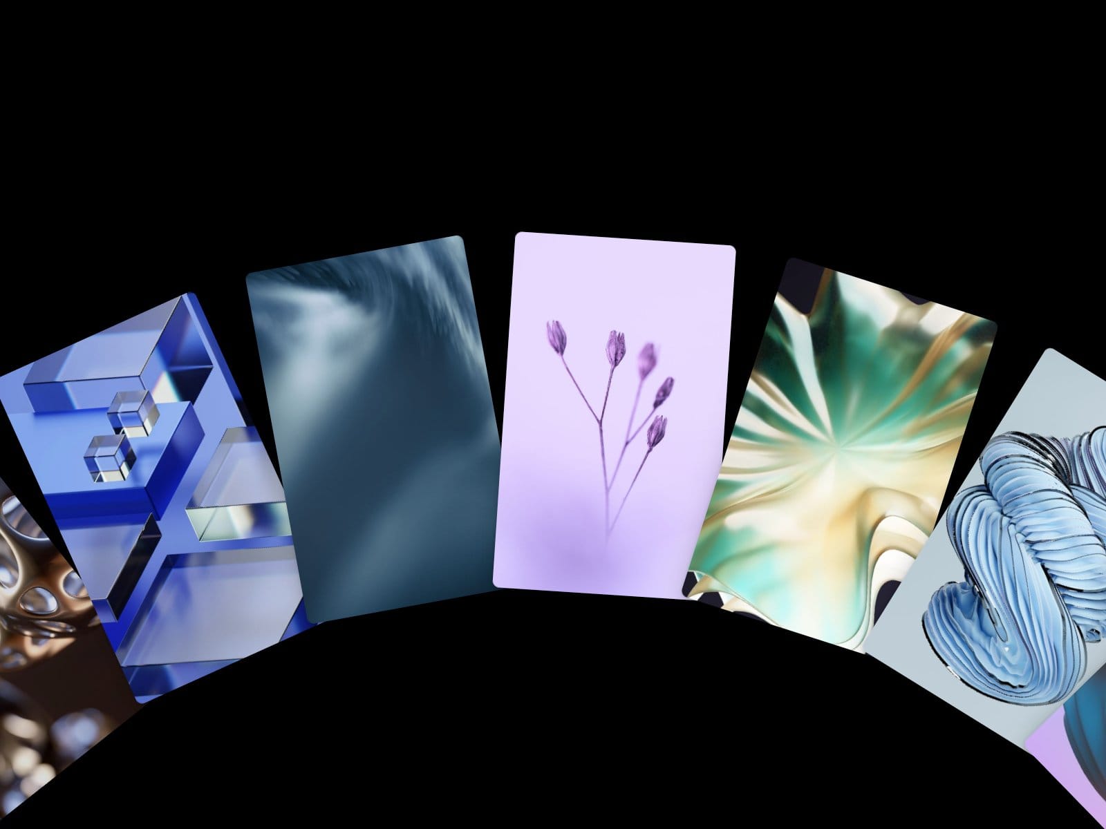
We built most of the page around the scroll. The hero sits on an animated gradient, the About phones drift apart, a large statement fills in with colour, the feature cards stack on top of each other, and a row of cards slides sideways while the section is pinned. A timeline draws itself down the "How it works" steps, the stats roll up digit by digit, and on desktop the footer is revealed from underneath.
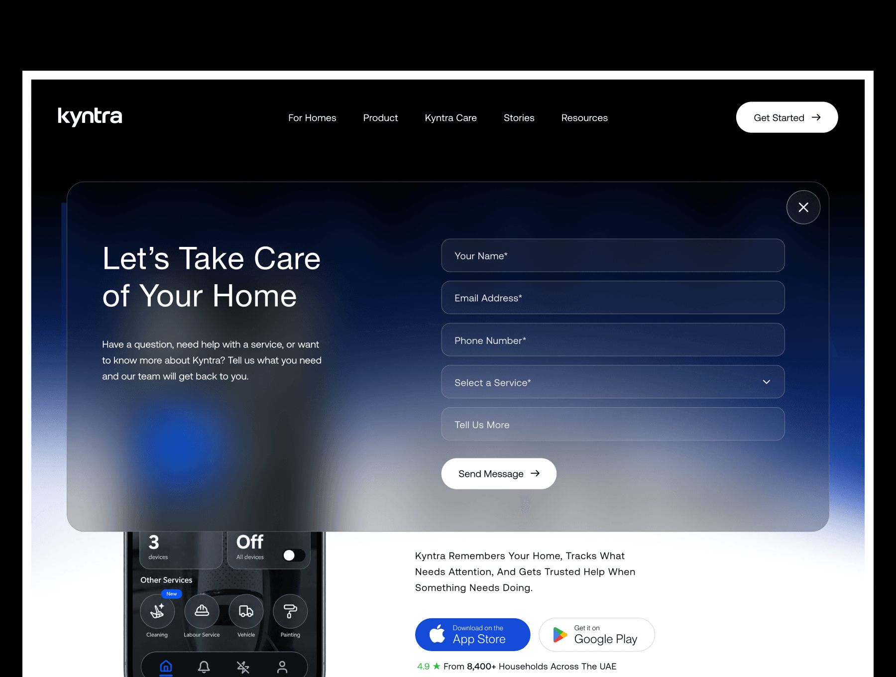
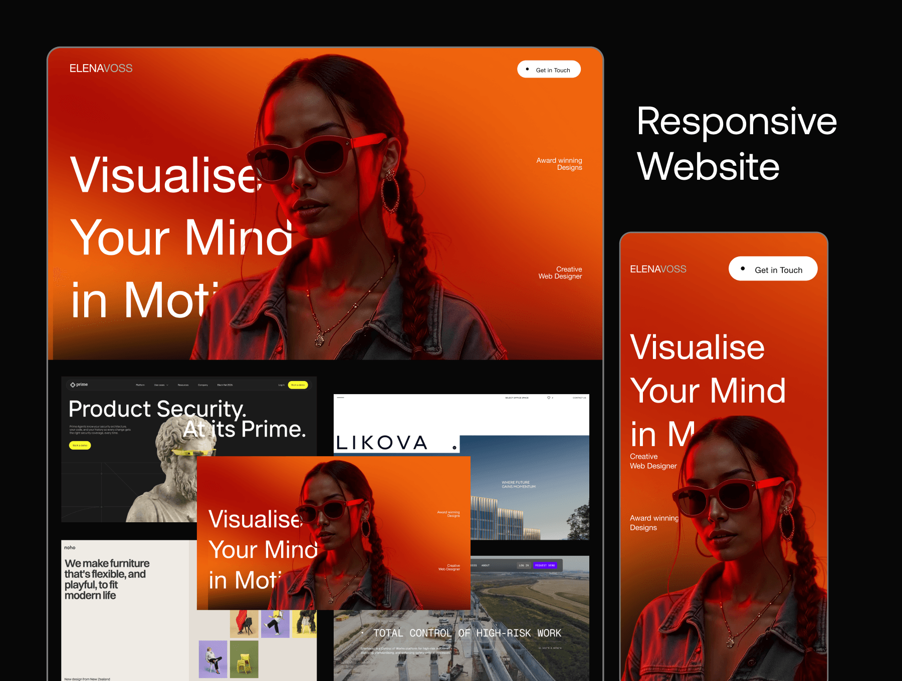
"Get Started" opens an enquiry form, "Download Kyntra App" slides in a panel with a QR code, and the FAQ opens one question at a time. We set it up for Desktop, Tablet and Phone, with a full-screen menu on smaller screens. On touch devices, the blog card details stay visible instead of waiting for a hover.
The animated sections are code components, so you edit their content, colours and timings in the properties panel. Testimonials, stats and articles are fictional demo content, ready to swap.
We'd love to hear what you think, especially about how the scroll interactions feel on Tablet and Phone.