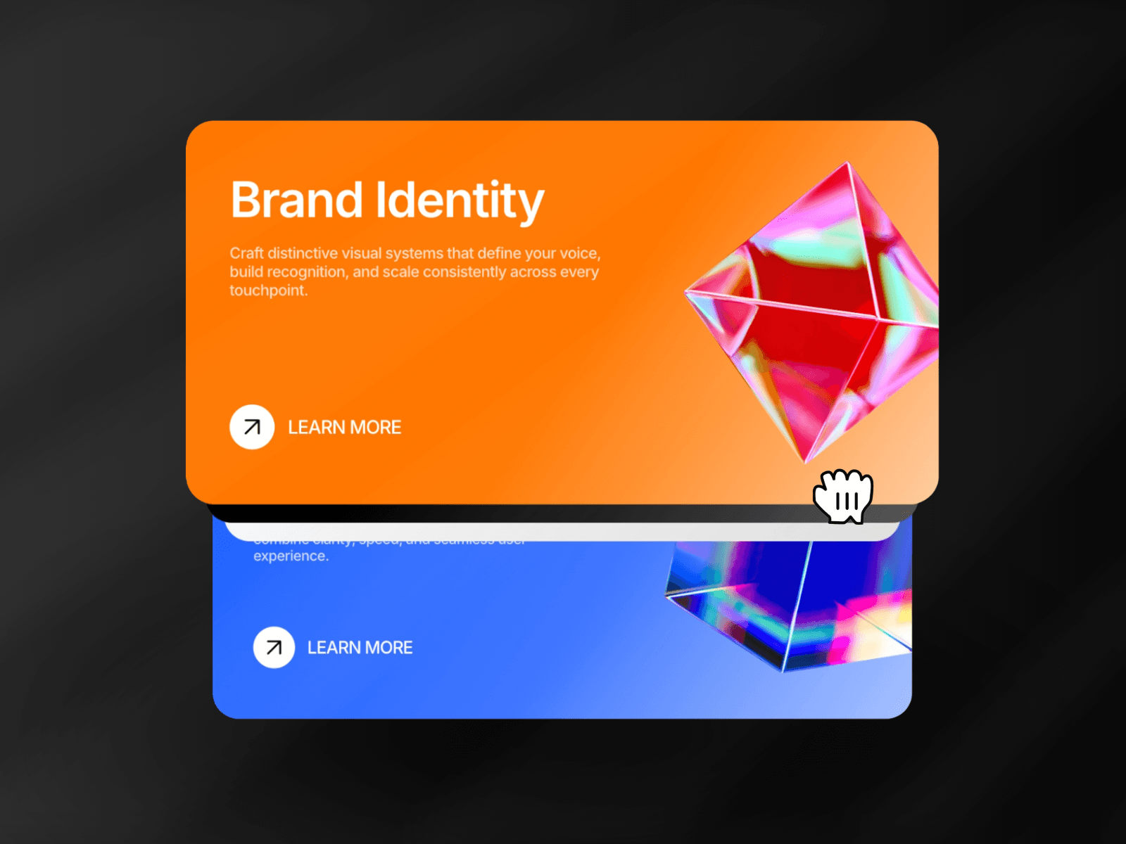
Card Stack Carousel is a swipeable and tappable interactive card stack built for Framer. This card stack carousel lets you showcase cards in a dynamic slideshow format, supporting gestures like swipe, drag, and tap. Perfect for onboarding flows, galleries, and feature highlights, it combines a sleek animated card stack with full customization options and smooth performance.
Unlike many stack carousel components that force you into predefined image or video placeholders, this one gives you full design freedom.
You design your cards directly on the Framer canvas with hover states, buttons, links, badges, or any custom layout, then simply connect those frames to the stacked carousel. That's it.
There are:
No locked templates
No predefined media slots
No content restrictions
Copy and paste the CardStackCarousel component.
Use the Cards control to connect your own card designs – drag any frame or component in as a card.
Adjust properties in the right-hand panel to customize stack spacing, scaling, swipe sensitivity, animation speed, and gesture method (swipe or tap).
Set width and height in your Framer canvas for the desired responsive card stack size.
Enable the auto cycle carousel option for automatic transitions, and fine-tune timing and interactions for your use case.
Responsive Card Stack: Adapts to your card designs and parent frame size.
Gesture Ready: Create a gesture card carousel with swipe, drag, or tap to slide cards.
3D Card Carousel Effect: Add depth with scaling and stack spacing controls.
Draggable Card Carousel: Let users drag cards naturally for smooth interactivity.
Framer-native, lightweight, and built for modern design workflows, the Card Stack Carousel gives you full control to design interactive card stacks that feel natural and engaging.
Made with ❤️ by Soyeb
Have questions or need a custom Framer component? Reach out at heysoyebali@gmail.com

Card Stack Carousel is a swipeable and tappable interactive card stack built for Framer. This card stack carousel lets you showcase cards in a dynamic slideshow format, supporting gestures like swipe, drag, and tap. Perfect for onboarding flows, galleries, and feature highlights, it combines a sleek animated card stack with full customization options and smooth performance.
Unlike many stack carousel components that force you into predefined image or video placeholders, this one gives you full design freedom.
You design your cards directly on the Framer canvas with hover states, buttons, links, badges, or any custom layout, then simply connect those frames to the stacked carousel. That's it.
There are:
No locked templates
No predefined media slots
No content restrictions
Copy and paste the CardStackCarousel component.
Use the Cards control to connect your own card designs – drag any frame or component in as a card.
Adjust properties in the right-hand panel to customize stack spacing, scaling, swipe sensitivity, animation speed, and gesture method (swipe or tap).
Set width and height in your Framer canvas for the desired responsive card stack size.
Enable the auto cycle carousel option for automatic transitions, and fine-tune timing and interactions for your use case.
Responsive Card Stack: Adapts to your card designs and parent frame size.
Gesture Ready: Create a gesture card carousel with swipe, drag, or tap to slide cards.
3D Card Carousel Effect: Add depth with scaling and stack spacing controls.
Draggable Card Carousel: Let users drag cards naturally for smooth interactivity.
Framer-native, lightweight, and built for modern design workflows, the Card Stack Carousel gives you full control to design interactive card stacks that feel natural and engaging.
Made with ❤️ by Soyeb
Have questions or need a custom Framer component? Reach out at heysoyebali@gmail.com