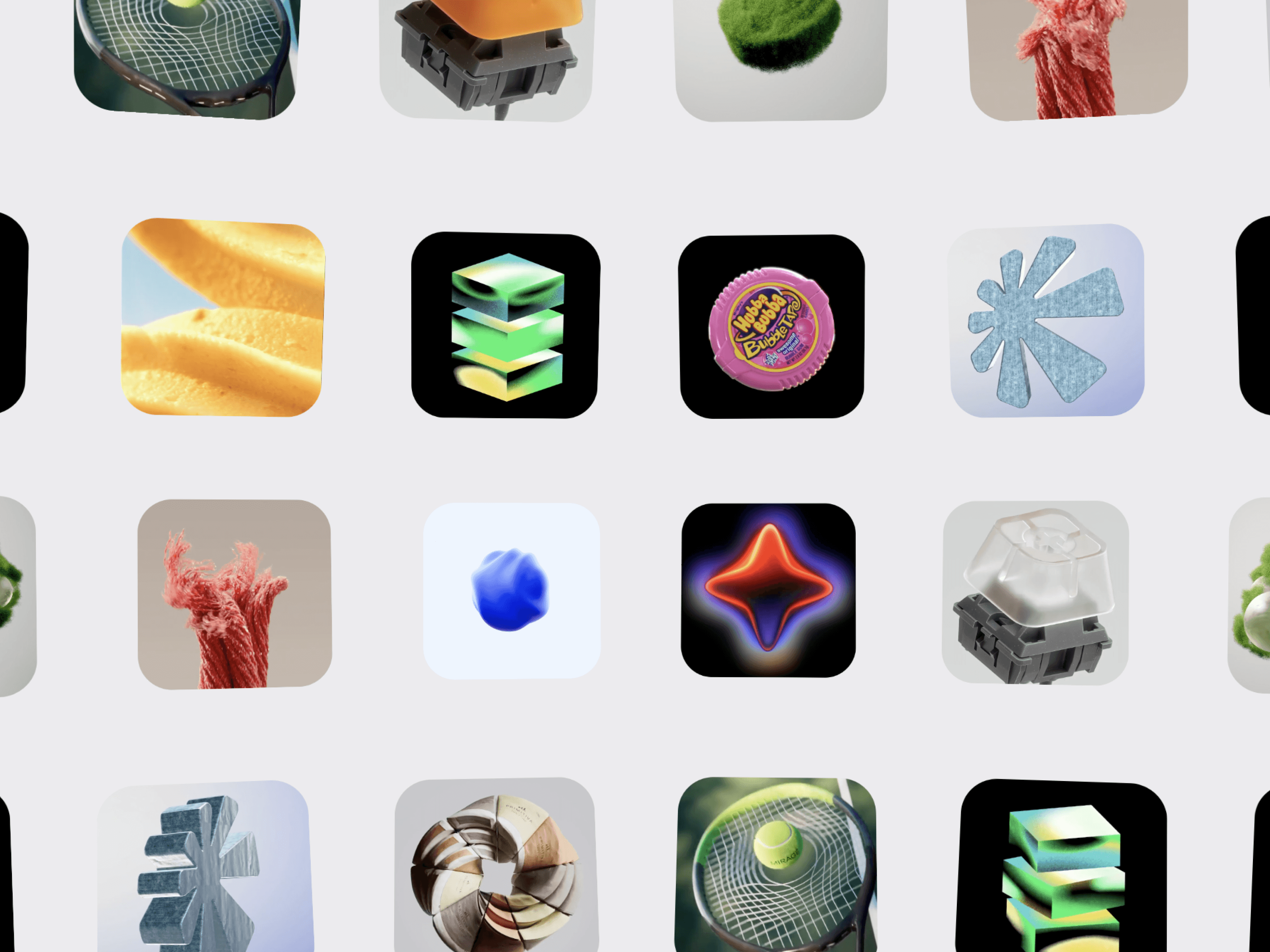
CMS Image Bento is a flexible, media-focused bento gallery for Framer that combines a clean asymmetric layout with customizable image cards, smooth interactions, responsive sizing, and individual CMS linking. It’s designed for showcasing projects, portfolios, case studies, products, campaigns, photography, and other visual content in a modern bento-style presentation.
Each card can be connected individually to a Framer CMS page or any URL using its CMS Link control. This allows every image to act as a direct entry point to its related content without requiring the component to be a CMS Collection.
Asymmetric Grid — Create a modern bento-style composition with varied image sizes.
Flexible Card Layout — Arrange visual content into a dynamic editorial-style gallery.
Responsive Scaling — Adapt the layout smoothly across different screen sizes.
Custom Image Sizing — Control the proportions and dimensions of individual visual elements.
Balanced Composition — Create visually rich layouts without sacrificing clarity.
Connect individual cards to Framer CMS pages.
Add a unique CMS Link to every image.
Link cards to projects, case studies, products, articles, or campaigns.
Use external URLs when needed.
Turn every image into a clickable visual navigation element.
Image Uploads — Add images directly inside Framer.
Image URLs — Use hosted images when preferred.
Custom Titles & Subtitles — Add supporting information to each card.
Card Links — Give every image its own destination.
Control images, image URLs, CMS links, card sizing, layout, spacing, aspect ratios, corner radius, shadows, background, hover effects, captions, text, links, navigation, and responsive behaviour directly from Framer.
Creative Portfolios · Design Studios · Agencies · Photography · Fashion · Architecture · Product Showcases · Case Studies · Campaigns · Editorial Websites · Art Direction · Personal Websites

CMS Image Bento is a flexible, media-focused bento gallery for Framer that combines a clean asymmetric layout with customizable image cards, smooth interactions, responsive sizing, and individual CMS linking. It’s designed for showcasing projects, portfolios, case studies, products, campaigns, photography, and other visual content in a modern bento-style presentation.
Each card can be connected individually to a Framer CMS page or any URL using its CMS Link control. This allows every image to act as a direct entry point to its related content without requiring the component to be a CMS Collection.
Asymmetric Grid — Create a modern bento-style composition with varied image sizes.
Flexible Card Layout — Arrange visual content into a dynamic editorial-style gallery.
Responsive Scaling — Adapt the layout smoothly across different screen sizes.
Custom Image Sizing — Control the proportions and dimensions of individual visual elements.
Balanced Composition — Create visually rich layouts without sacrificing clarity.
Connect individual cards to Framer CMS pages.
Add a unique CMS Link to every image.
Link cards to projects, case studies, products, articles, or campaigns.
Use external URLs when needed.
Turn every image into a clickable visual navigation element.
Image Uploads — Add images directly inside Framer.
Image URLs — Use hosted images when preferred.
Custom Titles & Subtitles — Add supporting information to each card.
Card Links — Give every image its own destination.
Control images, image URLs, CMS links, card sizing, layout, spacing, aspect ratios, corner radius, shadows, background, hover effects, captions, text, links, navigation, and responsive behaviour directly from Framer.
Creative Portfolios · Design Studios · Agencies · Photography · Fashion · Architecture · Product Showcases · Case Studies · Campaigns · Editorial Websites · Art Direction · Personal Websites