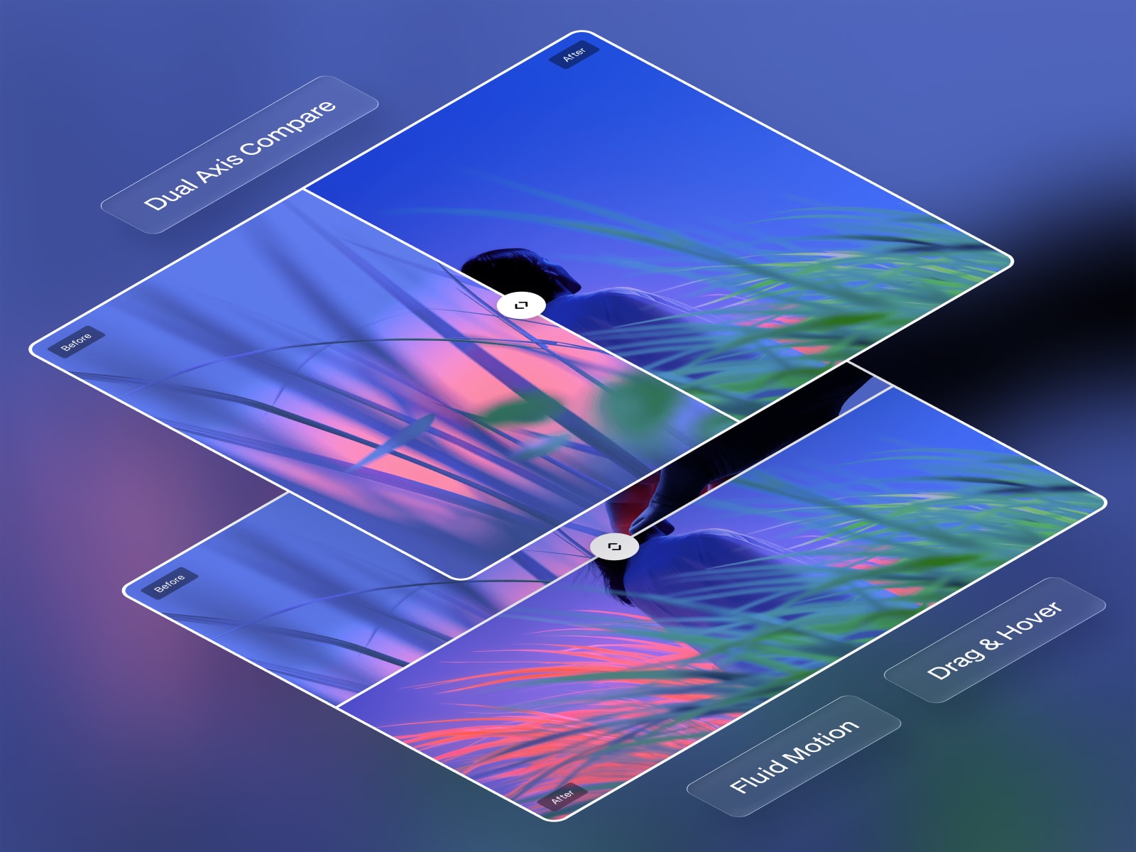
The most advanced bi-directional image comparison slider on the marketplace, driven by fluid spring physics. Designed to showcase visual transformations with seamless horizontal or vertical tracking.
Horizontal & Vertical Axes for precise alignment with specific layouts and device orientations.
Drag & Hover Interactions for adaptable, frictionless user engagement models.
Fluid Spring Physics for smooth, weight-aware dragging and cursor tracking.
Persistent Pointer Capture for unbroken interaction even when the cursor moves outside the component boundaries.
Z-Index Layering Hierarchy for flawlessly concealing labels behind the sliding handle at extreme edges.
Adjustable Starting Position for directing immediate visual focus to specific image details upon load.
Contextual Label Alignment for automatic, direction-aware typography placement.
Extended Typography Configuration for complete typographic control and brand synchronization.
Custom Text Inputs & Visibility Toggles for tailoring or hiding the before/after indicators.
Precise Offset & Padding Adjustments for exact spatial control over individual text badges.
Frosted Glass Blurs (Labels & Handle) for applying depth-aware, premium material styling over complex imagery.
Toggleable Arrow or Custom SVG Upload for integrating bespoke brand assets into the interaction point.
Customizable Handle Scale & Border for fine-tuning the visual weight of the central interaction node.
Configurable Divider Line Thickness for establishing clear or subtle separation between visual states.
Comprehensive Shadow & Color Settings for ensuring high contrast and legibility across any image pairing.
Global Corner Radius for shaping the outer container to seamlessly match the surrounding interface language.
Drop the component into your Framer canvas.
Upload your images and configure the component properties.
Publish your project to view your component live.
Shape visual comparisons with fluid, physics-driven precision.

The most advanced bi-directional image comparison slider on the marketplace, driven by fluid spring physics. Designed to showcase visual transformations with seamless horizontal or vertical tracking.
Horizontal & Vertical Axes for precise alignment with specific layouts and device orientations.
Drag & Hover Interactions for adaptable, frictionless user engagement models.
Fluid Spring Physics for smooth, weight-aware dragging and cursor tracking.
Persistent Pointer Capture for unbroken interaction even when the cursor moves outside the component boundaries.
Z-Index Layering Hierarchy for flawlessly concealing labels behind the sliding handle at extreme edges.
Adjustable Starting Position for directing immediate visual focus to specific image details upon load.
Contextual Label Alignment for automatic, direction-aware typography placement.
Extended Typography Configuration for complete typographic control and brand synchronization.
Custom Text Inputs & Visibility Toggles for tailoring or hiding the before/after indicators.
Precise Offset & Padding Adjustments for exact spatial control over individual text badges.
Frosted Glass Blurs (Labels & Handle) for applying depth-aware, premium material styling over complex imagery.
Toggleable Arrow or Custom SVG Upload for integrating bespoke brand assets into the interaction point.
Customizable Handle Scale & Border for fine-tuning the visual weight of the central interaction node.
Configurable Divider Line Thickness for establishing clear or subtle separation between visual states.
Comprehensive Shadow & Color Settings for ensuring high contrast and legibility across any image pairing.
Global Corner Radius for shaping the outer container to seamlessly match the surrounding interface language.
Drop the component into your Framer canvas.
Upload your images and configure the component properties.
Publish your project to view your component live.
Shape visual comparisons with fluid, physics-driven precision.


